Tattoo Ideas
Script & Lettering Tattoo Ideas
Lettering is the least forgiving thing we tattoo. A rose can lose a little detail over ten years and still read as a rose, but a word that closes up between the strokes stops being a word. Everything below comes from what we actually see walking back into the shop in Santa Monica five, ten, and fifteen years after the fact.
Book a consultationWhy lettering is harder than it looks
Most people bring us a phrase in a font they found on their phone and expect the hard part to be choosing between two typefaces. The hard part is that letterforms are a system. Every character has to share the same slant, the same stroke weight, the same rhythm of thick to thin, or the eye reads it as sloppy even if it can't say why. That's why a good lettering artist draws it, rather than printing it — a font pulled straight from a computer has to be redrawn to sit on the curve of a forearm or the slope of a collarbone, and it has to be spaced by hand once it's on the body.
The second thing: ink spreads. Over a decade or two, every line you have gets slightly wider and slightly softer as pigment settles in the dermis. On a bold traditional tattoos design that's fine — the design was built with that in mind. On a fine script with a hairline upstroke sitting a millimeter from a thick downstroke, that spread can close the gap and turn an elegant letter into a blot. Almost every "my script tattoo looks bad now" case we see is a spacing problem, not a font problem.
Script styles and what each one costs you
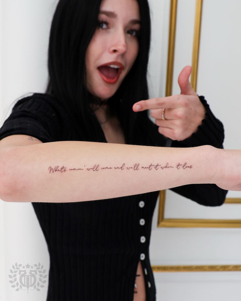
Fine-line script
The most requested style in Los Angeles right now, and the one with the shortest honest lifespan. Thin, single-weight, delicate, often lowercase. It photographs beautifully the week you get it. Placed well and kept small in word count rather than small in size, it can hold for a decade. Placed on a high-friction area, or crammed with a long quote, it will soften noticeably in three to five years. We'll do it — we just want you to walk in knowing you may be looking at a touch-up down the line.
Traditional and Old English
Heavy blackletter and bold traditional lettering are built to last. Thick strokes, generous gaps between characters, high contrast against the skin. This is the style that still reads clean on a fifty-year-old chest piece. The trade-off is that it demands space and it carries a strong stylistic voice — Old English says something specific, and it doesn't sit quietly next to a delicate botanical piece.
Chicano and single-needle fineline
The West Coast tradition — flowing, high-contrast script with dramatic thick-to-thin transitions and long tails. Done properly it's some of the most technically demanding work in tattooing, because the taper has to be smooth and consistent across every letter. Chicano lettering ages better than generic fine-line because the thick strokes anchor it; even if the hairlines soften, the structure of the word survives.
Typewriter, serif, and sans
Cleaner, more architectural, popular for dates, coordinates, and single words. Serifs are little flags at the ends of strokes, and small serifs are the first thing to blur. If you want a serif face, we'll usually scale it up a touch and thicken those serifs slightly so they're still there in fifteen years.
Handwriting and signatures
A parent's handwriting, a child's name in their own hand, a signature off a letter. These are the ones people care about most. Bring the original at the highest resolution you can — a flatbed scan beats a phone photo. We clean up the line without changing the character of the hand, and we'll always show you the redraw before we go anywhere near skin.
Placement, and where words actually live well
- Inner forearm — the best all-around lettering placement. Flat, low friction, easy to read, ages slowly, and it follows the natural line of a horizontal phrase.
- Collarbone and sternum — beautiful for a curved single line, but skin over bone is thinner and more sensitive, and the line has to be drawn to the curve, not straight across.
- Ribs — big canvas for a long quote, and the classic spot for vertical script. Painful, and it stretches and compresses as you breathe and as your weight changes.
- Spine — visually striking vertical placement. Word choice matters here because the reading angle is awkward; short phrases beat paragraphs.
- Fingers, hands, and feet — the honest answer is that these are high-turnover placements. Hands and fingers regenerate skin fast and are constantly abraded. We'll tattoo them; we won't promise you they'll hold without touch-ups.
- Inner bicep and back of the arm — underrated. Low sun exposure, low friction, and easy to keep private.
The rules we actually apply
A few working guidelines from the chair, not from a listicle:
- Fewer words, bigger letters. If you must choose, cut the quote before you shrink the type. A four-word phrase at readable scale beats a full sentence in microtype every time.
- Proofread three times, then have someone else proofread. Misspellings in tattoos are more common than anyone admits — including in other languages and scripts. If your phrase is in Arabic, Hebrew, Sanskrit, or Chinese, we want a translation confirmed by someone fluent, not a translation app.
- Watch your gaps. Where two strokes come close, they need more air than looks necessary on paper. On stencil it will look slightly too spaced. In ten years it will look right.
- Sunscreen is the difference. Living in LA, UV is what fades your lettering, not age. Daily SPF on exposed placements is the single highest-return aftercare habit.
- Black holds best. Colored or white lettering fades faster and less predictably. White ink script in particular tends to go patchy or yellow — we're generally honest about steering people away from it.
Pairing lettering with other work
Lettering rarely lives alone forever. If you think a sleeve is in your future, tell us at the consultation — a phrase placed without that plan can end up marooned in the middle of a design it doesn't belong to. Banners, ribbons, and negative-space framing are all ways to fold text into a larger composition later, but they're much easier to design in from the start. If you're still narrowing down concepts, our broader tattoo ideas pages cover how motifs and text work together.
What a consultation looks like here
We'll ask what the words mean to you, because that changes the style. A memorial line and a joke get drawn differently. We'll talk placement against your actual anatomy — not a reference photo of someone else's arm — and we'll do a hand-drawn layout, print the stencil, and place it on you so you can see it in a mirror before anything permanent happens. If the spacing is wrong or the size is off, that's the moment to say so, and we redraw. Nobody has ever regretted an extra twenty minutes at the stencil stage. When you're ready, book a consultation and bring your reference, your handwriting scan, and any doubts you still have about the wording.
Common script lettering tattoo questions, answered
What's the smallest a script tattoo can be?
There's no fixed number, because it depends on how complex the letterforms are and where it's going. As a working rule, if the gap between two strokes is thinner than about a millimeter on the stencil, it will likely close up over time. We'd rather scale a piece up slightly than hand you something that turns into a smudge in five years.
Will my fine-line lettering blur?
It will soften — all tattoos do. How fast depends on placement, sun exposure, and how tight the spacing was to begin with. Fine-line script on the inner forearm with generous letter spacing can look sharp for ten years or more; the same design on a finger might need attention within a year or two.
Can you tattoo my grandmother's handwriting?
Yes, and it's one of our favorite requests. Bring the highest-quality version you have — a scan is better than a photo, and a photo taken flat in even light is better than one at an angle. We clean up the line quality without smoothing away the character of the handwriting, and you approve the redraw before we start.
Is a quote in another language a bad idea?
Not at all, but verify it with a fluent human, not software. We also want to know whether the script is written right to left, whether letters connect, and whether the phrasing reads naturally to a native speaker. We've been asked to cover up more than one machine-translated phrase that didn't say what the client thought it said.
How much does a lettering tattoo cost in Santa Monica?
It depends on size, style, and how much drawing time the design needs — a hand-lettered Chicano script takes considerably longer to draw than a short typewriter-style date. We quote at consultation once we've seen the words, the placement, and the scale, rather than giving a per-word rate that wouldn't mean anything.
Do script tattoos hurt more than other tattoos?
The pain comes from placement, not from the fact that it's lettering. Ribs, sternum, spine, and feet are sharp everywhere. That said, lettering sessions can feel more tedious because there's a lot of precise linework and less shading, so the artist works slowly and deliberately over the same areas.
Can old, blurred lettering be fixed?
Sometimes. If the strokes have thickened but the word is still legible, a rework with bolder letterforms can absorb the blur and give you a clean result. If the gaps have fully closed, the honest options are a cover-up with a design that uses the existing black, or laser lightening first. We'll tell you which category yours falls into.
Where should I put a long quote?
Ribs, back, outer thigh, and the full length of a forearm are the placements with enough real estate for multiple lines at a readable scale. Before you commit, consider trimming the quote — long passages are the pieces people most often wish they'd shortened, both for aging and for how they read on the body.