Tattoo Library
Tattoo Styles
Twenty-seven styles, one studio. Compare the look, how each ages on real skin, and which of our artists specializes in it — then book a consultation for the one that fits your subject.
See the work in motion — a tattoo taking shape at Apollo.
Abstract
Abstract tattooing at Apollo — the Kandinsky-to-Twombly lineage, the four subcategories (gestural, geometric, color-fiel
Explore →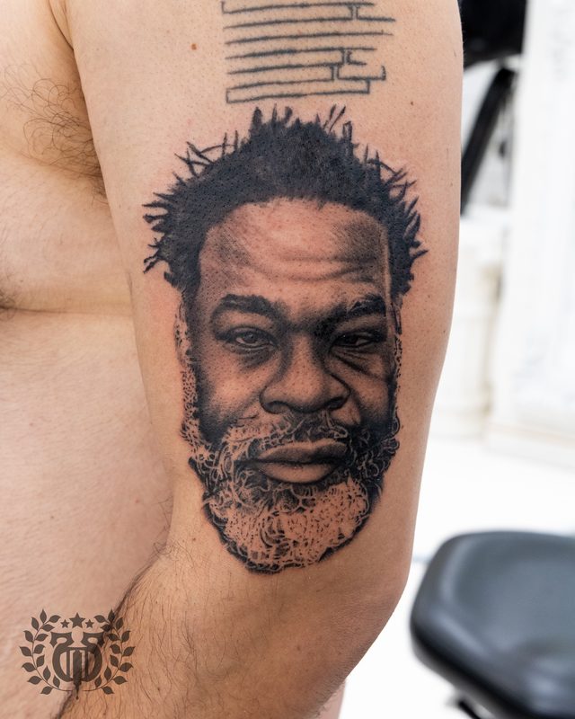
Animal Portrait
Animal portrait tattooing at Apollo — the three subcategories (pets, wildlife, fantasy), reference photography requireme
Explore →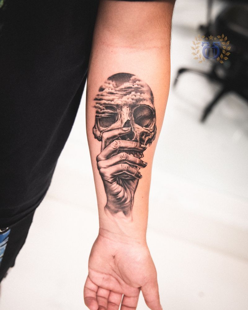
Black & Gray
The working-studio guide to black and gray tattoos — what the style actually is at the needle, how gray wash is mixed an
Explore → Chicano
Born in East LA — the fine-line black-and-gray tradition of religious and cultural iconography, smooth photographic shading, and lettering that reads like devotion.
Explore →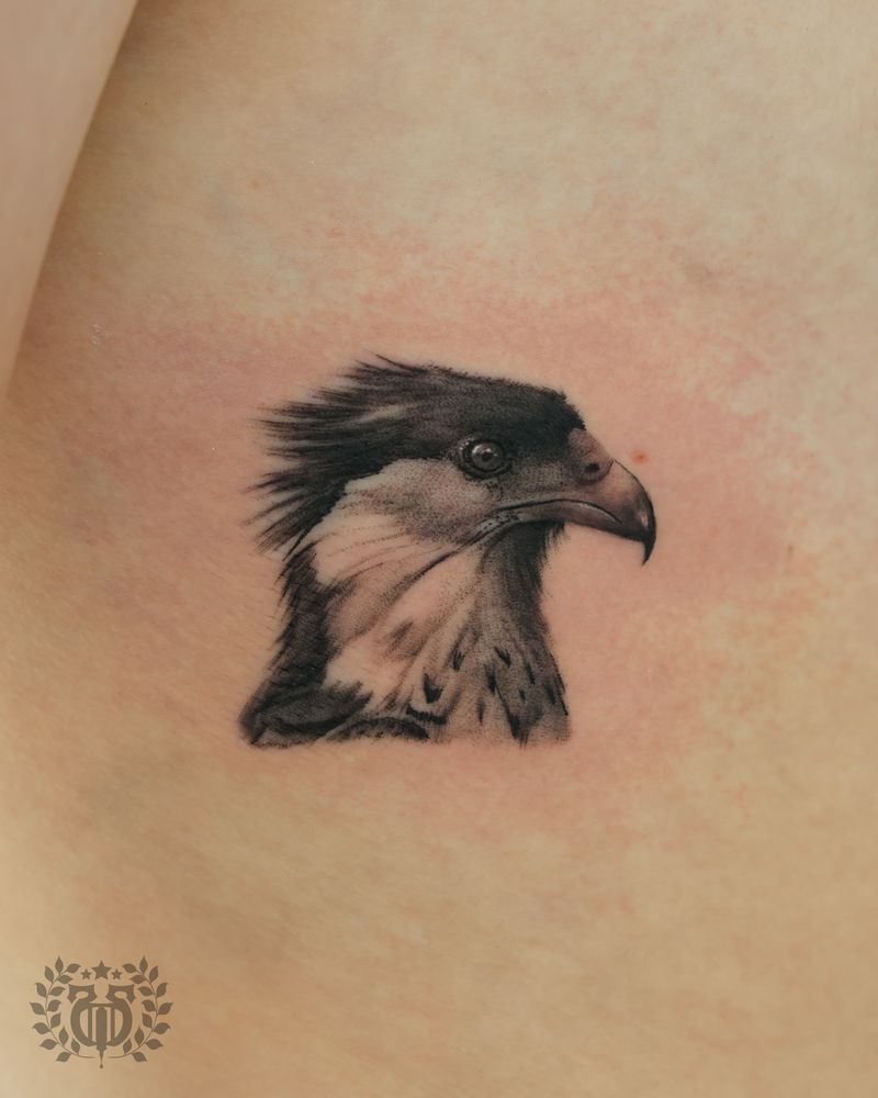
Black Gray Realism
Black-and-gray realism at Apollo — the East LA Chicano tradition, the single-needle technique, gradient work, design dir
Explore →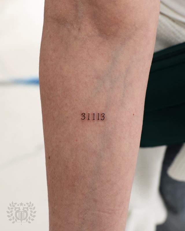
Blackletter
Blackletter tattoos at Apollo — the monastic and Gutenberg lineage, LA Chicano Old English tradition, five subcategories
Explore →Reading the work
A style is a set of choices, not a label
Line weight, contrast, color or none, and how it sits on the body — that is what a style really is. Browse for the feeling you are after and we will translate it into choices that hold up over decades, not just on day one.
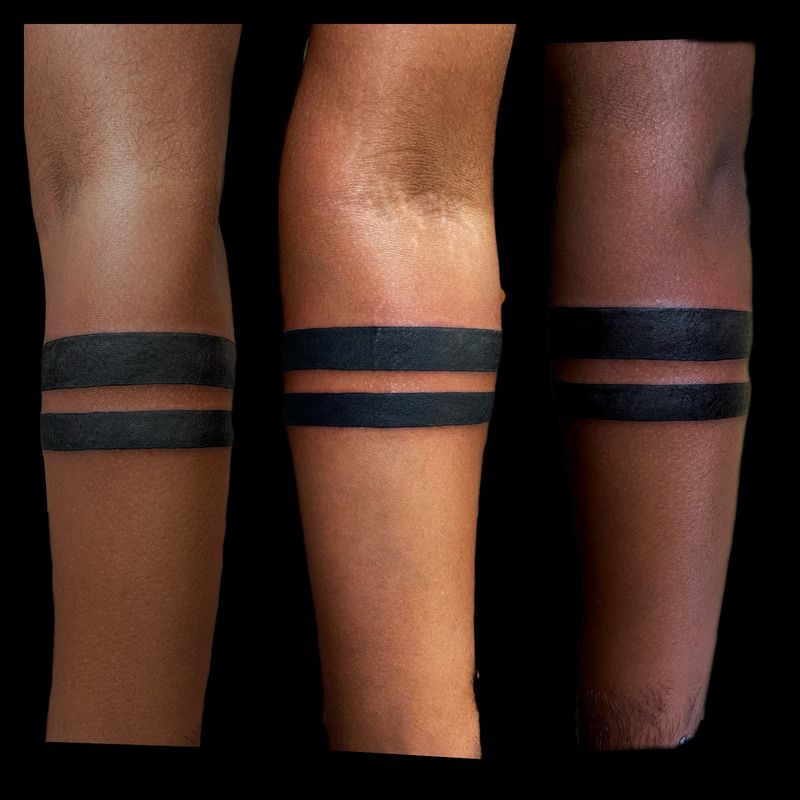
Blackwork
The working-studio guide to blackwork tattoos — single-pigment discipline at the needle, the living cultural traditions
Explore →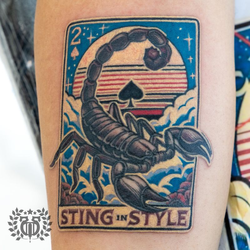
Color
The working-studio guide to color tattoos — what the style actually is at the needle, how saturation and pigment choice
Explore →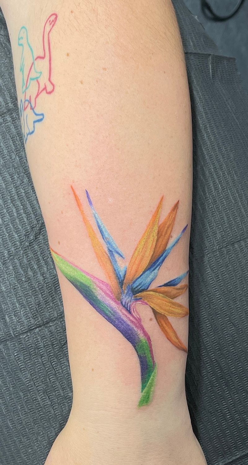
Color Realism
Color realism at Apollo — the Hurtado/Booth/Tyrrell/DeVries lineage, the layered pigment technique, placement and sun-pr
Explore →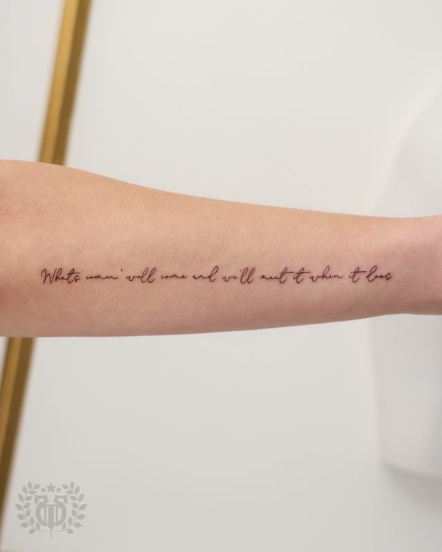
Cursive
Cursive tattooing at Apollo — the Palmer/Spencerian/Copperplate lineage, the four subcategories (fine-line, traditional
Explore →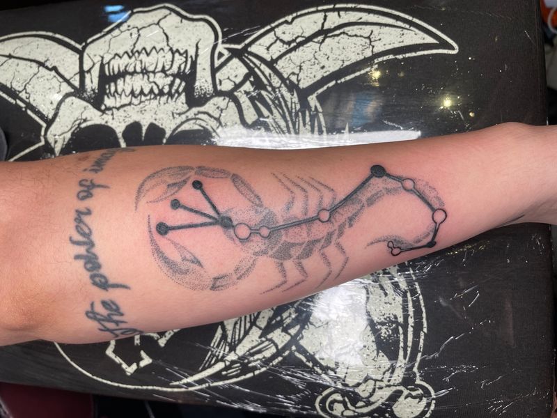
Dotwork
The working-studio guide to dotwork tattoos — the UK lineage that built the style, the five subcategories, how stipple a
Explore →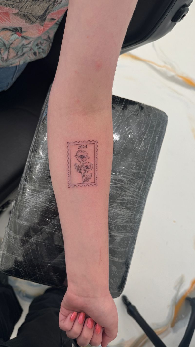
Fine Line
The working-studio guide to fine line tattoos — what the style actually is at the needle, the Los Angeles Chicano lineag
Explore →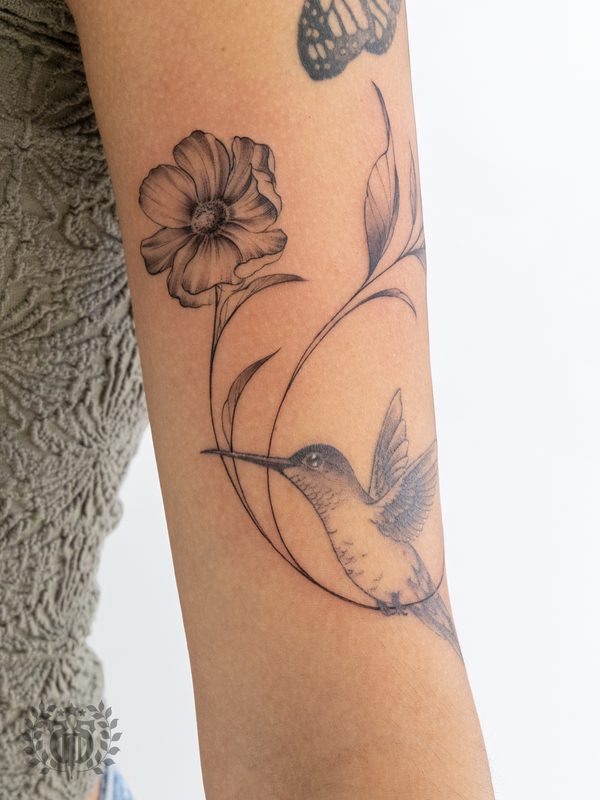
Floral
The working-studio guide to floral tattoos — the botanical illustration lineage, the styles florals cross (fine-line, ne
Explore →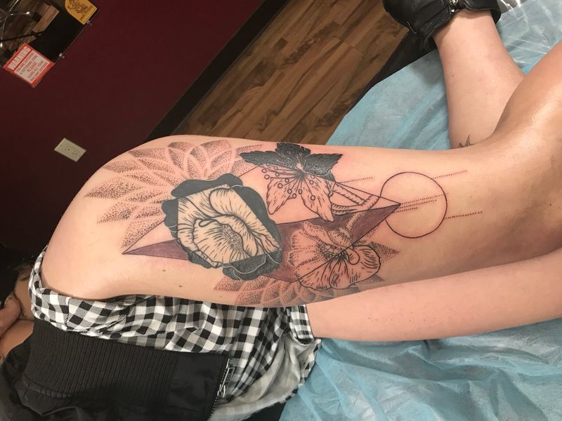
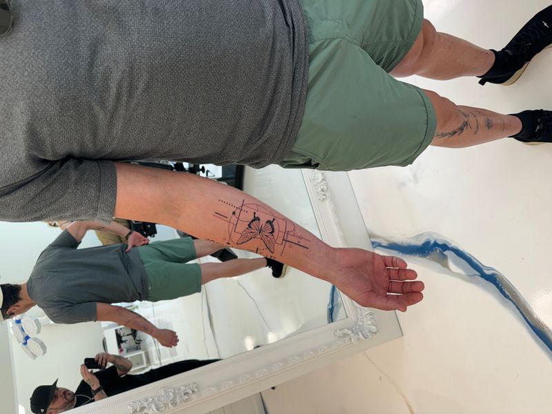
Geometric
The working-studio guide to geometric tattoos — the Chaim Machlev / Mo Ganji lineage, the five subcategories, why the st
Explore →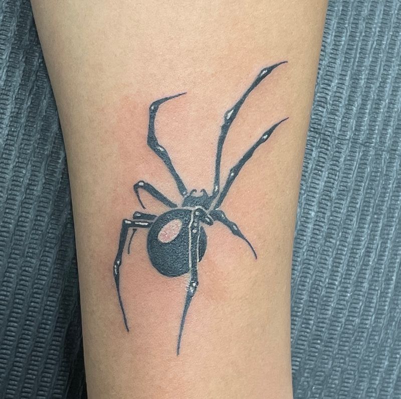
Ignorant
The working-studio guide to ignorant-style tattoos — the Fuzi Uvtpk Paris-graffiti lineage, the four subcategories, why
Explore →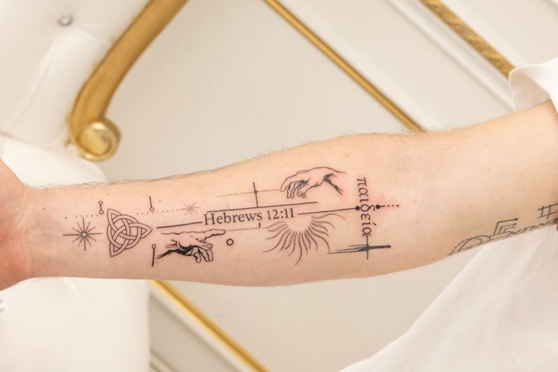
Illustrative
The working-studio guide to illustrative tattoos — the Rackham / Dore / Gorey lineage, the four subcategories (etching,
Explore →Artist fit
The right style means the right specialist
Every artist here has a lane. Once you know the direction, we match you with the person who lives in that style day in and day out — because specialization is what separates a good tattoo from a great one.
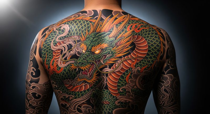
Japanese
A working-studio guide to Japanese Traditional tattooing (irezumi / horimono) — the Edo-period origins, tebori vs.
Explore →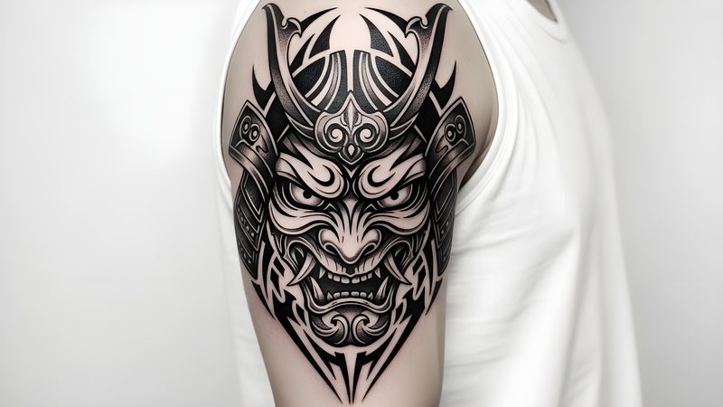
Japanese Modern
The working-studio guide to modern Japanese tattoos — the Horiyoshi III / Filip Leu / Shige lineage, how it relates to t
Explore →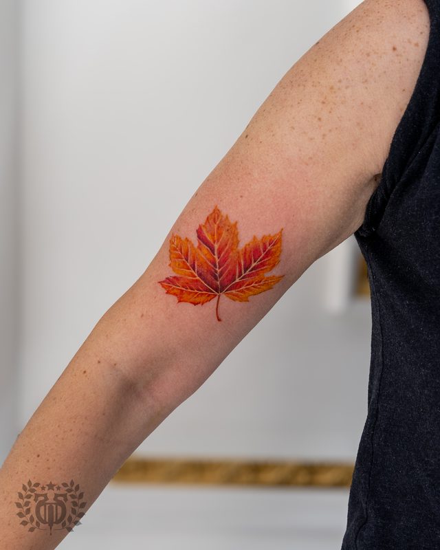
Memorial
A working-studio guide to memorial tattoos — why it's a theme not a style, the grief-state approach, design variations,
Explore →
Minimalist
A working-studio guide to minimalist tattoos — the philosophy of reduction (ma, Scandinavian design, Bauhaus), eight des
Explore →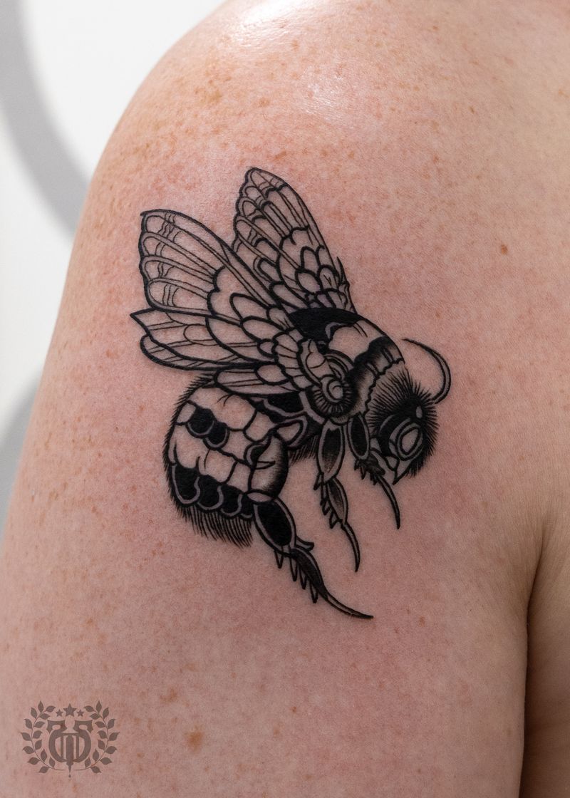
Neo Traditional
The working-studio guide to neo-traditional tattoos — the style that kept American Traditional's bold outline and pushed
Explore →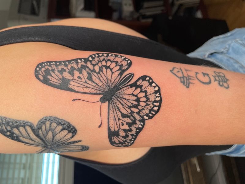
Ornamental
The working-studio guide to ornamental tattoos — what the style is at the needle, the design traditions it draws from (h
Explore →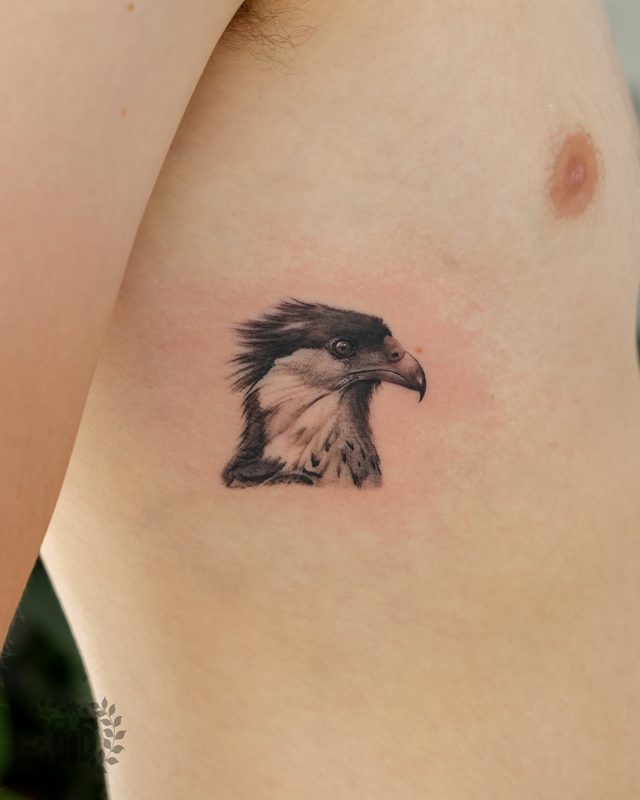
Realism
The working-studio guide to realism tattoos — what the style is at the needle, the LA Chicano lineage it shares with fin
Explore →
Sacred Geometry
A working-studio guide to sacred geometry tattoos — the patterns (Flower of Life, Sri Yantra, Metatron's Cube, mandala),
Explore →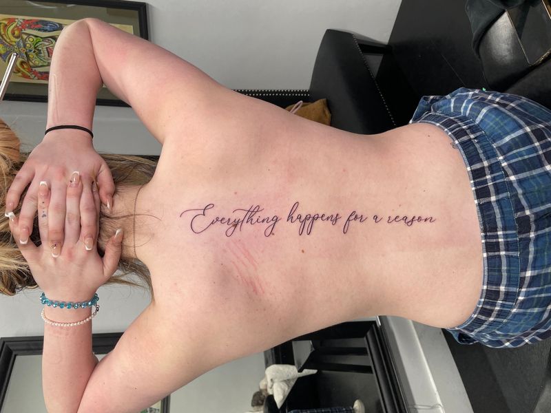
Script Lettering
The working-studio guide to script and lettering tattoos — the three major traditions (Chicano script, Old English black
Explore →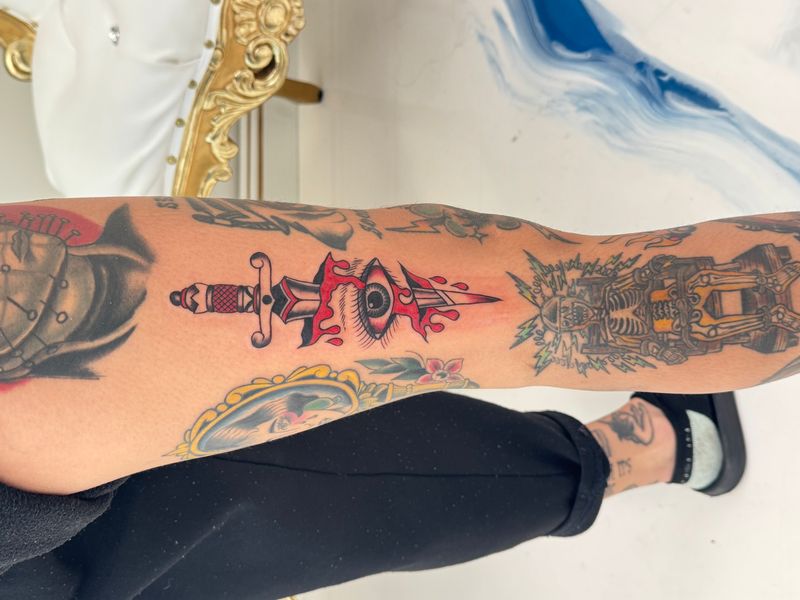
Traditional
The working-studio guide to American Traditional tattoos — what the style is at the needle, the Sailor Jerry lineage tha
Explore →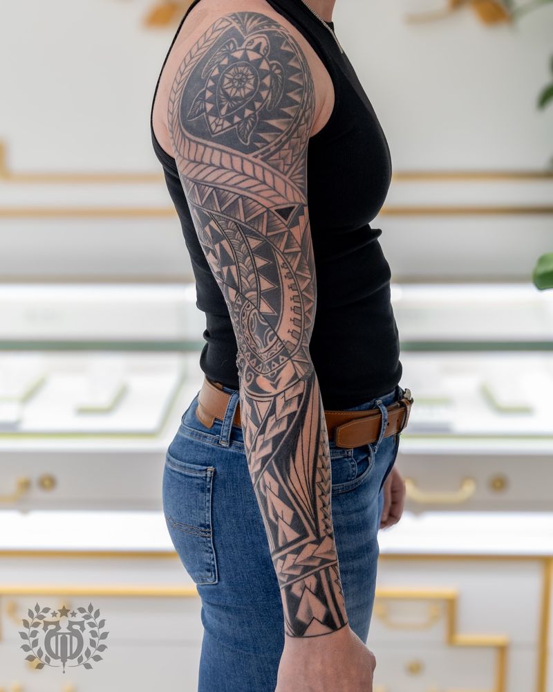
Tribal
A working-studio guide to tribal tattooing — honoring the living cultural traditions (Polynesian, Maori, Hawaiian, Iban,
Explore →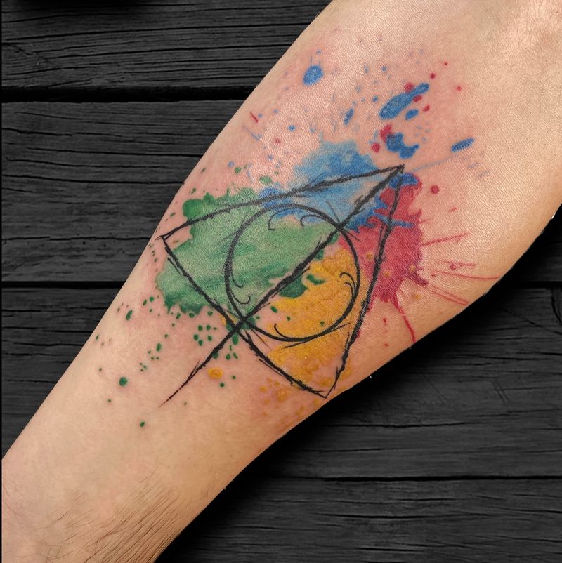
Watercolor
The working-studio guide to watercolor tattoos — what the style is at the needle, the with-or-without-black-underlayer d
Explore →