Tattoo Styles
Realism
The working-studio guide to realism tattoos — what the style is at the needle, the LA Chicano lineage it shares with fin
Book a consultationAt the needle
What realism actually is.
Realism is defined first by what it lacks — there is no outline — and then by the discipline of building a recognizable image from value and tone alone.
Where traditional, neo-traditional, and fine-line styles build an image around a black outline and then fill it, realism renders form the way the eye actually sees it — through continuous gradations of value and tone. There is no perimeter. A shoulder, a jawline, the edge of an eye socket resolves because a darker tone meets a lighter one, not because a line tells the viewer where it ends. Every technical decision downstream of that principle follows from it.
The workhorse configurations are magnum needles — especially curved magnums in 9, 11, 13, 15, and 17-count groupings — for laying soft, even shading across broad tonal fields, and round shaders in 5, 7, and 9 for smaller transitions and detail passes. Single-point (1RL) work inside a realism piece has become viable over the last decade as cartridge systems matured and is now used for the highest-detail moments — eyelashes, the glint in an iris, individual hair strands. Rotary machines dominate because consistent pressure produces smoother tonal packing than a coil's mechanical hit.
The defining technical signature of black-and-gray realism is the gray wash. Black pigment is diluted — traditionally with distilled water, today more often with a commercial mixing solution that preserves the ink's carrier chemistry — to produce a stepped set of tonal values. A standard working set is four to five dilutions: full-strength black, roughly 75%, 50%, 25%, and a whisper wash around 10%. Skilled artists mix on the fly rather than pouring fixed stops. Color realism operates differently: rather than diluting one pigment, the artist works from a layered saturation approach using full-palette color lines, packing pigment in passes and letting earlier layers show through to build depth.
Almost no serious realism piece is finished in a single session. Multi-session layering — typically two to three sessions on the same area, spaced weeks apart to let the skin heal between passes — is standard, because the tonal depth the genre demands cannot be packed in one sitting without trauma compromising the result. A realism session commonly runs six to twelve hours, and the artist is usually still sketching the next pass during the final stretch of the current one.
The lineage
Where realism came from.
Modern tattoo realism is two family trees that grew toward each other — the LA Chicano black-and-gray tradition and the 2000s color-realism movement. Apollo sits at their intersection.
1960s – early 1970s
Prison single-needle
Black-and-gray realism shares its origin with fine line — prison-built rotary machines, single sewing needles, the fine gray-washed portrait-heavy aesthetic. The technical restriction became the tradition.
1975 — East LA
Good Time Charlie's
Jack Rudy and Freddy Negrete formalized gray-wash dilution and codified the religious iconography, portraiture, and script that defined Chicano black-and-gray. The shop is still operating, and the lineage from 1975 runs unbroken to now.
1990s – 2000s
Paul Booth & dark realism
Working out of Last Rites in New York, Paul Booth became the defining figure of dark-subject American realism — horror imagery, religious and occult themes, dense saturation that reads like oil painting. Color realism entered the conversation as a serious fine-art medium.
2010s – present
Hurtado & the European school
Nikko Hurtado pushed color realism into celebrity portraiture with vivid skin-tone layering. Parallel to American realism, a Russian and Eastern European wave — Dmitriy Samohin, Valentina Ryabova — pushed the genre toward hyperrealism, softer gradients, higher fidelity to high-resolution photography.
The American / European realism split is a real craft distinction, not a ranking. American realism tends bolder and higher-contrast, with graphic impact that reads across a room. European realism leans softer and more gradient-heavy, closer to the photograph than to the oil painting. Apollo artists draw on both traditions, and the choice between them is a conversation you'll have at consultation.
What it carries well
The subjects realism was built for.
Realism carries categories no other tattoo style can carry — likeness, emotional memorial, photographic illusion — but the range is narrower than first-time clients often assume.
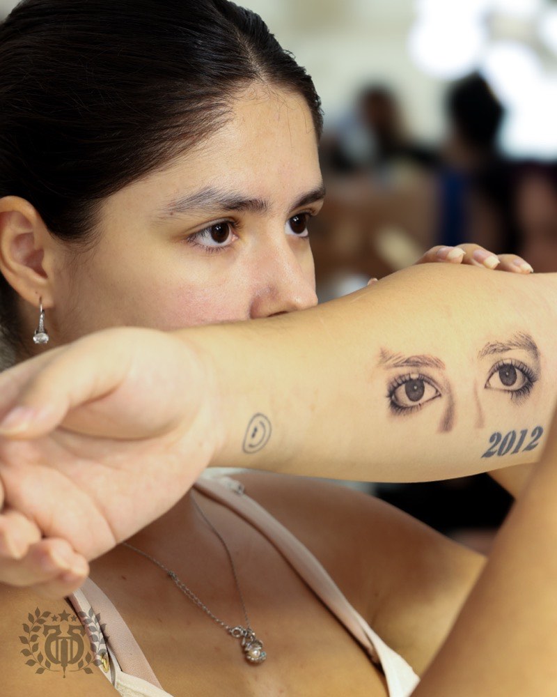
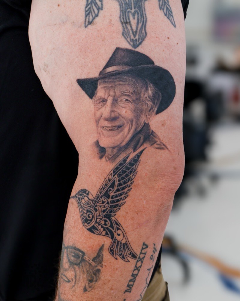
Human portraits
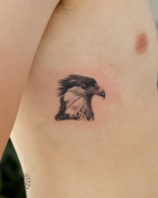
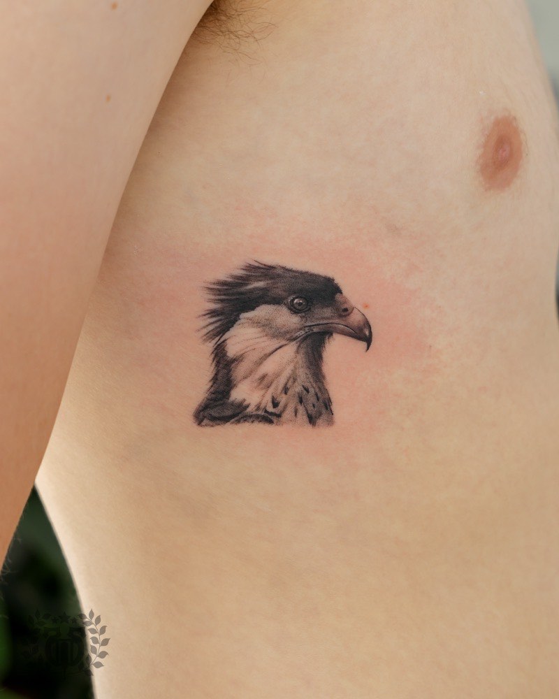
The category realism was built for. Photorealism as a tattoo subgenre emerged because clients wanted recognizable likenesses — family, children, deceased loved ones, cultural figures — that no other style could deliver. The question any portrait turns on is reference quality, not the subject. Living-subject portraits need high-resolution, well-lit photos from multiple angles. Memorial portraits face a harder problem: available photos are often decades old.
Animal portraits
Dogs, cats, horses, big cats. The technical challenge is the eyes — the emotional anchor — and the fur, which must convey direction, length, and light without devolving into rendered noise at skin distance. Horses and lions punish artists who don't understand the musculature under short fur. Reference alone won't save a piece where the anatomy is wrong.

Memorial & tribute
Realism's emotional center. The gravity of the subject justifies the cost, the session time, and the placement commitment the style demands. Overlaps heavily with portraiture and religious iconography — and it's the reason black-and-gray realism remains the genre's quiet majority.

Religious iconography
Virgin Mary, Sacred Heart, Christ figures, saints, Buddha. A cross-cultural realism stronghold because the source traditions — Renaissance painting, Orthodox iconography, devotional sculpture — are already rendered with dimensional light and volume. Realism doesn't have to invent the image; it translates an existing photoreferenceable artwork onto skin.
Film & character
The Nikko Hurtado territory. Film stills, actors in role, practical-effects monsters rendered at portrait fidelity. Works when the source is itself photoreal; struggles when the source is stylized. A comic-book character in realism usually betrays its origin medium — the style mismatch reads as a mistake, not an interpretation.
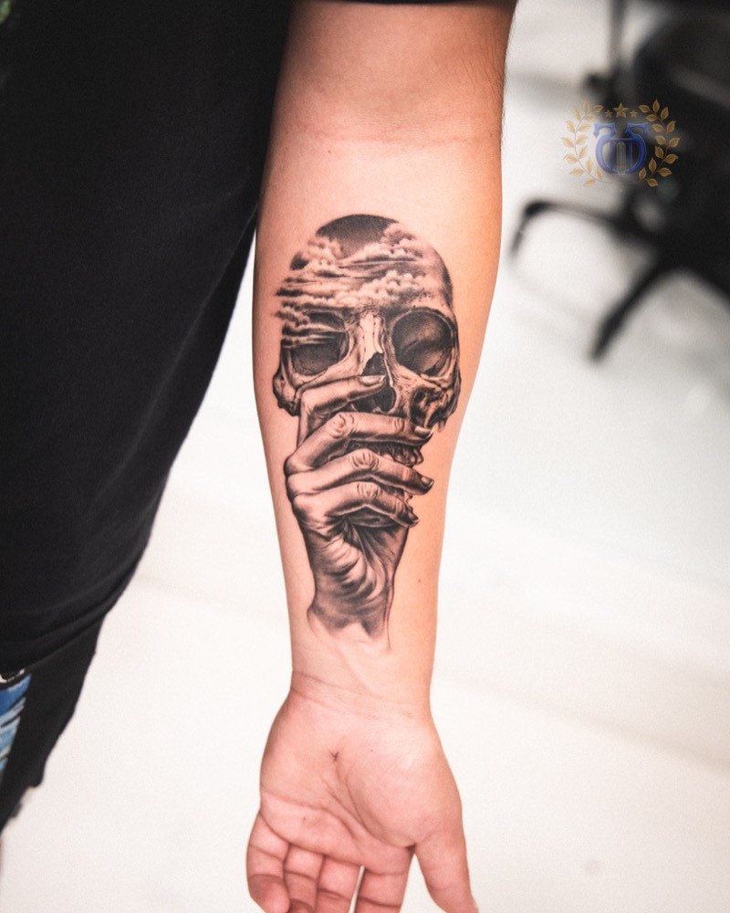
Skulls & anatomical
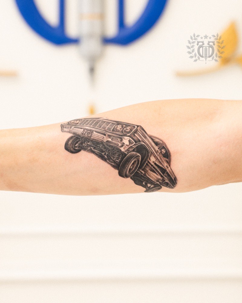
Realism's dark-tradition backbone, associated with Paul Booth's lineage. Skulls reward realism because bone is already a rendering study — texture, shadow, porosity, fracture. The subject carries without needing color, and the tonal range of gray wash shows off at its best on bone.

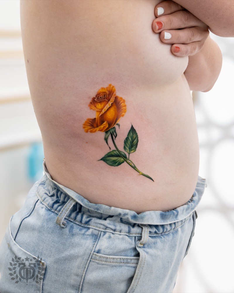
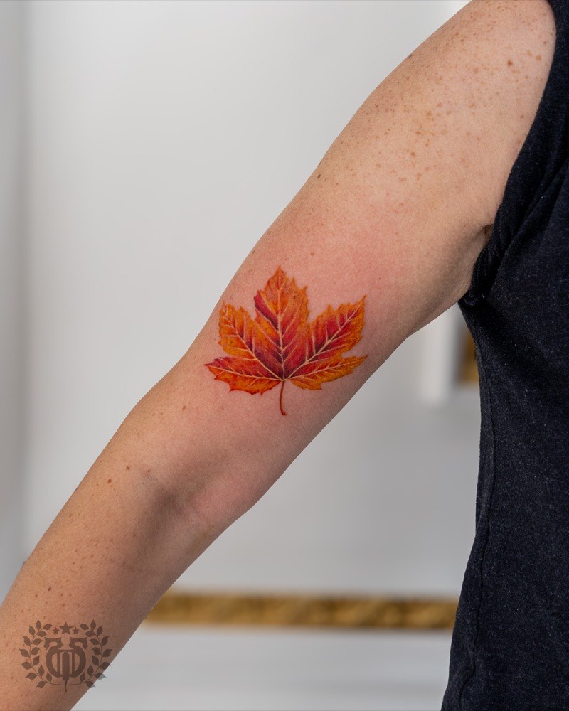
Floral realism
Roses, peonies, chrysanthemums, orchids. Realism borrows from botanical illustration here. Florals are forgiving because petals provide natural gradient surfaces and the subject doesn't require recognizable likeness — a rose just needs to read as that rose. Often the best first realism piece for clients new to the style.

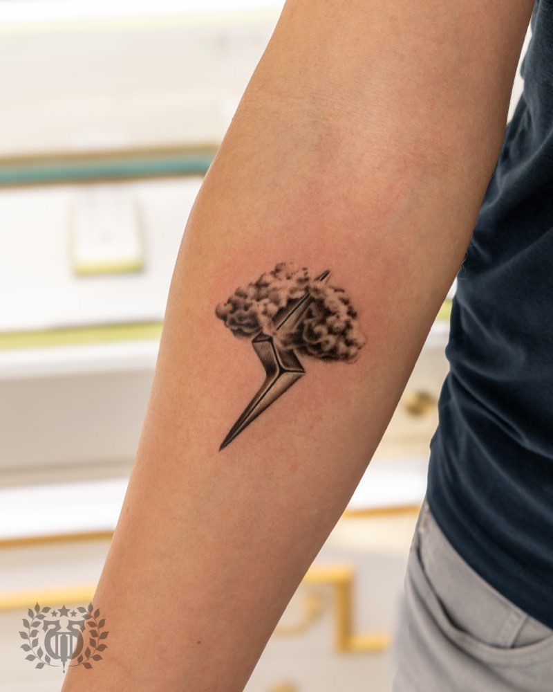
Object realism
Clocks, pocket watches, keys, chains, glass, water droplets. Showcases realism's ability to mimic metal reflections, transparent surfaces, weight. Usually integrated into larger compositions rather than standing alone. A realism sleeve with hybrid subjects almost always leans on at least one object to anchor the narrative.
What it can't carry
The honest limits.
Realism is a specialist's craft for specific subject categories. These are the requests where the style fails the subject — no matter the artist.
Small-scale portraits (under 4 inches)
The eyes carry likeness and cannot hold enough detail under that size to survive healing and twenty years of skin movement. Six inches is the floor.
Negative-space compositions
Realism fills space with tonal information. Designs that depend on empty canvas for impact (Japanese wind bars, minimalist linework) lose their breathing room inside a realism treatment.
Stylized pop-culture (cartoons, anime)
The style mismatch betrays the source. A cartoon rendered photoreal reads as a mistake, not an interpretation — the original was flat and stylized by design.
Text and script inside realism
Letters are geometric and flat by nature. They interrupt the photographic illusion and pull the eye out of a rendered scene. Text belongs beside a realism piece, rarely inside it.
Heavily geometric subjects
Mandalas, sacred geometry, technical schematics belong to blackwork or ornamental styles. Realism is organic — the tradition evolved for living subjects with dimensional form.
Cover-ups on lightly-inked pieces
Realism can cover existing ink when the original is dense and dark. Lighter existing work needs layered saturation that fine-line pieces can't absorb — realism is not the universal cover-up style some clients assume.
Size & placement
The numbers that matter.
Realism's minimum-viable sizes are the most-violated rule in consultation. Below these floors, the style simply can't hold the detail it needs to survive.
Minimum sizing rules
Below this, the eyes — which carry likeness — cannot hold enough detail through healing and long-term softening. Eight inches is preferred for memorial work.
Depends on fur complexity and eye prominence. A short-haired dog can land at four inches; a lion or horse benefits from six or more.
Clocks, keys, glass, water — material realism needs enough scale for reflections and surface texture to read as dimensional.
Before composition even begins. A realism sleeve below this canvas crowds subjects and loses the breathing room the genre needs.
Placements that favor realism
- Outer upper arm / bicep. Realism's default placement — flat canvas, consistent skin, moderate sun.
- Outer forearm. Visible daily, steady skin, ideal for portrait and floral work.
- Thigh (front or outer). Large uninterrupted canvas, low friction, holds large-scale realism well.
- Chest. Sufficient canvas for major portraits; follows natural body contour for religious and memorial pieces.
- Back and back-piece territory. Realism's largest canvas. The only placement that supports true landscape realism.
- Calf (outer). Flat canvas with moderate sun exposure — good for animal portraits and memorial work.
Placements to reconsider
- Wrist, hands, fingers. Too small for portrait detail; high turnover fades fine realism work within years.
- Neck. Small canvas, high visibility, constant movement — nothing about this placement favors realism.
- Feet. Friction-based ink loss compromises fine detail within years.
- Ribs. Extreme pain interrupts session continuity; skin movement distorts dimensional rendering.
- Inside upper arm. Bending deforms the image in daily use — portrait realism especially fails here.
The palette decision
Black-and-gray or color?
The most important decision after subject. Not a stylistic preference — a real tradeoff between vibrancy, longevity, and what the reference photo is already telling you.
Choose black & gray when
- The reference photograph is itself black-and-white
- The emotional style is somber (memorials, contemplative iconography)
- Long-term readability matters more than vibrancy
- Session time or budget is constrained (B&G sessions are typically shorter)
- You want the style that ages longest — carbon black is the most photostable tattoo pigment in commercial use
Choose color when
- The source material is inherently vibrant (florals, tropical birds, character realism from color film)
- Color carries narrative meaning — a specific palette in a religious image, a national flag, a memorial flower
- Portrait likeness depends on skin tone and eye color
- You're prepared for more frequent touch-ups (5–8 years vs 8–12 for B&G)
- You're committing to strong daily SPF — color pigments photobleach faster than carbon black
The hybrid approach
- Predominantly black-and-gray with one accent color — a signature realism move
- A gray-rendered portrait with a single red rose
- A monochrome skull with one color element
- A religious figure in B&G with a single color halo
- Strong enough convention that most established realism portfolios include examples
The hidden requirement
Reference quality decides realism.
Realism fails before the needle when the reference is inadequate. Here's what the artist needs and why the Instagram-screenshot client usually walks away without a tattoo.
What makes a reference usable
- High resolution. Phone screenshots at 600×600 are not usable for a 6-inch portrait.
- Soft directional light. Flat flash erases the dimensional information realism needs.
- Good contrast. Crushed shadows or blown highlights leave nothing for the artist to render.
- Multiple angles for portraits. Reconstructing bone structure needs more than one photo.
What makes a reference useless
- Instagram screenshots. Compressed, filtered, low-resolution — the image is already lost.
- Single decades-old photo for a memorial. Sometimes unavoidable, but discuss it with the artist first.
- Heavily filtered portraits. Filters remove the skin texture and bone structure the artist needs.
- One non-negotiable reference. A client who arrives with one "it has to be exactly this" often costs themselves the tattoo.
Composite work is normal and often necessary. Building a scene from multiple references — a face from one photo, a pose from another, an environment from a third — is a skill the artist brings to the collaboration, not a compromise on fidelity. If the artist asks for better reference or pushes back on a borderline photo, they are protecting the piece you'll wear for life.

Longevity
How realism ages on real skin.
Realism ages harder than any other major style — no outline to carry the design, tonal transitions that fade fast, and a binary readability threshold (the portrait must remain recognizable). Here's the honest year-by-year read.
Settling and softening
The crisp tonal range visible at the healed two-week mark compresses as pigment beds into the dermis. Edges soften, micro-contrast eases, and the piece reads about 10–15% quieter than the week-two photo. This is normal and correct — not a failure of the work.
Mid-tone compression begins
The subtle gray transitions that give realism its dimensionality start narrowing. Fine detail — iris striations, individual eyelash strands, fur hair separation, skin pore texture — begins losing precision. Contrast compression is silent but already in motion. Most pieces are still holding their intent well.
First major touch-up window
The industry-recognized inflection point for realism. Experienced artists re-saturate deep blacks, redefine key transitions around the focal point — usually the eyes or the brightest highlights — and refresh the darkest passages. A well-built realism piece responds beautifully to this touch-up; an under-built piece reveals its original compromises.
Meaningful contrast loss
Color realism shows substantial fade — reds pinking, whites yellowing, mid-tones muddying. Black-and-gray realism holds considerably better because carbon black is the most photostable tattoo pigment in commercial use. Portraits at twelve years read softer; still recognizable if original contrast was overbuilt, visibly tired if it wasn't.
The twenty-year divide
Black-and-gray realism tattooed by a specialist can still read beautifully at twenty years. Color realism at twenty years frequently needs substantial rework to maintain subject integrity. This isn't a failure of color realism — it's the pigment chemistry limit of the medium, and the honest framing every client should know before choosing.
Four structural reasons realism ages harder than other styles: no outline to carry the design as fine detail softens; tonal transitions are the first to fade — the subtle grays nearest the skin's natural tone drop out earliest; pigments photobleach unevenly (reds fastest, blacks slowest); and the subject must remain recognizable — a faded traditional rose is still a rose, but a faded portrait where the person is no longer identifiable is a failed tattoo.
Realism in the wild
A visual sampler.

Decision matrix
Subject → scale → placement → palette.
A consolidated reference Apollo artists use at consultation. Every row is a starting point, not a rule — the right artist will adjust once they see your reference and the skin itself.
Misconceptions
Five things we correct at consultation.
The patterns that come up most often with first-time realism clients. Not judgments on past tattoos — framing for the next one.
“Realism ages the same as any other style.”
It doesn't. Realism has no outline to carry the design as detail softens — which means it ages on a more aggressive curve than traditional or blackwork, and requires overbuilt contrast on day one to survive twenty years.
“A perfect-looking realism piece on day one is great work.”
Usually the opposite. A day-one piece that looks exactly matched to reference is probably under-built. Experienced artists design slightly too bold because they know the skin will quiet it down whether they plan for it or not.
“Color realism holds up as well as black and gray.”
Pigment chemistry says otherwise. Carbon black is the most photostable pigment in commercial use; reds fade fastest, yellows shift muddy, whites yellow or disappear. Color realism at twenty years often needs rework — black-and-gray at twenty years still reads.
“I can use an Instagram screenshot as my reference.”
Low-resolution, over-filtered reference is the single most common failure predictor in realism. The image is already lost before the needle. Good references are high-resolution, well-lit from soft directional light, and ideally multiple angles.
“One long session is better than three shorter ones.”
Realism is engineered for multi-session layering. The dermis needs to heal between passes to accept the next tonal layer cleanly. A rushed single session trauma-compromises the result — it's the aesthetic equivalent of overbaking a cake.
Artist fit
How to choose a realism specialist.
Realism demands specialization even more than fine line — the session length, the reps required, and the subject-specific fade planning all filter the field hard.
Green flags
- Multi-year healed realism documented in the portfolio
- Consistent quality across multiple subjects within the same specialty
- Specific language about reference selection and client collaboration
- Willingness to request better reference — or decline borderline projects
- Clear description of touch-up philosophy for settling vs long-term rework
- Healed work photographed at month 6 and year 2 alongside day-one shots
Red flags
- Portfolio shows only fresh / day-one photos — no healed documentation (uniquely misleading in realism)
- Stylized color that isn't faithful to the reference image
- Inconsistent skin tone across a single portrait — weak layering discipline
- Blown-out highlights reading as pure white holes
- Muddy mid-tones across the whole portfolio
- Visible stencil lines in finished work
- “Any style” marketing — realism rewards depth, not range
- No examples of your specific subject category (portraits, animals, objects are distinct skill sets)
Seven questions worth asking
- Can I see three healed realism pieces from at least two years ago?
- What reference quality do you require from clients?
- How do you handle it when reference quality is borderline?
- Walk me through how you plan contrast for this piece knowing it will fade.
- What's your typical session length, and how many sessions for this subject?
- What does your touch-up window look like for settling vs major rework?
- Which subject category is your strongest — portraits, animals, or objects?
An artist comfortable in realism answers all seven with specificity. An artist who deflects on reference quality or fade planning is telling you something.
FAQ
Realism questions, answered honestly.
Seven questions that come up most often in consultations, with the answers Apollo artists give when there's time to be complete.
How long do realism tattoos last before they need a touch-up?
Black-and-gray realism typically needs a touch-up every 8–12 years; color realism runs 5–8 years, sometimes sooner with heavy sun exposure. The settling touch-up at 3–6 months post-session is a separate, planned phase of the work — not a flaw. The 5–7 year major touch-up is where artists re-saturate deep blacks and refresh transitions around the focal point. Done well, this can reset the aging clock meaningfully.
Should I get my realism piece in black and gray or color?
Black-and-gray is the right call when the reference is itself black-and-white, the emotional tone is somber, the budget is tighter, or long-term readability matters more than vibrancy. Color is the right call when the source material is inherently vibrant (florals, character realism drawn from color film), when color carries narrative meaning, or when portrait likeness depends on skin tone and eye color. Hybrid approaches — mostly black-and-gray with one accent color, like a single red rose against a gray-rendered field — are a signature realism move. Most established realism portfolios include both.
Why do realism artists require such high-quality reference photos?
Because realism fails before the needle when the reference is inadequate. The artist is reconstructing a three-dimensional subject from a two-dimensional photograph; a low-resolution or over-filtered source means the underlying information needed for skin tone, skeletal structure, fur direction, or material reflection is already gone. Usable references are high-resolution, well-lit with soft directional light, high-contrast without crushed shadows, and — for portraits — ideally provided in multiple angles. The artist should have input on reference selection; a client who arrives with one non-negotiable reference has often already cost themselves the tattoo.
What's the smallest a realism tattoo can be?
For human portraits, about six inches (15cm) is the floor for recognizable likeness. Under that, the eyes — which carry the identity of the face — cannot hold enough detail through healing and twenty years of skin movement. Animal portraits can land at four to five inches depending on fur complexity. Object realism (clocks, keys, glass) can work at three inches. Half-sleeves and sleeves require at least eight inches of vertical canvas before composition even begins.
What's the difference between American and European realism?
A real craft distinction, not a ranking. American realism — shaped by Paul Booth, Nikko Hurtado, and the Black Anchor Collective lineage — tends bolder and higher-contrast, with graphic impact that reads across a room. European realism — led by artists like Dmitriy Samohin and Valentina Ryabova — leans softer, more gradient-heavy, with closer fidelity to high-resolution photography. Both produce extraordinary work; the difference is about what each school thinks the eye wants to see on skin. A realism artist's portfolio will usually lean clearly in one direction.
Why is realism more expensive than other styles?
Session time. A realism portrait commonly runs 6–12 hours per session, and almost every piece requires multiple sessions to build the tonal depth the genre demands. The reference-selection conversation, the contrast-planning work the artist does before the needle, the single-session commitment, the specialized needle and pigment inventory — all of it adds up. Realism pricing reflects the hours the work actually takes, not a style premium. Apollo's pricing guide walks through this in detail.
Can realism cover up an existing tattoo?
Sometimes. Realism can absorb existing ink when the original is dense and dark — the layered saturation of the style can out-value the underlying tattoo. Lighter existing work (fine-line, script in hairline weight) is harder to cover with realism because the new piece would need overwhelming saturation to mask the old lines. The honest conversation is often about laser lightening the existing piece first and then designing a realism composition into the faded area. A specialist realism artist will evaluate the old tattoo harder than the new idea during the cover-up consultation.
Ready to talk specifics?
Bring the reference, the subject, and an honest size expectation — we'll match the artist.
Realism is a specialist's craft. Bring two or three high-quality references (yes, resolution matters), the subject you're thinking about, and the area you want it on. We'll walk through scale, black-and-gray vs color, session planning, and what the piece should look like at year one, year ten, and year twenty.