Tattoo Ideas
Mountain
Where the line stops decides everything. A single-line peak with the wrong open edge reads as a mistake; with the right one it reads as distance. Twelve directions from hairline summits to atmospheric ranges and the Fuji-and-wave pairing, plus named peaks such as Whitney, Shasta and Baldy that most people never think to ask for.
Book a consultationWhere the line stops
A mountain tattoo is decided by where the line stops.
When a client walks in and says I want a mountain tattoo, what they’re holding is a shape. Five decisions turn a shape into a place. Skip any of them and the artist has to guess, and a guessed mountain is the one that comes back looking like everybody else’s.
Which mountain, specifically?
A generic triangle is an aesthetic. A named ridgeline is a tattoo. Whitney, Baldy, Fuji, Rainier, the Palisades, the one visible from a childhood porch. Start with a specific peak. “A mountain” is the category. The one you actually climbed, or lost someone on, or drove toward every morning — that’s the piece.
Single peak or full range?
A single peak is a different design problem than a three-summit ridgeline or a full horizon panorama. Single-peak fits 2–4 inches. A multi-ridge range with atmospheric perspective needs 6–10 inches minimum. Decide the composition before you decide the style.
Graphic glyph or rendered landscape?
A clean triangle, stacked silhouette, or single-line peak reads as design. A rendered range with aerial perspective, treeline, and atmospheric haze reads as a place. They age differently, they scale differently, and they say different things. A glyph survives being made small. A rendered range does not.
With the sky or without?
A mountain with a sun, moon, or constellation tells a fuller story but locks in a time of day and a mood. A mountain with open negative space above it stays austere and adaptable. Most clients want the sky. The ones who don’t usually know exactly why.
How many inches of skin?
A one-inch triangle behind the ear is a valid piece. A 14-inch atmospheric range across the shoulder blade is another valid piece. They are not scaled versions of each other. Your honest placement sets your honest style — not the other way around.
The mountain isn’t decorative here; it’s a private receipt.
A generic triangle is an aesthetic. A named ridgeline is a tattoo.
Distant ridges must sit lighter, softer-edged, and cooler than foreground ridges. Without that gradient, every ridgeline fights for the same visual plane.
Negative space
The sky is half the tattoo, and it has a shape.
No other subject in this catalog is mostly blank skin. A mountain is a lower edge and an empty field above it, and the four things below are where that arrangement is won or lost.
Where the stroke ends
On a single-line peak the ridge is one continuous mark, and the decision that makes or breaks it is where that mark stops. Terminate hard against a vertical, taper to nothing over a quarter-inch, or run cleanly into a horizon bar, and the eye reads a deliberate edge. Stop at full weight in open skin partway down a slope and the eye reads an unfinished tattoo. Ask to see the endpoints on the stencil before you approve it. Most people never look at them.
The sky is not leftover
The blank skin above a ridge is doing work. It is the atmosphere, and it has proportions. A peak sitting low in a tall frame reads vast. The same peak crowded up under a sun, a moon, a constellation and a cloud bank reads busy, and the mountain stops being the subject. If you want more than one celestial element, you have a composition problem, not a sizing problem.
Atmospheric perspective, and who can do it
Distance is carried by contrast, not by size. The near ridge is dark and hard-edged. Each ridge behind it sits lighter, softer and lower in contrast until the farthest is barely a tone. That gradient is the whole reason a black-and-gray range reads as miles deep, and it is the one thing fine line cannot produce. A hairline is a hairline; every ridge drawn in it sits on the same plane. Fine-line ranges suggest depth by overlap alone, which works, and which is a real trade: you buy clean aging and you give up the third dimension. Nobody says this out loud often enough, so it gets said here.
The whisper lines close first
On a rendered range the first thing to go is the faintest thing: the whisper-weight back ridges that sold the distance in the first place. They soften toward skin tone while the foreground has barely moved, which flattens the piece from the back forward and leaves a strong near ridge floating on nothing. If a range’s depth rests entirely on marks lighter than everything else in it, ask the artist to give at least one distant ridge a real line, however thin, so there is still a horizon at year fifteen.
Twelve ridgelines
Twelve ridgelines, from one hairline to a full horizon.
A mountain will compose at almost any size, which is exactly why so many of them get made badly. A single-line peak on the inner forearm and a Fuji-and-wave half-sleeve share a subject and nothing else. Different line weights. Different aging curves. Different reasons to exist. Read the twelve below as twelve separate commissions, not twelve sizes of one.
The single-line peak
Fine-line minimalism
A continuous or near-continuous hairline traces two or three triangular summits, sometimes with a faint base horizon. Visually it’s the closest thing to handwriting on skin. Demands a steady hand at extremely low needle pressure — any wobble reads as a tremor rather than a stylistic choice. The default 2020s mountain tattoo for clients who want the idea of a mountain more than the image of one. The whole piece turns on one decision nobody thinks to ask about: where the stroke ends. A line that stops hard in open skin halfway down a slope reads as an accident. A line that tapers to nothing over a quarter-inch, or lands cleanly on a horizon bar, reads as a choice.
The forest treeline landscape
Layered horizontal band
Foreground pines in silhouette, a mid-ground ridge, a distant peak, a strip of open sky. The Pacific Northwest postcard compressed into a rectangle of skin. Restraint in the foreground is the whole game — too many individual trees turns the treeline into static. Right direction for hikers, PCT-section veterans, and clients wanting a scene rather than a symbol.
The circled mountain
Geometric frame
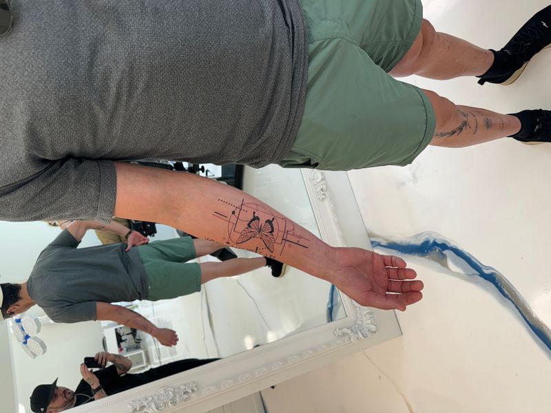
The ridge sits inside a perfect circle, sometimes with a horizon line bisecting it or a dotted ring offset behind. The circular frame is a modern convention, not an inherited one. It borrows the enso, the surveyor’s compass rose, and the round vignette of a Victorian botanical plate, and it arrived in tattooing through logo and album-art design rather than through any flash tradition. It also demands geometric precision. A circle that is a fraction out of round will sabotage an otherwise clean mountain, and the eye catches it instantly on a bicep, where the curve of the arm already distorts the shape. For clients who want the tattoo to feel designed, curated, logo-adjacent.
The atmospheric range
Illustrative with aerial perspective
A full realistic or semi-realistic range: overlapping ridges receding into haze, individual rock facets, snow catching light on a specific flank. The most ambitious direction on this list. Demands soft-black gradient control, aerial perspective, and patient saturation over two or three sessions. Rushed, it flattens into a gray blob. This is the one direction here that can put actual miles between the near ridge and the far one, and that capability is the entire reason to pay for it. For clients with the real estate and the patience.
The mountain with moon
Celestial pairing
A sun rising behind the ridge, a full moon framed between peaks, a faint constellation above the summit line. Warms a piece that could otherwise read cold. Demands compositional balance — the celestial body is a second focal point, and if it competes with the summit the eye doesn’t know where to land. The most-requested pairing after treeline.
The Fuji-and-wave
Hokusai-lineage Japanese modern
Mt. Fuji paired with a single cresting Hokusai wave in the foreground. Traditional black linework with a single indigo wash. A canonical irezumi subject with a century of drawing behind it — books only with a Japanese-tradition specialist. A generalist rendering reads as costume. The composition that tells clients they need at least six inches.
The alpine lake reflection
Mountain plus water
A peak rising from a mirrored lake surface, the reflection rendered as a ghosted, lower-contrast echo. Vertical composition. Illustrative style with a subtle blue tint in the water — depth through duplication. For Santa Monica clients in particular, who often want the mountain and the water in the same frame.
The three-peaks triad
Memorial geometry
Three stylized triangular summits of graduated height, 3 inches wide, each peak representing a person, a trip, or a year. Clean geometric line, no fill — a quiet tribute piece. Fits the inner bicep, above the elbow, or the inside of the forearm. The memorial style done without a single letter of text.
The Whitney single-line
Named-peak silhouette
One continuous unbroken line tracing the ridgeline profile of a specific named peak — Whitney, Baldy, the Matterhorn, Half Dome. 4 inches across the inner forearm, ultra-minimal, sometimes dated discreetly beneath. For the client who actually summited it and wants the receipt.
The lone pine with moon
Minimalist narrative
A single evergreen silhouette against a thin crescent moon. Minimalist but not sparse — the celestial pairing gives it narrative without crowding. Works at 3–5 inches on the calf or outer forearm. The composition for clients who want a mountain-adjacent piece without committing to a full ridgeline.
The watercolor ridge
Wash and bleed
Soft-wash ridgelines in translucent teal and dusk-purple that fade to bare skin at the edges, no hard outline. Deliberately unfinished-looking, for the client who wants an atmospheric mood rather than a literal map. Ages fastest of every direction here — plan for a touch-up at 7–10 years. If that’s a dealbreaker, pick a different category.
The full-back panorama
Multi-session statement
A sweeping multi-peak range across the upper back with subtle wildlife silhouettes at altitude and a faint cloud layer mid-range. 12–14 inches wide, black-and-gray realism, commits the whole shoulder line. Planned from the first consultation — shape, orientation, and the negative space around the range are composition decisions, not sizing ones.
Scale honesty
Four tiers, and only one of them holds aerial perspective.
Depth costs inches. Every ridge behind the first one needs enough room to sit at its own contrast level, and there is a size below which that stops being physically possible.
Six ways to draw altitude
Only two of these six can render distance.
Black-and-gray realism and illustrative etching can put miles between one ridge and the next. The other four can’t, and the good versions don’t pretend to. That single fact sorts this list more usefully than taste does.
Fine line — clean aging, no distance
The dominant 2020s mountain style
Hairline work, one-stroke ridges, disciplined spacing. The default style for minimalist peak silhouettes and three-summit glyphs. Ages well on stable skin, softens faster on high-flex zones because hairline weight is at the limit of what skin holds.
Illustrative etching — treeline as texture
Treeline panoramas and storybook ranges
Etched line weight, crosshatched shading, deliberate botanical detail. The right style for treeline compositions, Pacific Northwest scenes, and ranges rendered with evergreen foreground. Crosshatch is the cheap trick that works here: hatching a back ridge lighter than a front one buys depth without asking for realism-grade gradient.
Japanese modern — Fuji, and the wave grammar behind it
Hokusai-lineage ship-and-wave style
Bold outline, saturated indigo wash, wind bars, finger waves. The canonical home of the Fuji-and-wave composition. Books only with a Japanese-tradition specialist — the wave grammar is its own discipline. Half-sleeve minimum, usually full sleeve or back panel.
Black-and-gray — the only style that does haze
Atmospheric ranges with aerial perspective
Soft gradient, aerial perspective, individual rock facets, snow catching light on a specific flank. Demands an artist with realism chops and a long attention span — ranges of this complexity run two or three sessions. Doesn’t scale down — 6 inches is the floor.
Geometric containment — the circle has to be a circle
Contained circle, triangle, dotwork
Mountain inside a perfect circle, ridge inside a triangle, dotwork fade behind a silhouette. For clients who want the tattoo to feel designed, curated, logo-adjacent. Usually blackwork only, sometimes with a single color accent.
Watercolor — weather without edges
Splash, wash, bleed
The contemporary fine-art style. Soft-wash ridgelines in translucent teal and dusk-purple that fade to bare skin. Honest caveat: watercolor ages faster than line-based work. Most watercolor mountains get a touch-up at year 7–10. If that’s a dealbreaker, pick a different category.
Five placement styles
The body gives you horizontal runways, vertical rises, and contained frames.
Match the silhouette to the anatomy rather than forcing anatomy to match the silhouette. A ridgeline has a native orientation, and the body only offers three shapes that will hold one.
Horizontal runway
Outer forearm · chest panel · upper back · full back
A horizontal ridgeline reads naturally along the forearm because the limb itself is a landscape bar — eye travels left to right the same way it scans a panorama. The definitive placement for multi-peak ranges and treeline compositions.
Vertical rise
Ribs · spine · calf
The rib panel gives you a vertical canvas where a single dominant peak can rise with generous negative space above it for sky, stars, or a moon. Calf supports a vertical three-summit stack or a mountain-and-lake reflection running hip-down.
Contained frame
Bicep · shoulder cap · sternum · outer forearm medallion
The curve of the bicep begs for a contained frame — a circle, arch, or shield — with the landscape nested inside. Sweet spot is 3.5–5 inches diameter. Natural home for geometric-framed mountains and Half-Dome-in-a-circle medallions.
Hidden — a summit only you have to see
Inner bicep · behind the ear · inside wrist · sternum
Private style — a mountain for the wearer, not for the room. Three-peak triads, single-line named summits, small silhouettes. Often paired with fine line or dotwork because the style matches.
Panel work — a composition, not a placement
Full back · chest panel · full thigh · half-sleeve
Not placements — compositional commitments. A statement mountain is the anchor of a larger piece, planned from day one, often executed over four to eight sessions. The conversation starts with the artist before the drawing does.
Eight compositional pairings
Anything you put above the ridge locks in a time of day.
A bare ridge stays open to any weather and any hour. Add a crescent and it is permanently night. Add a low sun and it is permanently the morning of one particular day. That is the trade in every pairing below.
Mountain + compass / coordinates
Both are wayfinding symbols — a range marks a destination, coordinates mark a specific moment there. Tiny lat/long beneath a ridge is the cleanest memorial move for a summit date, elopement location, or first-trip marker.
Mountain + evergreens
Evergreens give mountains foreground scale and mood. A single pine in front of a distant peak communicates depth and weather; a treeline band adds texture and makes a minimalist ridge feel like a place rather than a shape.
Mountain + moon
Celestial elements anchor the sky half of a landscape composition and let you commit to vertical negative space without it feeling empty. A crescent moon above a peak adds narrative while keeping the piece iconic.
Mountain + wave
Water visually completes the elevation story — what comes down from the peak becomes the river, the lake, the ocean. A wave-and-peak (Fuji-style) creates tension between two monumental natural forms.
Mountain + constellation
A specific star pattern above the summit — Ursa Major, Orion, the Pleiades — locks the piece to a specific night sky. Works cleanly in fine-line and dotwork. Best paired with named peaks the client has actually sat under.
Mountain + sun / sunrise
A rising sun behind the ridge warms the palette and adds narrative. Demands compositional balance — the sun has to sit in the sky without competing with the summit. Ages faster in color than in blackwork fade.
Mountain + animal silhouette
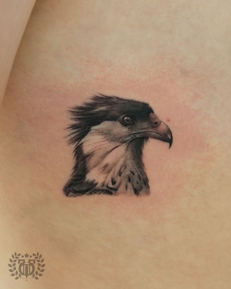
A wolf at treeline, an eagle at altitude, a condor above the ridge. The animal sells the scale of the range and places the viewer in the scene.
Mountain + date / Roman numeral
A summit date, an elopement year, a memorial year in Roman numerals below the ridge. The stoic-permanence style. Keep the numerals large, serif, and well-spaced — cramped numerals age worse than any other banner text.
Before the consult
Name the peak before you walk in.
Six answers. Bring them and the first sketch is close. Bring none of them and the first hour goes on questions you could have answered on the drive over.
Which specific peak?
Not a mountain. The mountain. Whitney, Baldy, Fuji, Rainier, the one visible from the porch you grew up on. Bring the name. If the name doesn’t exist, bring the reference photo and the story. A mountain chosen by reflex reads as decoration forever.
What happened on that mountain?
A summit, a loss, a milestone, a move, pure aesthetic. You don’t need a manifesto — you need a sentence. “It’s the day I summited Whitney.” “It’s where my dad scattered my grandfather’s ashes.” “I just love the triangle.” Any of those is enough. “I saw one on Pinterest” is not.
Single peak or full range?
A single peak is a different design problem than a multi-ridge panorama. Single-peak fits 2–4 inches. Multi-ridge with atmospheric perspective needs 6–10 inches minimum. Compositional scope determines every downstream choice.
Glyph or rendered?
Fine-line, illustrative, Japanese modern, black-and-gray realism, geometric, watercolor. If you don’t know, say so. Ask specifically to see a healed range and a healed single-line peak from the same artist, side by side. The gap between those two is the honest picture of what you’re choosing between.
How many inches do you actually have?
A 3-inch fine-line peak is 1 hour. A 6-inch illustrative range with treeline is 3–4. A full-back atmospheric panorama is four to eight sessions. Know your ceiling in time, budget, and sitting — before you fall in love with a design that lives above it.
Color or black-and-gray?
Black-and-gray holds longer than any color palette. Color opens the sunset, the alpenglow, the teal alpine lake — but plan for a touch-up cycle. If you want a mountain that will look right in 2055, pick black-and-gray. If you want current aesthetic, pick color and plan for maintenance.
How mountains go flat
Eight ways a range loses its depth.
Almost every mountain tattoo that disappoints its owner failed in one of these eight ways, and seven of the eight are decided before the machine is switched on.
Forty-seven saved images, one stencil
47 saved images, bits picked from each, artist asked to combine. Result: a mountain that belongs to no specific designer and reads as a compromise. Fix: cut to three references and say out loud what each one is for. This one is the ridge profile. This one is the line weight. This one is the sky.
The photo-as-blueprint mistake
Handing over a vacation photo and expecting literal reproduction. A photograph holds millions of tonal values; skin works in a far narrower range. Fix: bring the photo as a feeling and reference, not as a blueprint. The artist translates.
Overpacking tree detail at small scale
Every individual pine in a 3-inch composition will blur together within a few years as ink migrates slightly. Fix: at small scale, commit to silhouette clusters rather than counted trees. Let the treeline be a texture, not a census.
Busy sky on a tiny ankle piece
Sun rays, cloud banks, and a ridge line all competing in a 2-inch footprint produce a muddy result by year three. Fix: pick one focal element when the real estate is small. The ridge is the tattoo; everything else is support.
Forcing horizontal onto vertical
The Sierra and the Tetons read horizontally for a reason; forcing the composition onto ribs distorts the silhouette and kills the recognition. Fix: either pick a different placement or commission a composition designed vertically from the start.
Mixing too many style languages
Realistic peaks inside a geometric frame topped with a watercolor sky is three different visual vocabularies arguing with each other. Fix: pick a dominant language and let the others support rather than compete.
Skipping aerial perspective
Aerial perspective — the soft back-ridges that create depth — is what sells the realism. A landscape that ignores atmospheric fade looks like stacked cardboard cutouts. Fix: ask how your artist plans to grey-down the back ridges before you approve the sketch.
Judging gray wash off day-one photographs
Picking the artist for a rendered range off just-wrapped Instagram shots. Fresh gray wash is a completely different material from settled gray wash, and the difference shows up hardest on exactly the soft back ridges a range depends on. Fix: ask for a healed range at one year and again at five. That is the tattoo being sold to you.
People who have actually stood under a ridge draw it differently than people who have only seen it on Instagram.
A color sky is a maintenance relationship, not a one-session event.
Your honest placement sets your honest style — not the other way around.
The first-mountain guide
A first mountain should be a silhouette, not a scene.
Silhouettes age well because there is almost nothing in them to lose. The honest starting recipe is a fine-line single peak or an illustrative three-summit at 3–4 inches on the forearm. Eight decisions worth making deliberately.
Personalization
A named summit is the difference between a shape and a place.
Almost every client arrives having decided the first of these three and none of the other two. The first is the one strangers see. The third is the one you actually wear.
The silhouette
Peak count, line weight, size, placement, palette. These are the bones. They determine whether the piece reads as fine-line, illustrative, geometric, or realism, and whether it reads as intimate, declarative, or statement. Most clients start and stop here — which is why most clients end up with mountains that look like every other mountain in their feed.
The named summit
A specific named summit. A coordinate set beneath the ridge. A single evergreen from a grandfather’s property. A star pattern from the night you slept at altitude. A small wildlife silhouette that only lives in that range. Whitney and Baldy have genuinely different profiles, and an artist who works from the real skyline instead of a generic triangle produces a piece nobody else on the beach is wearing.
What the ridge is a receipt for
What it marks for you. Nobody else needs to know. The private layer is what keeps the piece from ever feeling generic — because even if the design itself reads as a standard peak to strangers, you know what’s underneath. That’s enough. That’s often the whole point.
Matching mountain tattoos
Matching ridgelines, and what happens after the trip.
The trip ends. The tattoo doesn’t. Build the pair so each half still works as a solo mountain and you never have to find out whether that mattered.
Who books these
Couples who summited together, siblings who grew up with the same horizon, friend groups after a shared expedition, parent-and-adult-child pairs marking a specific trip. Different relationships invite different composition decisions.
Match the range, vary the detail
Same ridgeline, small variation per person — different treeline, different moon phase, different placement — so each piece still belongs to the person wearing it. Identical tattoos are a different conversation than matching ones.
Plan for the piece to outlive the trip
If a falling-out, an estrangement, or a death would destroy the piece, redesign it now so it works as a solo mountain too. That isn’t cynicism about the friendship. It is the same planning you would give any other permanent thing.
One stencil, one sitting, or they will not match
A ridgeline is a profile, and two artists will read the same profile differently by a degree or two at every summit. Two degrees is invisible on paper and obvious when you hold the arms side by side. Same stencil, same hand, same afternoon.
FAQ
What clients ask once they have picked a peak.
Ten questions covering design selection, first-tattoo guidance, aging, scale, placement, pricing, matching, and color choice.
How do I know which mountain tattoo design is right for me?
Answer the five in sequence and the design narrows itself. First: which specific peak — Whitney, Baldy, Fuji, or the one from your childhood porch? Second: single peak or full range? Third: graphic glyph or rendered landscape? Fourth: with sky elements (moon, sun, constellation) or without? Fifth: how much canvas can you realistically commit to in time, budget, and sitting? A mountain that answers all five cleanly is the mountain that’s actually yours. A mountain that skips any of those steps is someone else’s tattoo.
What’s the best mountain tattoo style for a first tattoo?
Fine-line single-peak or illustrative three-summit at 3–4 inches on the outer forearm or inner forearm. Both ages well, both read cleanly, both are easy to live with long-term. Plan on 1–2 hours in the chair, one session, pricing discussed at consultation. Book with an artist whose HEALED fine-line or landscape portfolio at 1-year-plus is documented, not just their fresh-wrap Instagram feed. Boring is the correct answer for a first mountain. Boring ages well.
Do mountain tattoos age well?
Well-scaled mountain tattoos with appropriate line weight and planned contrast age gracefully for decades. The pieces that struggle are the ones packed with fine detail at small sizes, or those relying heavily on pale warm pigments without a touch-up plan. Aerial perspective (the soft back-ridges) is typically the first element to soften, and that’s a feature of the medium rather than a flaw in the art. Black-and-gray illustrative ranges age best. Watercolor ranges age fastest — plan for a touch-up at 7–10 years.
How big should a mountain tattoo be?
Depends on the style. Under 2 inches works for triangle-glyphs and silhouette marks only — anything with interior detail blurs within a few years. 2–4 inches is the sweet spot where fine-line peaks and three-summit triads live. 4–8 inches is where illustrative, atmospheric, and treeline ranges earn their keep — below 4 inches, aerial perspective compresses and stops reading. 8 inches and up is back pieces, chest panels, full-thigh panoramas, Japanese half-sleeves. Decide the inches first and let the inches decide what kind of mountain you can have.
Single-line vs. detailed — which ages better?
Clean single-line silhouettes generally age with less drift because there’s less interior detail to blur. Detailed compositions age beautifully too when they’re scaled generously and built with appropriate line-weight hierarchy. The worst aging comes from detailed work crammed into too-small real estate, not from detail itself. Hair-thin strokes on high-flex zones soften fastest; heavier outlines on stable skin hold longest.
Color vs. black and gray?
Black and gray tends to age with more consistency and suits dramatic, moody landscapes beautifully. Color brings sunsets, alpenglow, and foliage to life but asks for a touch-up cycle every handful of years to keep the gradients honest. Clients who travel, surf, or spend significant time outdoors should factor UV exposure into the decision — a black and gray Sierra range will outlast a full-color sunset on the same forearm.
Can you copy a photograph exactly?
Not literally, and you wouldn’t want it to. A photograph holds tonal values skin can’t reproduce, so your artist translates the reference into a composition that reads correctly on a living, moving surface. The goal is a tattoo that captures the feeling of the place, not a pixel-accurate rendering of the source image. Bring the photo as a reference, not as a blueprint.
Best placement for a mountain tattoo?
Horizontal ridgelines read naturally on the outer forearm, chest panel, upper back, or calf — the limb itself is a landscape bar. Vertical peaks and alpine-lake reflections suit ribs, spine, or calf. Contained-frame medallions (mountain-in-a-circle) suit the bicep or shoulder cap. Forearm catches significant UV year-round in a climate like Santa Monica’s; back and inner-arm placements age longest because they see less sun.
How much does a mountain tattoo cost in LA?
Mountain pricing at Apollo scales with four factors: overall scale, style complexity, color vs. black-and-gray, and session count. Small fine-line or geometric work is typically a single session at 2–4 inches. Mid-scale illustrative ranges with treeline or atmospheric perspective usually span one to two sessions. Realism and detailed Japanese-modern pieces run two to four sessions. Back panels, full-thigh panoramas, and half-sleeve Fuji-and-wave compositions run four to eight sessions. Hourly rate depends which artist you book, and the final number depends on artist, size, design and placement. We quote from the sketch, never from the idea.
Can I get a matching mountain tattoo?
Yes, and matching mountains are a common consultation. Working rules: match the ridge, vary the detail (different treeline, moon phase, or placement so each piece still belongs to the wearer); plan for the piece to outlive the trip — if a falling-out or death would destroy the design, redesign it so it works as a solo mountain; book the same artist, same day, same stencil, because matching across studios drifts in line weight and proportion. Not every matching piece needs to survive every relationship — but it should survive the decision you’d make today.
Ready to name your ridgeline?
Bring the name of the peak, the photograph you took of it, and an honest number of inches.
Where the line stops is the design. Bring the ridgeline you mean, whether it's a named peak, a remembered horizon or just a shape you like, and we'll work out how much atmosphere it needs to read as distance.