Tattoo Ideas
Sacred Heart
A working-studio catalog of Sacred Heart tattoo ideas — 12 design directions from American Traditional to Chicano black-
Book a consultationThe browsing framework
Five decisions narrow "I want a Sacred Heart" to one design.
Every Sacred Heart consultation at Apollo starts the same way: five questions, asked in order, each one narrowing the design space by half. Answer them honestly and you save yourself an hour of sketch revisions and a bad first draft.
What exactly are you marking?
Every Sacred Heart we book at Apollo marks something — a vow, a loss, a survived year, a faith held or rebuilt. Before we draw anything, we ask you to say it out loud in one sentence. If you can't finish that sentence, the design won't land. We'd rather push your booking a month than ink a placeholder.
Jesus, Mary, or neither figure?
Sacred Heart of Jesus (crown of thorns, cross, flame, lance wound) and Immaculate Heart of Mary (roses, sword, flame, twelve stars) are two separate devotions — we don't blend them on one heart. A secular anatomical heart with flames and a banner is a third path. Pick one before the consult; switching mid-design usually means restarting.
Traditional American or Chicano?
American Traditional runs bold black line, saturated red and yellow, flat fills — built to hold for thirty years. Chicano black-and-grey runs single-needle, soft smoke shading, often a Mary face inside the heart — the Jack Rudy and Freddy Negrete tradition out of East LA. Different artists, different chair time, different aftercare. We staff both. We don't mix the two on one piece.
Visible daily or mostly private?
A forearm Sacred Heart talks to every client, cashier, and in-law you meet. A sternum or upper-thigh heart talks to you and whoever you let in. Neither is more devoted — we've tattooed both on nuns and on bikers — but the placement decision changes size, line weight, and how much explaining you're signing up for.
How much real estate can you give it?
A Sacred Heart under three inches loses the crown-of-thorns detail inside five years — we've seen it, we've covered it. If you only have room for a two-inch piece, we'll steer you toward a simple flame-heart instead of a full Sacred Heart. Give the devotion the space the devotion needs.
Pick the devotion before you pick the design.
A Sacred Heart under three inches loses the thorn detail inside five years. We've seen it. We've covered it.
Jesus and Mary are separate devotions. We don't blend them on one heart.
Flash · ready to ink
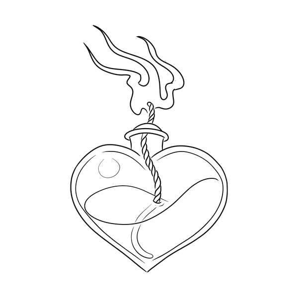
Sacred heart flash designs
15 hand-drawn designs from our flash collection — book any one as-is, or use it as the starting point for a custom piece. Sizing, placement and linework dialed in at your consultation.
12 design directions
The working catalog clients actually browse.
Twelve compositional patterns cover almost every Sacred Heart we've booked in the last five years. They're not interchangeable — a Chicano single-needle Sacred Heart and a Sailor Jerry flash Sacred Heart aren't scaled versions of the same tattoo. They're different design languages.
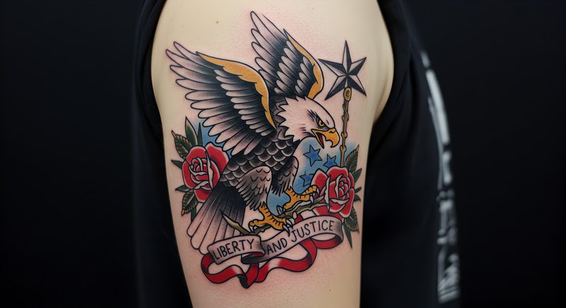
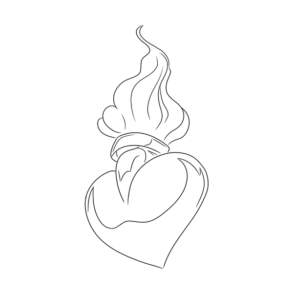
Classic American Traditional Sacred Heart
Flame, crown of thorns, drop of blood
The heart most of the world knows — symmetrical chest organ wrapped in thorns, crowned with a five-tongue flame, one bead of blood. Bold 3/0 outline, Eternal Ink True Red for the heart, chrome green for thorn leaves, yellow highlight inside the flame. We tattoo this more than any other Sacred Heart, and it's the version we'll bet on aging correctly at year 30. If it's your first, this is the honest answer.
Chicano single-needle Sacred Heart
Black-and-grey, soft smoke, East LA tradition
Freddy Negrete and Jack Rudy tradition — 3RL single-needle, Solid Ink Greywash pulled light, often a Mary medallion inside the heart or a rosary wrapping the thorns. We push the smoke light so it reads delicate rather than muddy at year 10. A mid-scale Chicano Sacred Heart is a two-session piece and worth every minute of the second sitting.
Immaculate Heart of Mary
Roses, sword, lily — not thorns
Mary's heart, not Jesus's. Circled by roses instead of thorns, pierced by a sword (Simeon's prophecy from Luke 2), sometimes a white lily at the side. The composition is softer, more Marian. Neo-Traditional handles it beautifully — burgundy, dusty rose, Fusion Pure White for the lily, steel grey for the blade. Our most-requested variant from women in their 30s marking a conversion, a vow, or a mother.
Anatomical Sacred Heart
Real cardiac rendering with thorns and flame
Devotional imagery on an anatomically correct heart — ventricles, aorta, visible vessels, pulmonary trunk, all wrapped in a braid of thorns and topped with flame. We only take this as a 6-inch-plus piece because the anatomy collapses under that size. Black-and-grey realism is the default. We've steered more than one client away from adding color — it muddies the anatomy and thorns compete with vessels.
Memorial Sacred Heart with banner and dates
Traditional, name across the flame
The grief piece. A Traditional Sacred Heart with a scroll banner crossing over the flame or under the heart, one name and two dates. We set the name in a serif cap weight that will still read at year 20 — we've watched too many script memorials blur by year 8. If the person you're marking mattered enough for a tattoo, they mattered enough for a font that lasts.
Minimalist fine-line crown-and-flame
Sacred Heart reduced to essentials
Single-needle outline, no fill, the heart rendered as pure line with a three-tongue flame and a light thorn ring. Small, 2–3 inches, usually on inner forearm or sternum. Honest caveat — we like this as a second or third tattoo, not a first. Without fill, the design has no scaffolding, so sun and skin flex matter more. Plan a touch-up at year 6.
Sacred Heart with sunburst rays
Holy-card composition with radiating light
The heart centered inside a burst of rays — sometimes thirty-two, sometimes twelve, sometimes a halo that simplifies to dashes. Pulls directly from 19th-century Sulpician holy-card printing. Works in Traditional, Neo-Traditional, or illustrative. The rays anchor the heart on a flat panel like the sternum in a way a stand-alone heart cannot. Symmetry is everything; an artist who can't rule a straight ray field will ruin this design.
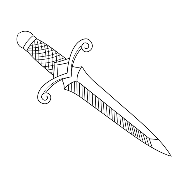
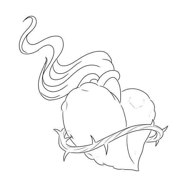
Sacred Heart with dagger
Thorns, flame, and a blade through center
One of the oldest Traditional compositions after rose-and-dagger. The heart pierced through the center rather than crowned with thorns alone. The dagger carries its own meaning — sacrifice, betrayal, the sword of sorrow. We run this Traditional or Neo-Traditional. Strong opinion: keep the dagger simple. Ornate hilt work on a 4-inch piece turns into visual noise within a decade.
Sacred Heart with banner across front
Latin motto or single-word declaration
A scroll banner crosses the face of the heart — 'Ave Maria,' 'In Hoc Signo,' 'Mater Dei,' or a single English word. Banner in front, flame and thorns behind. We draw these with the banner oversized relative to the rest of the composition rather than crammed in. A banner that doesn't read at arm's length is a banner we didn't build correctly.
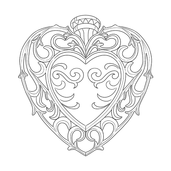
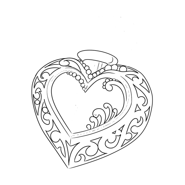
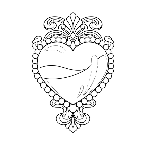
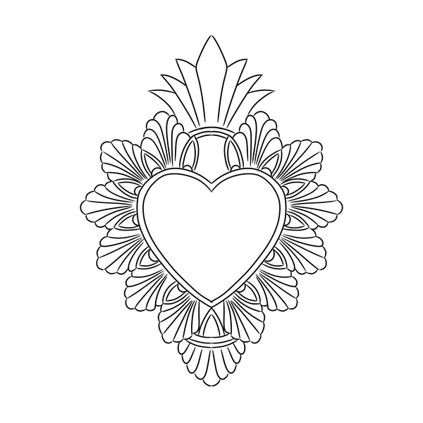
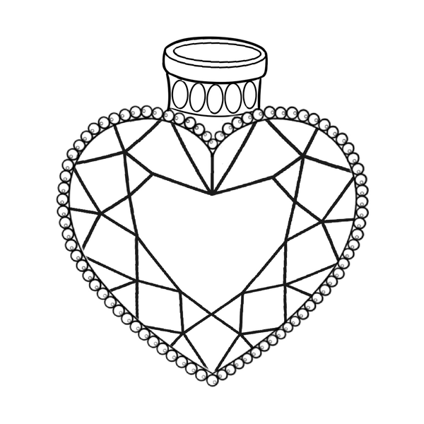
Ornamental Sacred Heart medallion
Heart centered in dotwork frame
A Sacred Heart placed inside a mandala, filigree frame, or ornamental border — Byzantine feel, closer to devotional jewelry than flash. Dotwork and fine line do the frame; the heart itself stays simplified so ornament doesn't overwhelm it. We run this as a sternum or center-chest anchor, usually over two sessions. Most clients who book this one have sat through a smaller piece already.
Double Sacred Heart (Two Hearts)
Immaculate and Sacred, paired
Mary's heart and Jesus's heart, side by side — one crowned with roses and pierced by a sword, the other with thorns and flame. Traditional Catholic 'Two Hearts' pairing. A significant chest piece, not a starter. Needs 8 inches wide minimum to give each heart room to read as its own object. Our senior artists plan these from the first consultation; we won't take this as a same-day walk-in.
Sacred Heart sleeve anchor
Heart as the hub of a larger composition
The Sacred Heart planned from day one as the center of a half or full sleeve — roses, rosary, praying hands, script, radiating filler flowing outward. We book this as a four-to-eight-session commitment, starting with the heart and building outward session by session. The decision we press clients on: pick the heart style first and let everything else match it.
Six styles
Pick the style before you pick the artist.
The Sacred Heart has been tattooed in every major style American tattooing has invented. The choice isn't which style you like most; it's which style matches how you'll wear the piece for the next thirty years.
American Traditional
Sailor Jerry flash, century of evidence
Bold 3/0 liner outline, Eternal Ink True Red heart, chrome green thorns, yellow flame highlight, 9mag for the red fill. Of every Sacred Heart we've laid in at Apollo, the Traditional ones still read correctly at year 30. If you've never been tattooed and you want a Sacred Heart, we'll point you here first.
Chicano Black-and-Grey
Single-needle, smoke wash, Jack Rudy tradition
The West Coast devotional style. 3RL single-needle work, Solid Ink Greywash pulled light, often a Mary face or rosary inside the heart. Freddy Negrete, Jack Rudy, and the Good Time Charlie's Tattooland tradition that built this style on Whittier Boulevard in 1975 — we sit squarely inside that history. Two sessions for anything over 5 inches.
Neo-Traditional
Expanded palette, dimensional shading, Marian mood
Burgundy heart, dusty rose thorns, muted gold flame, soft grey rays. Where the Immaculate Heart of Mary lives most comfortably — Neo-Traditional gives you ornament and dimension without committing to realism. We run this with Fusion pigments for the mid-tones because they hold saturation longer than cheaper reds. Two sessions is standard for anything over four inches.
Fine Line / Single-Needle
The 2020s minimalist approach
Hairline work, minimal fill, the Sacred Heart reduced to its skeleton. 1RL or 3RL machines, Eternal Ink Lining Black, sometimes one muted red wash inside the heart. Honest caveat we tell every client — fine line on high-flex skin softens faster than Traditional. On sternum or inner forearm, it holds. On the side of the hand, it doesn't. We'll steer you off fingers and feet.
Religious Holy-Card Realism
Photorealistic devotional rendering
The Sulpician holy-card look rendered in black-and-grey or full-color realism — the heart treated as a painted object rather than a symbol. 5 inches is the floor; realism doesn't scale down. Bring a specific reference, ideally a holy card or devotional painting. A realism Sacred Heart without a named source reads as inventory, and we can spot it on healed work at a glance.
Ornamental / Dotwork
Byzantine medallion, filigree frame
The heart centered inside a dotwork mandala or filigree medallion — Eastern European, Catholic-baroque feel. Our senior artists run this with a 5RL for the linework and 7RS rounds for the dotwork fields. Ages extremely well because everything is line and dot rather than color saturation. Two-session piece at mid-scale.
Five placement styles
Placement changes the meaning more than style does.
A Sacred Heart on the outer forearm reads different than the same heart on the sternum. Five placement styles cover almost every choice a client will actually make.
Classical / soft
Shoulder blade · upper back · inner thigh · sternum · hip
The Sacred Heart as ornament against a curve. No Traditional-flash shorthand, no declaration to the room — it sits where a devotional medal would sit under clothing. Reads most naturally in Neo-Traditional, ornamental, or Marian compositions.
Bold / declarative
Outer forearm · bicep · chest over heart · outer calf
The Traditional placement and the Traditional style. Reads at six feet and in a t-shirt. If your uncle has a Sacred Heart on the outside of his forearm, you're inheriting from that tradition — and we'll tattoo it on you the same way we tattooed it on him.
Modern / neutral
Inner forearm · ribcage · inner bicep · back of upper arm
Placements that read as Sacred Heart without locking the style era. Good for fine line, good for Neo-Traditional, good for ornamental. The inner forearm has become the default 2020s placement for devotional work at our chairs.
Intimate / hidden
Underboob · inner bicep · inner thigh · center sternum · nape of neck
The devotional piece the wearer sees before anyone else does. Often paired with fine line or single-needle because the mood matches. The Sacred Heart that lives inside a shirt, not outside one.
Statement
Full chest panel · upper back · full front thigh · sleeve anchor
Not placements so much as compositional commitments. A statement Sacred Heart is the anchor of a larger piece, planned from day one, executed over four to eight sessions. The conversation starts with the artist before the drawing starts.
Scale honesty
Four tiers. Your scale sets your style.
Not the other way around. If you want detail, commit to the scale that holds it.
Eight compositional pairings
A Sacred Heart alone is one sentence. A Sacred Heart with another element is a compound sentence.
The pairing changes the meaning more than size or color does. Eight classical pairings, each landing the Sacred Heart in a different style.
Sacred Heart + roses
Our most-requested pairing. Roses soften the thorns and pull the composition toward devotion rather than suffering. We usually run three to five blooms — odd numbers read better — in red, black-and-grey, or a muted desaturated palette.
Sacred Heart + banner
A banner grounds the piece and makes it personal. We letter 'Cor Jesu Sacratissimum,' 'Madre,' a mother's name, or a memorial date. Script choice matters — Chicano fine-line hearts get single-weight script; Traditional hearts get bold block banners.
Sacred Heart + dagger
The dagger reads as sacrifice, vow, or grief you chose to carry. Strong on the forearm or sternum. The blade gives a vertical anchor the heart alone can't provide. Photographs beautifully when the dagger crosses diagonally behind the flame.
Sacred Heart + sunburst rays
Radiating rays turn the heart into a monstrance. Traditional flash handles this with solid black rays; our black-and-grey artists build it with fine stippled light. Great for chest centerpieces.
Sacred Heart + praying hands
Hands above or framing the heart — Dürer-style praying hands or Chicano-style clasped hands with a rosary wrapped through the fingers. A six-to-eight chair-hour piece minimum because the hands carry as much detail as the heart.
Sacred Heart + Immaculate Heart
Two hearts, one composition. Jesus on the wearer's right, Mary on the left is traditional. Matching chest panels, mirrored forearms, or a single sternum piece with both hearts sharing a banner. Strong for couples or family memorials.
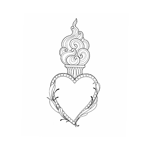
Sacred Heart + standalone flames
Stripped of thorns and cross, just the heart and a crown of flame. Reads less overtly Catholic, more elementally devotional. We build these in American Traditional with solid reds and yellows, or in ornamental black-and-grey.
Sacred Heart + crown
A royal crown replaces or sits above the crown of thorns — Christ the King composition. Popular with clients who want the devotional weight without the suffering imagery. We recommend adding small jewel details in color; it gives the crown its reason for being.
Consultation
Six questions to bring with you.
Walk into the consult with answers to these and you save yourself an hour and a bad first draft.
Who taught you this devotion?
We ask because a Sacred Heart you inherited from a grandmother reads different than one you found on Pinterest last month. If it came from family, we sometimes ask to see an old prayer card or a photo of the home altar. That reference shapes the banner and flame style more than any mood board.
What's the banner going to say, exactly?
Banner text is where Sacred Hearts age badly. We need the final wording at consultation, not the stencil stage. Latin, Spanish, English, a name, a date, nothing at all — all valid. We'll tell you honestly if your phrase won't fit legibly at your size, and we recommend dropping words before shrinking the font.
Are you open to a second session for color?
A proper Traditional Sacred Heart with saturated red, yellow flame, and green leaves is often two sessions — line and black first, color six to eight weeks later once the skin settles. We ask upfront because some clients want one-and-done. We'll do one-and-done at smaller sizes, but we'll tell you what you're trading.
How does your skin hold red?
Red ink retention varies — some skin holds it twenty years, some fades to pink inside three. We ask about prior red tattoos, sun exposure habits, and pigment sensitivity history. If you've had a red piece fade fast, we'll plan a bolder red base and book a color refresh at year five.
Is anyone else getting a matching piece?
If your partner, sibling, or parent is also booking a Sacred Heart — even at a different studio — we want to know at consultation. Matching hearts need coordinated line weight and scale or they read mismatched in photos forever. We've fixed three of these in 2024 alone.
What's your timeline, honestly?
We ask because 'I want it before my mom's anniversary in six weeks' is a different booking than 'sometime this year.' Rushed Sacred Hearts are the ones clients regret — we'd rather place you on a three-month wait with our Chicano specialist than squeeze you onto next Tuesday.
Banner text sized for the stencil is banner text nobody can read at year seven.
If you can't say what your Sacred Heart marks in one sentence, the design won't land.
A rushed memorial Sacred Heart is the one clients regret. The heart will still be there in six months.
Common mistakes
Eight patterns to watch for — and the fix.
Most disappointing Sacred Heart tattoos fall into one of these eight categories. Catching it in consultation prevents it in the chair.
The Pinterest stack
Client shows up with twelve saved Sacred Hearts and wants elements from all of them — this crown from one, this flame from another, this banner font from a third. The result is a composite that belongs to nobody. Fix: pick your single strongest reference and let us design around that one piece, not around the stack.
Mixing Jesus and Mary elements
Roses on a crown-of-thorns heart, a sword through a flame-and-cross heart — these combinations read as confused to anyone who grew up with the actual devotions. Not a deal-breaker for secular clients, but if faith is the reason you're booking, the mix undercuts the meaning. Fix: commit to one devotion at consultation and let the second wait for a future piece.
Thin-line Chicano attempt
Single-needle fine-line Sacred Hearts in Chicano style look stunning at week two and blurry at year seven. Chicano black-and-grey was built on heavier whip-shading for a reason — it ages. Fix: if you want the fine-line look, book a Traditional heart with clean bold line; if you want Chicano, commit to proper whip-shading with an artist trained in it.
Banner text sized for the stencil
Banner text that looks readable on an eight-inch printout becomes a smudge at three-inch forearm scale once the skin settles. We've rescued four of these in spring 2024 alone. Fix: we size banner text at the final tattoo dimension during consultation, on your actual skin with a marker, and we drop words until it's legible — no exceptions.
Memorial rush inside six months of loss
Grief changes the tattoo you want. Clients who book a Sacred Heart three weeks after losing someone often come back at the one-year mark wanting something different. We don't refuse these, but we push back. Fix: we'll hold your deposit and your date for up to twelve months while you sit with the design — no rebooking fee.
Chosen by reflex, not by meaning
Sacred Heart has become a default 'meaningful' tattoo the way 'live laugh love' became a default wall sign. If you can't say what yours marks, the symbol is doing the work the meaning should do. Fix: we ask the one-sentence question at consultation; if the answer is fuzzy, we recommend a different piece or a second consult in a month.
Skipping the red-ink retention conversation
Clients assume the red we mix today is the red they'll see in 2036. It isn't — reds shift, fade, sometimes drift toward salmon. Studios that don't raise this are setting you up to feel betrayed. Fix: at Apollo we budget a color refresh into the year-five conversation and tell you that upfront, before your deposit clears.
Hand and finger placements
Sacred Hearts on the back of the hand or the fingers lose detail within two to five years regardless of artist skill — friction, sun, and skin turnover eat the thorn detail and banner text. We'll do it, but only with open eyes. Fix: if you want hand visibility, commit to a touch-up every 3–4 years, or move the piece to the forearm.
The first-Sacred-Heart guide
If this is your first, the answer is Traditional at four inches on the forearm.
Boring ages well. Eight decisions the first Sacred Heart should make on purpose.
Personalization
Three layers turn a stock Sacred Heart into an heirloom piece.
A Sacred Heart becomes yours in three distinct layers. Most clients only think about the first. The third is where the piece actually lives.
The bones — the base heart itself
Layer one is the structural heart everyone will recognize: the shape, the crown of thorns or roses, the flame, the cross or sword. This layer belongs to the tradition, not to you — we draw it the way it's been drawn for a century because that's what makes it legible. Your job is to pick the tradition (American Traditional or Chicano) and stop there.
The personal element — variety, companion, color
Layer two is where your piece stops looking like everyone else's. A specific flower tucked behind the heart for a grandmother, a companion element (a small cross, a rosary bead, a saint's initial), a color choice that nods to a home-country flag, a banner in a specific language. We add one — sometimes two — personal elements here. More than that clutters, and the devotion gets buried.
The private meaning — what nobody else needs to know
Layer three is invisible to strangers and that's the point. The date hidden inside the flame's shading. The initial tucked into the thorn pattern. The reason you booked it at all — the marriage survived, the addiction put down, the child carried to term, the faith rebuilt. We'll help you place a private element into the design, but we won't ask you to explain it on consultation day or any day after.
Matching Sacred Hearts
One of the most-requested appointments. One of the most under-planned.
Matching Sacred Hearts should survive the relationship that inspired them. Design them that way on purpose.
Couples — same piece, drawn twice
For couples booking matching Sacred Hearts we draw both stencils in the same session, at the same scale, with the same line weight. We don't do mirror-image hearts — they date the piece to a specific era of couples-tattoo trends. Identical is better than mirrored.
Parent and child — scale to the body
A Sacred Heart on a parent's forearm and a matching one on an adult child's forearm should share style and color story, not exact size. We scale each to its wearer's frame. Matched pieces that ignore body proportion end up looking oversized on one and undersized on the other.
Jesus-and-Mary pair across two people
The traditional pairing — Sacred Heart of Jesus on one partner, Immaculate Heart of Mary on the other — is one of our favorite bookings. We coordinate flame style and banner treatment so the pair reads as a set in photos, while each heart stays faithful to its own devotion.
Plan for the piece to outlive the relationship
Honest caveat: we've covered up three matching couple hearts in 2024. We'll still book yours — we're not your therapist — but we design matching pieces so each heart stands alone as a complete devotion without the partner's. If the relationship ends, your tattoo doesn't become a scar you're hiding.
FAQ
The questions every Sacred Heart consultation surfaces.
Ten questions covering meaning, Catholicism, Jesus vs. Mary, red ink longevity, style choice, memorials, sizing, placement, and the crown of thorns.
What does a Sacred Heart tattoo mean?
At its root it's the heart of Christ — love, sacrifice, devotion, suffering transformed into grace. The thorns are the Passion, the flame is divine love, the wound is the lance at Calvary. For our clients it also carries personal meaning: a mother, a loss, a vow, a faith reclaimed. We always ask what it means to you before we draw.
Do I need to be Catholic to get one?
No. The imagery comes from Catholic devotion — St. Margaret Mary Alacoque's visions in 1673 at Paray-le-Monial — but the Sacred Heart belongs to anyone drawn to it. We tattoo practicing Catholics, lapsed Catholics, Protestants, agnostics, and people who just love the symbol. What matters is that you understand what you're wearing and that it means something.
Difference between Sacred Heart of Jesus and Immaculate Heart of Mary?
Sacred Heart of Jesus: crown of thorns, cross on top, flame, lance wound. Immaculate Heart of Mary: roses around it, a sword piercing through (Simeon's prophecy from Luke 2), sometimes twelve stars. They're distinct Catholic devotions. Some clients get both as a paired piece.
How long do red Sacred Heart tattoos actually last?
Modern reds hold far better than the reds of twenty years ago. We use Eternal and Fusion pigments, both known for red stability. A well-placed, properly-saturated red Sacred Heart on your chest or upper arm will read sharp for ten to fifteen years before needing a color refresh. Sun exposure is the enemy — SPF 50 daily once healed.
Traditional American vs. Chicano black-and-grey — how do we pick?
Traditional is bold, graphic, saturated color — Sailor Jerry line weight, built to read from across the room in fifty years. Chicano black-and-grey is the Jack Rudy and Freddy Negrete style out of East LA — soft gradients, single-needle detail, photorealistic shading. We ask what your other tattoos look like and which tradition your eye is drawn to.
Can I get a Sacred Heart as a memorial?
Yes — one of the most common memorial pieces we do. A banner with name and dates, a rose for each child or sibling, a small date tucked into the flame. We build these slowly. Book a consultation, bring photos or keepsakes, and we'll draw something that carries the weight without becoming a billboard.
Best size for a chest piece?
For a centered sternum Sacred Heart with roses, rays, and a banner, we recommend six to eight inches tall minimum. Smaller than that and the detail work crowds. Full chest panels run eight to twelve inches. Plan on eight to twelve chair hours across one or two sessions depending on color fill and pain tolerance.
Can Sacred Hearts be small and delicate?
Yes, with caveats. A two-inch fine-line Sacred Heart on the inner forearm or behind the bicep works beautifully — we skip the banner, simplify the thorns, keep the flame small. What doesn't work: cramming a traditional five-element Sacred Heart into a one-inch space. It blurs within five years.
What does the crown of thorns mean?
The thorns wrap the heart the way they wrapped Christ's head at the Passion — suffering accepted, love that didn't flinch. Even on non-religious pieces the thorns read as love that cost something. We draw them as a continuous woven band, usually seven to nine visible thorns, wrapping once or twice depending on the composition.
Is it offensive to wear one if I'm not religious?
No. We've talked with Catholic clients, priests, and theologians about this over the years, and the consensus is the Sacred Heart is devotional but not closed. What we ask is that you know what it is — the visions, the thorns, the meaning — so you can answer when someone asks. Ignorance is the only disrespect. Wearing it thoughtfully isn't.
Ready to pick one of the twelve?
Bring the sentence. Bring three references, not thirty. Bring the scale you can commit to.
Apollo Sacred Heart consultations start with the five-decision browsing ladder and build the design outward. Book the consult and walk out with a Sacred Heart whose style, scale, placement, and meaning all agree on what the piece is for.