Tattoo Styles
Illustrative
The working-studio guide to illustrative tattoos — the Rackham / Dore / Gorey lineage, the four subcategories (etching,
Book a consultationAt the needle
What illustrative actually is.
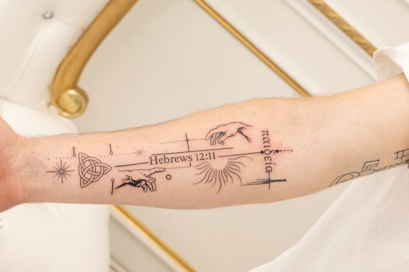
Illustrative is defined first by its sensibility, then by its mark-making, then by its sources. The mark of the pen or the brush is meant to be visible.
The shared trait across every illustrative style is drawing-forward aesthetics — the image reads as a drawing, not a photo and not a flash sheet. Line weights vary expressively. Shading is built from hatching, stippling, or visible brushwork rather than smooth gradient. Compositions borrow from the illustrated page: foreground, middle ground, distance, often framed rather than floating.
Crosshatching is the signature technique — parallel hatches layered at varying angles to build tonal depth. It's one of the hardest techniques in ink-based art, requiring understanding of line direction, density progression, and how parallel marks describe form. The gap between competent crosshatching and generic packing is the gap between illustrative and merely decorative.
Illustrative also relies on compositional thinking. Does each piece have a clear focal point? Do negative spaces feel intentional rather than leftover? Is there visual rhythm moving the eye through the image? Illustration literacy reveals itself in these decisions — the artist's drawing practice outside tattooing is what carries them inside it.
Illustration lineage
Where illustrative came from.
Illustrative tattooing descends from a book-and-magazine lineage that predates tattoo flash by centuries. The names matter.
15th – 19th century
Engraving & woodcut
Copperplate engraving, woodcut printmaking, and steel-engraving book illustration built the visual grammar of crosshatching, parallel hatching, and stippled shading. Albrecht Dürer and the Renaissance printmakers established mark-making conventions that survive in contemporary illustrative tattoo work essentially intact.
19th – early 20th century
Doré, Rackham, golden-age illustration
Gustave Doré's Dante and Don Quixote plates, Arthur Rackham's storybook illustrations, and the golden-age children's book tradition codified the visual vocabulary most illustrative tattoo clients imagine when they picture the style: atmospheric ink drawings, narrative figure work, and whimsical detail.
Mid 20th century
Gorey, Sendak, editorial illustration
Edward Gorey's melancholy pen-and-ink sensibility built the dark-illustrative branch. Maurice Sendak's warmer storybook work shaped the character-illustration style. Editorial illustrators for The New Yorker, Harper's, and the great magazine era established the compressed-narrative vignette format contemporary illustrative tattoos still follow.
Late 20th – present
Graphic novels & contemporary
The graphic novel renaissance — Charles Burns, Mike Mignola, Shaun Tan — pushed illustrative into the editorial-comic style and influenced a generation of tattoo artists with printmaking and illustration backgrounds. Contemporary illustrative tattooing draws freely from all these wells at once.
Every serious illustrative portfolio today pulls from several of these sources. Asking your artist which illustrators and printmakers influence them is one of the fastest ways to read whether they're an illustrator who tattoos — which is what you want.
Design variations
Eight styles illustrative works in.
Illustrative is not a single style but a family of styles connected by drawing-forward sensibility. These eight cover the contemporary working vocabulary.
Etching-style
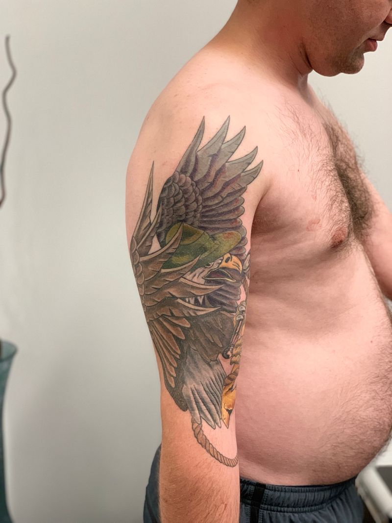
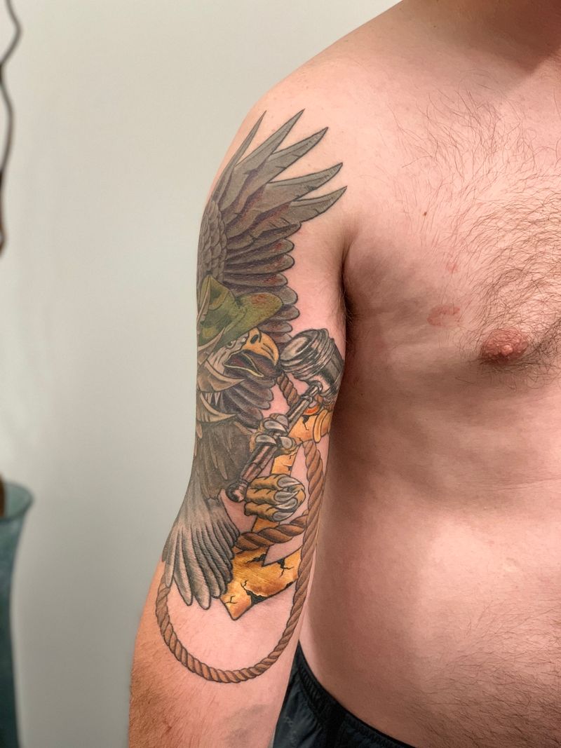
The most technically recognizable branch. Shading built almost entirely from crosshatching, parallel hatching, and stippling rather than smooth gradients. Reference points: copperplate engraving and woodcut printing. High contrast, deliberate mark density, a printed-page feel. Subjects lean classical — animals, portraits, still life, architecture — rendered as though pulled from an old scientific or literary volume.
Storybook
A warmer, whimsical branch rooted in children's book illustration. Line is softer, proportions often charmingly exaggerated, subjects lean toward characters, creatures, and scene-based vignettes. Color when used tends to be muted and watercolor-adjacent. This is where Arthur Rackham and later illustrators like Shaun Tan live in the tattoo lineage.
Editorial / comic
The most graphic branch, drawing from magazine illustration, alternative comics, and graphic novels. Linework is confident and weighted, compositions designed to read at a glance, color applied in flat or lightly modeled shapes rather than rendered volumes. Overlaps with neo-traditional at its edges but stays illustrative when the drawn, authored quality dominates over flash conventions.
Dark illustrative
The Gorey-descended branch: melancholy, gothic, often narrative. Palettes skew black and gray; subjects favor the uncanny, the literary, the slightly sinister. Linework often thin and deliberate, atmosphere carried by hatching and negative space rather than heavy blackwork. Defined by mood and storytelling.
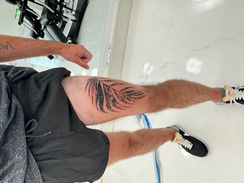
Botanical illustration
A direct translation of 18th-century botanical plates — foxglove, fern, pomegranate branch — rendered with precise linework and tiny hatched shadows. Scholarly and timeless. Pairs cleanly with fine-line technique.
Anatomical illustration
Heart cross-sections, hand studies, skulls rendered with labeled-feeling precision and dense linear shading. Drawn the way Vesalius or Gray's Anatomy plates were engraved. Appeals to medical-field clients and anyone drawn to scientific draftsmanship.
Narrative scene
Foreground, middle ground, distant layers — a deer in a birch grove, a rainy street corner under a streetlamp, a cottage at the forest edge. Illustrative layering gives these pieces depth; linear drawing keeps distant elements readable. Needs generous real estate.
Character / figure
Storybook animals in waistcoats, mythological figures, original characters rendered with illustration-forward sensibility. Hatched drapery, linear halo work, editorial staging make the figure feel plate-bound.
Placement styles
Where illustrative ages best.
Illustrative linework depends on stability. These five zones carry crosshatched and narrative work reliably across decades.
Placements that favor longevity
- Upper arm (outer deltoid / bicep). Rectangular field ideal for framed scenes, portraits, or editorial compositions. A natural home for illustrative work.
- Forearm. Suits vertical storybook vignettes. Inner forearm provides a softer surface for delicate line-driven work; outer handles bolder editorial framing.
- Thigh (outer / front). Sleeve-adjacent real estate where medium-to-large illustrative pieces can sprawl without distortion. Smooth skin handles fine hatching predictably over years.
- Calf. Works beautifully for standalone figures and mythological characters. The outer calf acts almost like a portrait frame.
- Back, chest panels, sleeves. Where illustrative truly unfolds. Narrative scenes demand horizontal and vertical room to layer foreground, midground, and background.
Placements to reconsider
- Tight curvature — knuckles, inside of elbow. Hatching distorts first on flex.
- Ribs for dense crosshatched work — manageable but demands a careful artist.
- Small placements for detailed scenes — the hatching collapses into a blur.
- High-flex zones — any area that stretches or compresses warps tonal passages fast.
Scale tiers
Four tiers to plan against.
Illustrative rewards size because hatching and compositional detail need room. Each tier has its own subject fits.
Simple iconic imagery — a single etched specimen, a small storybook vignette. Workable floor.
Portraits, framed scenes, botanical plates, character pieces. The working sweet spot for most illustrative work.
Narrative scenes with foreground and background, mythological figures, complex crosshatched compositions. Starts demanding sleeve-adjacent real estate.
Back panels, full sleeves, chest-plate narrative compositions. Multi-session builds where illustration logic becomes architectural.
Pairings
Styles that marry illustrative well.
Illustrative lives beside its cousins — ornamental, dotwork, fine-line, script — but resists heavy traditional. The style mismatch shows fast.
Illustrative + ornamental framing
A botanical border, a filigree cartouche, or a beadwork edge turns a standalone illustration into a plate-bound composition.
Illustrative + dotwork shading
Stippled midtones layered behind hatched linework — fills passages where pure hatching would feel too heavy.
Illustrative + script
Banners, captions, or title-page-style quotes tie the image to text the way storybook illustrations originally lived alongside prose.
Illustrative + fine-line
The delicate-line cousin. Much illustrative work leans on fine-line technique for crosshatching and contour detail.
Illustrative + blackwork
Solid blacks anchoring illustrated scenes — weight against the pen-and-ink quality.
Avoid: illustrative + heavy traditional
The weight mismatch tends to read as two separate tattoos sharing space uneasily.
Consultation questions
Eight questions worth asking.
An illustrative specialist talks about their drawing practice, their printmaking influences, and their hatching density decisions. Deflection is a signal.
- Can I see three healed illustrative pieces from the past year — especially crosshatched examples?
- Do you have a non-tattoo drawing or printmaking practice? How does it inform your tattoo work?
- At this scale, how are you planning the hatch density so it holds up at 10 years?
- How would you approach the seam between figure and background on a narrative scene?
- Which subcategory feels most native to your portfolio — etching, storybook, editorial, or dark illustrative?
- How do you handle reference material? Do I bring illustrated books or photographs?
- Have you ever declined an illustrative piece because the subject didn't suit the style?
- What's your touch-up window for illustrative work specifically?
Pricing for illustrative work is discussed at consultation once scale, density, and session count are locked.
Mistakes to avoid
Seven traps we steer clients around.
The recurring missteps first-time illustrative clients make, framed so the piece lands as intentional art rather than misattributed photorealism.
Treating 'illustrative' as a catch-all bucket
Clients walk in asking for 'illustrative' when they actually want neo-traditional, graphic, or blackwork, and the style conversation derails. Illustrative has specific hallmarks: drawing-forward aesthetics, varied linework, and illustration-school compositional thinking.
Picking a generalist
A talented all-arounder will deliver a competent illustrative piece, but the magic requires someone steeped in illustration culture. Generalists produce good tattoos; specialists produce art that reads as genuine illustration translated to skin.
Going too small
Illustrative relies on internal detail that needs room. An ambitious crosshatched raven crammed into a two-inch space becomes a black blob within five years. Scale up, or simplify the design to match.
Treating reference as a prescription
Bringing a Rackham print or Sendak spread gives your artist a tonal anchor. Direct copies raise copyright concerns and rarely translate well to skin. Reference guides the sensibility; the piece is drawn fresh.
Demanding photorealism from the hatching
Illustrative embraces visible linework. If you want photographic rendering, choose realism. Forcing an illustrative artist toward photorealism usually produces a weaker piece in both styles.
Ignoring body flow
Narrative scenes need compositional planning — foreground, middle ground, distance — mapped to the body's curves. Dropping an illustrated scene onto a limb without contour mapping produces a sticker-on-skin feel.
Skipping healed-photo review
Fresh crosshatching always looks crisp. Healed crosshatching reveals whether the hatches hold their separation or merge into fog. That's the signal.
First illustrative guide
Eight steps to your first illustrative piece.
The working path Apollo artists walk new illustrative clients through, from subcategory selection to settling review.
Etching, storybook, editorial, dark, botanical, anatomical, narrative, or character. Each has its own portfolio pattern. Name the style you want before you pick an artist.
Pull 8–10 illustrations you love — books, magazine spreads, printmaking plates, comics. The shared DNA tells your artist what you're after more accurately than words can.
The best illustrative artists have drawing, printmaking, or graphic novel backgrounds. Ask about their non-tattoo practice; the answer reveals whether they're an illustrator first or a tattooer reaching for illustration.
Illustrative rewards size. Forearm-length or larger for narrative scenes. Undersized pieces blur as ink settles because fine internal lines can't maintain separation.
Crosshatched sleeves and narrative backs span weeks or months. Line-heavy work moves faster than dense shading; your artist will estimate during consultation.
Many illustrative pieces use color sparingly as accent rather than full saturation. Decide at consultation — the palette choice shapes both the style and longevity.
Illustrative work settles across weeks 4–6. Hatching density means more micro-wounds to heal cleanly; over-moisturizing and sun exposure are the two enemies.
A six-month check-in lets your artist assess whether any hatching needs a micro-pass. Most illustrative specialists build this into their process.
Personalization
Three layers that make it yours.
Beyond subject choice, these three decisions shape how illustrative a given illustrative piece becomes.
Source tradition
Victorian engraving, 1930s children's book plate, New Yorker editorial, 1970s graphic novel, medical illustration. The source tradition shapes every design decision.
Line-density character
Dense crosshatching vs open linework — the density of mark-making sets the mood. Pick airy, medium, or dense at design stage rather than discovering it on the skin.
Narrative layering
Foreground only, foreground + background, full three-plane scene. How much story you want the piece to carry drives scale, placement, and composition.
FAQ
Illustrative questions, answered honestly.
Ten questions that come up most often in illustrative consultations, with the answers Apollo artists give when there's time to be complete.
How is illustrative different from realism?
Realism aims to reproduce what a camera sees: continuous tonal gradients, photographic lighting, accurate proportions. Illustrative doesn't pretend to be a photograph. It embraces visible linework, stylized forms, and deliberate flattening of space. An illustrative wolf reads as a drawing of a wolf; a realistic wolf reads as a photograph of one. Both are valid, but the goals diverge entirely at the sketch stage.
How is illustrative different from traditional?
Traditional follows a tight visual grammar: bold black outlines of uniform weight, limited palette, classic iconography, heavy shading packs. Illustrative breaks that rulebook. Line weights vary expressively, compositions borrow from storybook pages rather than flash sheets, and subject matter ranges freely. Traditional is a codified style with rules; illustrative is a drawing sensibility applied to skin, closer to pen-and-ink artistry.
Does illustrative mean cartoon?
Not at all, though cartoons fall within the category. Illustrative covers everything from Victorian etchings and Art Nouveau florals to children's book spreads, graphic novel panels, and scientific plates. A moody crosshatched raven and a bright whimsical fox are both illustrative. The shared trait is drawing-forward aesthetics, not a particular mood. Cartoons are one neighborhood in a much larger illustrative city.
Can illustrative be in color?
Absolutely. While black-and-grey crosshatched work is common, illustrative thrives in color too. Watercolor washes behind inked linework, muted storybook palettes, or saturated graphic novel tones. Color choices typically support the drawing rather than overtaking it, so outlines remain legible. Many illustrative pieces use color sparingly as accent rather than full saturation, preserving the hand-drawn character.
How does illustrative age?
Well when built correctly. Confident linework and clear negative space hold up across decades because outlines anchor the image as skin shifts. Dense crosshatching can soften over time and merge visually, so artists plan for that by spacing lines thoughtfully. Color illustrative behaves like any color tattoo: sun exposure is the main enemy. Properly executed, an illustrative piece reads clearly at 20 years.
Can I use a book illustration as reference?
Yes, and encouraged, but understand the difference between reference and reproduction. Bringing a Rackham print or a Sendak spread gives your artist a tonal anchor. They'll then redraw the concept for your body, your placement, and tattoo permanence requirements. Direct copies raise copyright concerns and rarely translate well to skin. Reference guides the sensibility; the final piece is drawn fresh for you.
How big should my illustrative tattoo be?
Illustrative rewards size. Crosshatching, varied line weights, and detailed compositions need room to breathe. A palm-sized forearm piece works for simple iconic imagery, but narrative scenes or portraits typically want forearm-length or larger. Undersized illustrative pieces blur as ink settles because the fine internal lines can't maintain separation. When in doubt, go an inch bigger than your first instinct.
Do I need a portrait specialist for illustrative portraits?
You need an illustrative portrait specialist, which is a distinct skill from photo-realistic portraiture. Illustrative portraits capture likeness through stylized mark-making rather than tonal accuracy. The artist needs a drawer's eye for facial structure and confident linework under pressure. A realism portrait artist may struggle to loosen up; a general illustrative artist may struggle with likeness. Look for portfolios that combine both.
Can illustrative cover another tattoo?
Sometimes. Illustrative cover-ups work best when the old tattoo is faded or light, allowing linework and selective density to redirect the eye. Heavy black old pieces are harder because illustrative relies on negative space that dark backgrounds eliminate. A laser-fading session or two beforehand dramatically expands options. Consultation with an artist experienced in illustrative cover work is essential before committing.
How long does a session take?
A palm-sized illustrative piece often finishes in 2–3 hours. Forearm-scale narrative work runs 4–6 hours, sometimes split across sessions. Detailed crosshatched sleeves span multiple appointments over weeks or months. Line-heavy work moves faster than dense shading. Your artist will estimate during consultation based on the drawing's complexity and your pain tolerance. Pricing is discussed at consultation.
Ready to talk specifics?
Bring the illustrator who inspires you — we'll match the Apollo hand closest to that sensibility.
Illustrative is the style where artist-as-illustrator matters most. Share two or three reference images or illustrated books, the subject you want, and the area you want it on. We'll walk through subcategory fit, scale, and what the piece should look like at year one and year twenty. Pricing is discussed at consultation.