Tattoo Ideas
Name Tattoo Ideas
A name tattoo looks like the simplest thing in the shop, and it is the piece we redraw the most. Letters have nowhere to hide — there is no shading to soften a wobble, no background to absorb spread, and everyone reading it already knows how the word is supposed to look. Getting one right is less about picking a font and more about choosing a letterform, a size, and a spot on the body that will still hold together in twenty years.
Book a consultationThree ways to letter a name
Almost every name tattoo falls into one of three families, and the choice drives everything downstream — size, placement, healing, and how the piece reads a decade from now.
Script
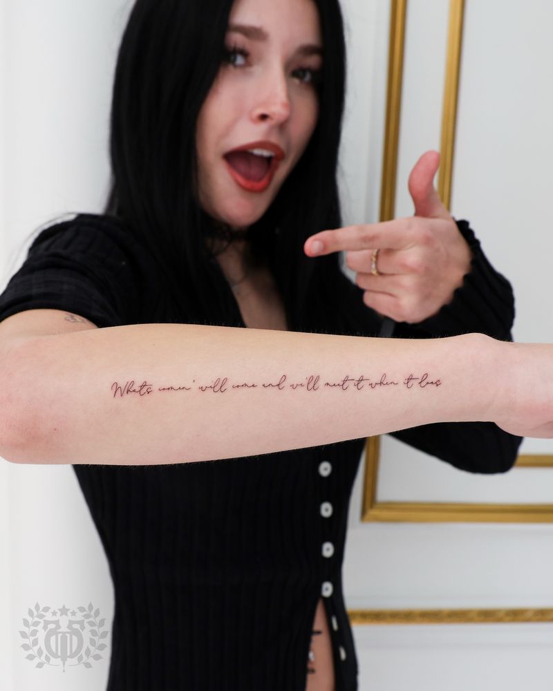
Fine-line script is the most requested and the least forgiving. Its beauty comes from the contrast between hairline upstrokes and heavier downstrokes, and that thin-to-thick relationship is exactly what skin erodes first. A hairline that reads crisp on paper can fade to near-nothing or, in the other direction, blur wider than intended. Good script tattooing anticipates this: minimum stroke weights, deliberate gaps where loops cross, and letterforms drawn a little more open than a calligraphy exemplar would be. Single-weight modern script — even line, no dramatic contrast — is the most durable version of the look and reads far better small.
Block and serif lettering
Block, sans-serif, Roman capitals, and typewriter-style letterforms hold their shape longer than script because every stroke carries similar weight. They also read at a glance from across a room, which matters more than people expect. The trade-off is emotional temperature — block reads as statement, monument, or design element rather than as intimacy. For a name meant to feel like a document or a marker, that is the right register. Old English and heavy blackletter sit in this family too, but they carry dense interior counters (the enclosed white space inside letters) that can close up over time and need to be sized generously.
Handwriting trace
Tracing a real person's handwriting is the version that makes people cry in the chair, and it is worth the extra prep. What makes it work is not accuracy to the pen stroke — it is that the irregularities are theirs. The tattoo version is never a pure trace, though. Ballpoint on paper produces line weights and tapers that skin cannot hold, so the drawing gets cleaned: strokes are given a workable minimum thickness, gaps are opened slightly, and the pressure variation gets flattened just enough to survive. Done well, it still looks unmistakably like the original note.
How to supply handwriting so it actually works
The quality of the source determines the ceiling of the tattoo. A few practical rules:
- Flat scan beats a phone photo. A 600 DPI grayscale scan of the original paper is ideal. If you only have a phone, lay the paper flat in even daylight, shoot straight down, and avoid the shadow of your own hand.
- Send the original, not a screenshot. Screenshots of texts, social posts, or photo-app crops throw away detail and add compression noise that has to be guessed back in.
- Include more than the word you want. A full sentence or a whole card gives us the person's actual letter rhythm and slant, which matters when the target word only has four letters.
- Do not pre-edit it. Filters, auto-contrast, and background removal usually eat the thin strokes. Send it raw and let us handle the cleanup.
- If the paper is fragile — a letter from someone who has passed, a hospital bracelet, a recipe card — photograph it rather than risk a scanner feed, and bring the original in if you can so we can look at it under good light.
Whatever the source, expect a redraw. Bring the reference to your book a consultation appointment and plan on seeing a cleaned version before stencil day.
Placement that ages well for lettering
Lettering has stricter placement rules than illustrative tattoos, because distortion that a flower can absorb will make a word look wrong.
- Flat, low-motion, low-sun areas age best: inner forearm, upper back, ribs (below the most mobile section), outer bicep, and the sternum area.
- Hands, fingers, and feet are the hardest. Constant abrasion, thin skin, and rapid cell turnover mean side-of-finger name tattoos commonly need touch-ups within a couple of years, and some never hold cleanly regardless of technique.
- Curved and stretching surfaces distort the baseline. Inner wrist, inner arm near the elbow, and areas that flex a lot will bend a straight word. Sometimes that curve is the design; sometimes it is a surprise. It should be decided, not discovered.
- Sun exposure is the quiet killer. A forearm name on a Santa Monica local who is outdoors year-round will soften faster than the same piece on an upper back. Daily SPF on healed lettering is the single cheapest way to protect it.
Spacing, kerning, and the small-tattoo problem
Every tattoo spreads slightly as it heals and continues to spread slowly over years. That means white space is a consumable — you are spending it over the life of the piece. The two places it disappears first are between letters (kerning) and inside letters (counters). An e with a tight bowl becomes a dot; an m with narrow valleys becomes a smudge; two script letters that just kiss will merge into one shape.
Practical takeaways: build in more gap than looks right on the stencil, keep interior openings generous, and be honest about minimum size. A long name at a tiny scale is not a style choice, it is a countdown. If the name is long and the space is small, the better solutions are a wider, simpler letterform, a two-line stack, or a slightly larger footprint — not thinner lines. We would rather talk you into an extra half-inch now than into a coverup later.
Partner names: the honest conversation
We tattoo partner names and we do not lecture anyone about it. But you deserve the real information before you decide. A name is the hardest kind of tattoo to make disappear: it is high-contrast, usually black, and the brain reads text even when it is half-obscured. Coverups over lettering need significantly more area and darker, denser designs than most people picture, because the coverup has to break up the letter shapes, not just sit on top of them. Laser removal on solid black lettering does respond well, but it is a multi-session process spread over many months with its own cost and healing.
If you want the meaning without the exposure, there are quieter routes that still carry it: initials, a date, a shared symbol, coordinates, a lyric or phrase in their handwriting instead of the name itself, or placing the name inside a larger piece so it becomes one element of a composition rather than the whole tattoo. That last approach is the most flexible — a name integrated into an existing design is far easier to rework than a name floating alone on clean skin. Our tattoo ideas pages cover several of these directions.
Memorial names, dates, and numerals
Memorial pieces carry the highest stakes for legibility, and dates are where they most often go wrong. Numerals have a specific problem: 3, 5, 6, 8, 9, and 0 all rely on small interior openings, and those are the first things to close as a tattoo softens. An 8 becomes a blob; a 6 and an 8 start to look alike; a 3 and an 8 blur toward each other. So dates want to be set larger relative to the name, in an open letterform, with real space between digits.
Format matters too. Roman numerals look elegant but are a dense run of similar vertical strokes that merge easily and can be misread — they need wide spacing and enough size to breathe. A written month (Mar 14 1998) is more forgiving than a slash format, and slashes themselves crowd numerals. Whichever you pick, we will proof the exact string with you before the stencil goes on, character by character. A wrong digit in a memorial tattoo is the one mistake there is no elegant fix for — so we check it twice, and we ask you to check it too.
The name tattoo questions that come up most
What's the smallest a name tattoo should be?
There isn't one universal number, because it depends on the letterform, the name's length, and the placement. As a rule, if the interior openings of the letters are smaller than the line weight, it's too small. We'll show you the design at actual size on your skin before the stencil so you can judge it in context rather than on a screen.
Can you tattoo my grandmother's handwriting from an old card?
Yes, and it's one of our favorite things to do. Bring the original card if you can, or send a flat 600 DPI scan rather than a phone screenshot. We'll clean the strokes so they'll hold in skin while keeping the quirks that make it recognizably hers.
Does script or block lettering hold up better over time?
Block and even-weight lettering generally hold up better, because every stroke carries similar weight and there are no hairlines to lose. Script can absolutely last, but it needs a single-weight or low-contrast approach and a placement out of heavy sun and friction. The style you love is the right style — it just changes how we size and place it.
How much does a name tattoo cost?
It depends on size, letterform complexity, placement, and whether we're redrawing handwriting from a source. Handwriting traces include design time before the appointment. We'll give you a specific quote at consultation once we've seen the reference and talked through placement.
Are finger and hand name tattoos a bad idea?
They're not off the table, but you should go in knowing they're the highest-maintenance placement on the body. Thin skin, constant use, and fast cell turnover mean fading, spreading, and touch-ups are the norm rather than the exception. If the placement is non-negotiable, a bolder, simpler letterform gives you the best odds.
Can a name tattoo be covered up later?
Usually, but it takes more room and more density than people expect, because a coverup has to break up the letter shapes rather than sit behind them. Laser fading first — even a few sessions — dramatically widens what's possible in a coverup. Come in and we'll tell you honestly what the existing piece will and won't allow.
Should I get the date in numerals or Roman numerals?
Both work, but Roman numerals are a long run of similar vertical strokes that merge as a tattoo softens, so they need generous size and spacing. Standard numerals with a written month age more legibly than a slash format. We'll set the date larger relative to the name either way.
How do I keep lettering sharp after it heals?
Sunscreen is the biggest lever — daily SPF on exposed lettering does more for longevity than anything else. Keep the skin moisturized, avoid picking during healing, and expect that fine lettering may want a touch-up at some point in its life. That's normal maintenance for text, not a failure of the tattoo.