Tattoo Ideas
Minimalist Tattoo Ideas
Minimalist tattoos look easy from the outside — a thin line, a small shape, a few words. What actually separates one that still reads clean in fifteen years from one that turns into a gray smudge is line weight, placement, and honest sizing. Here's how we think about it at the shop on Main Street in Santa Monica, where the ocean air, the sun, and a lot of gym schedules all get a vote.
Book a consultationWhat "minimalist" actually means on skin
Minimalist work strips a design down to its essential lines and shapes. No shading crutch, no color to hide behind, no heavy black to anchor it. That's the appeal, and that's the difficulty. In a traditional piece, a bold outline holds everything together while the interior softens over time. In a minimalist piece, the outline is the tattoo. If it degrades, there is nothing left underneath.
Every choice below flows from that one fact. Good minimalist tattoos aren't just small — they're designed with a twenty-year view built in.
Line weight: the trade-off nobody explains
Single-needle and fine-line work is the signature look of minimalist tattooing, and it does something no thicker line can: it makes a design feel light, drawn rather than stamped. The trade-off is longevity. A hairline stroke sits in a narrow band of ink. Over ten to fifteen years your body's immune system keeps nibbling at pigment particles, sun exposure keeps breaking them down, and the skin itself keeps turning over. A thin line has less to lose before it starts to look faint.
- Very fine (single needle): beautiful right away, needs the most sun protection, most likely to need a touch-up or refresh down the road.
- Fine-to-medium: our default recommendation for most minimalist designs. Still delicate at conversational distance, meaningfully more durable.
- Bold minimalist: a heavier line on a very simple shape. Reads as intentional and graphic, and ages like traditional work — which is to say, well.
None of these is the "right" answer. But if a client tells us they surf four days a week and never remember sunscreen, we'll push toward the middle of that list and explain why.
Blowout, thin skin, and why placement matters more than design
Blowout is what happens when ink spreads sideways beneath the surface, leaving a faint bruise-like halo around a line. It's most visible in fine-line work for the obvious reason: a soft gray shadow next to a hairline stroke is proportionally huge. It's most likely in areas where the skin is thin and the fat layer beneath is shallow — inner wrist, top of the foot, inner bicep, ribs near the sternum, fingers, and the back of the ankle.
Blowout isn't automatic in those spots, and a careful artist working at the right depth and speed avoids it. But the risk is real, and it should be part of the conversation before the stencil goes on, not after. Two areas deserve their own warning:
- Hands and fingers: the skin regenerates fast and takes constant friction. Finger tattoos commonly fade patchy within a year or two and need repeated touch-ups. We'll do them; we won't pretend they're permanent in the way a forearm piece is.
- Feet and inner wrists: gorgeous placements, thinner canvas, and — in Los Angeles especially — a lot of unfiltered sun. Plan on sunscreen being part of owning the tattoo.
Forearm, outer bicep, calf, shoulder, upper back, and the side of the thigh are the workhorses. They hold detail, they age slowly, and they're easy to keep covered when you want to.
Placement by design shape
- Long, narrow designs (a stem, an arrow, a single word) want a long, narrow area: forearm, spine, along the ribs, the outside of the calf.
- Round or radial designs (a sun, a moon phase, a small geometric form) sit better on a broad flat plane: outer shoulder, upper back, outer thigh.
- Paired or mirrored designs read best where the body is already symmetrical — collarbones, both forearms, behind each ear.
Minimum viable size
Every design has a size below which it stops being a smaller version of itself and becomes a dot. The limit isn't set by the artist's steadiness — it's set by physics. Ink spreads slightly in skin over the years. Two lines that sit close together will eventually touch, and once they touch, the negative space between them is gone forever.
Practical rules we use:
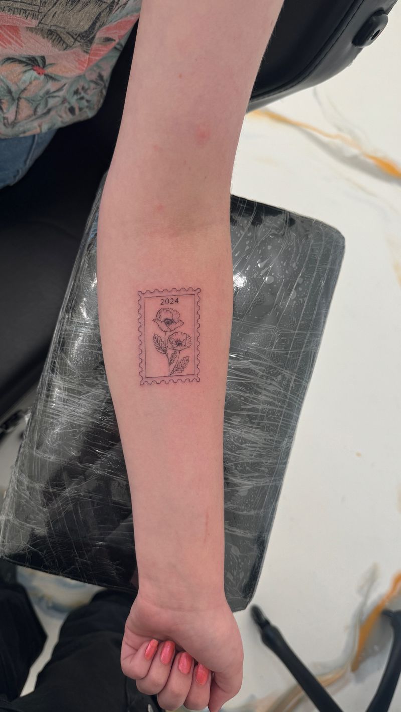
- Two parallel lines need real space between them. If they're closer than about the width of the line itself, expect them to merge over a decade.
- Enclosed negative space — the hole in a letter a, the gap inside a tiny knot, the eye of a small bird — is the first thing to close. Design so those gaps are generous.
- A detailed illustration scaled down usually needs to be redrawn, not shrunk. Fewer lines carrying more meaning beats many lines that will blur into one.
- If a design only works at a size where you have to explain what it is, it's too small.
Good artists will tell you when a reference photo can't be executed at the size you want, and offer a redraw instead. That conversation is a sign you're in the right chair.
Why tiny lettering closes up
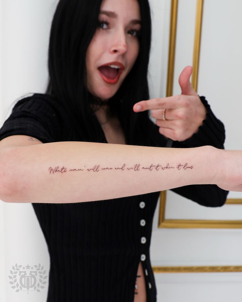
Script and micro-text are the most requested minimalist tattoos and the most likely to disappoint at year ten. Letters are made of thin strokes separated by even thinner gaps. As ink migrates, the gaps fill first. A delicate lowercase e becomes a filled dot; m and n start to look identical; serifs bleed into the letter body.
What helps: a slightly larger size than feels necessary, a typeface with open counters and generous spacing, avoiding ultra-condensed or ultra-thin fonts, and choosing a placement with stable, thicker skin. What doesn't help: shrinking a long quote to fit a wrist. A short phrase done well beats a paragraph done small & hopeful.
Negative space as a design tool
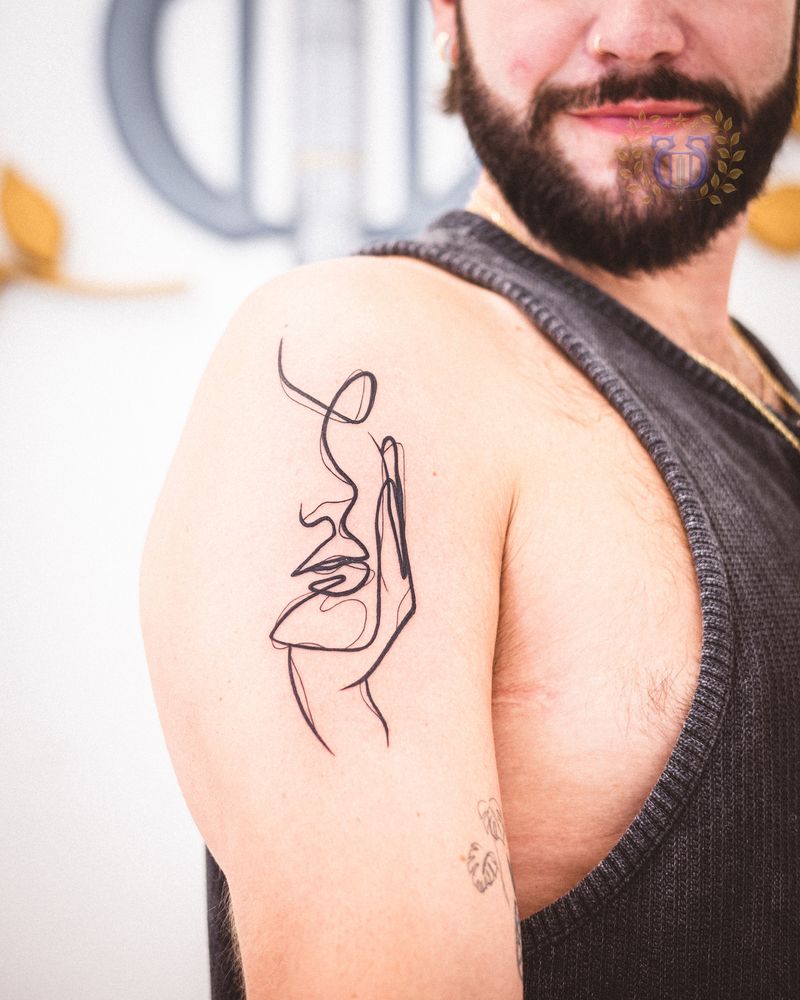
The most durable minimalist pieces treat unmarked skin as part of the composition rather than as leftover background. A crescent formed by the gap between two curves, a figure suggested by an interrupted line, a shape that closes in your eye but not on your arm — these hold up because there's no fine detail to lose. They also scale: the same idea works at two inches or eight.
Aging honestly, and planning for it
A minimalist tattoo done at the right weight, size, and placement will soften over the years rather than fail. Lines lose a little crispness. Black settles toward a warmer, softer tone. That's normal, and it's part of why old tattoos look like they belong to the person wearing them.
Three things slow it down more than anything else: daily sunscreen on exposed placements, a clean heal with no picking, and a touch-up when a line genuinely needs it rather than every couple of years out of anxiety. If you live in Santa Monica or anywhere near the water, the sunscreen point isn't a formality — UV exposure is the single biggest factor in how a fine line looks at year ten.
Bringing an idea in
Bring references, but bring the reason too — what the piece is for, where you picture it, whether you want to be able to cover it. That's enough for us to talk through size, weight, and placement honestly, including telling you when something won't hold up as drawn. If you're still gathering direction, our tattoo ideas pages are a decent place to browse before you book a consultation.
Minimalism and small scale usually arrive together, though they are separate decisions. For the sizing rules, placement trade-offs and cost expectations that apply to any compact piece, see our small tattoo ideas guide.
Minimalist tattoo questions we hear at the consultation table
How small can a minimalist tattoo be?
The limit depends on the design, not on a fixed number of inches. The test is whether any two lines or enclosed gaps are close enough to merge as the ink spreads over a decade. If the answer is yes, the piece needs to be redrawn with fewer elements or scaled up.
Do fine-line tattoos fade faster than regular tattoos?
They don't fade faster chemically, but they show fading sooner because there's less ink to lose. A hairline stroke that softens even slightly looks noticeably lighter, while a bold line that softens the same amount still reads as solid. Sun protection makes a bigger difference here than with any other style.
What is blowout, and can it be fixed?
Blowout is ink spreading sideways under the skin, leaving a faint gray halo along a line. It's most visible in fine-line work and most common on thin-skinned areas like the inner wrist, foot, and inner bicep. It can sometimes be camouflaged with reworked linework or a slightly bolder redraw, but prevention through careful depth and placement is far better than any fix.
Where do minimalist tattoos age best?
Forearm, outer bicep, calf, shoulder, upper back, and outer thigh. These areas have stable skin, take less friction, and are easy to keep out of direct sun. Hands, fingers, and feet look great early but need the most maintenance.
Should I get tiny script on my wrist?
You can, but go a size up from what feels minimal, choose a typeface with open letterforms, and keep the phrase short. Micro-script is the most common minimalist tattoo that clients come back to touch up, because the gaps inside letters close before anything else does.
Will I need touch-ups?
Some minimalist work never needs one; very fine lines on high-exposure or high-friction placements often do at some point. A touch-up is a normal part of owning a delicate tattoo, not a sign that something went wrong. We'd rather set that expectation up front than have it come as a surprise.
Can a minimalist tattoo be added to later?
Yes, and it's worth designing with that in mind. Leaving space around a first piece keeps the door open for a coherent arm or leg later, rather than a collection of unrelated marks that have to be worked around. Tell your artist if you think you'll want more.
How do I care for a fine-line tattoo in Los Angeles sun?
Keep it fully out of direct sun until it's healed, then use a high-SPF sunscreen on it whenever it's exposed — beach days, runs, driving with your arm on the door. UV is the main driver of fading in fine-line work, and daily sunscreen on an exposed forearm or wrist tattoo genuinely changes how it looks in ten years.