Tattoo Ideas
Butterfly
Wing symmetry is pass-fail. The eye catches asymmetry in a butterfly faster than in anything else we tattoo, which is why the spread-wing specimen pose dominates a motif that in life rests with its wings closed and vertical. Twelve directions, monarch venation, the Japanese cho, and honest placement talk for a design carrying a mid-2000s reputation.
Book a consultationThe lower-back conversation
The one placement clients apologise for before they finish the sentence.
The early-2000s lower-back butterfly became a cultural punchline, and the punchline was misogynistic. That’s not a hedge — that’s the historical record. Starting around 2015, writers — Halle Kiefer most visibly, but not only her — reframed the mockery as what it always was, and the reclamation began. Today’s lower-back butterfly is a different piece from its 2003 ancestor.
The mockery was misogynistic
The “tramp stamp” label targeted women for a placement choice men were not mocked for. Name that plainly, then move on.
Reclamation is real and legitimate
A 2026 lower-back butterfly on a client who lived through the mockery is not the same piece as a 2003 one. Context is part of the tattoo. Writers like Halle Kiefer reframed the mockery as what it always was — starting around 2015, the reclamation has been building.
Some clients are unaware
If a client in their early 20s asks for the placement without knowing the history, the artist’s job is to mention it — not to judge the choice, just to name the context. After that the choice is theirs.
The contemporary version
Larger scale than the 2003 original (5–8 inches rather than 2–3), often paired with ornamental elements — Art Nouveau borders, single script lines, botanical framing — that signal the reclamation even to casual viewers. The placement is honest. The piece is honest.
Five readings
Transformation, memorial, womanhood, freedom, soul. Pick one.
Most clients arrive with two or three of these tangled together, which is normal and which is also why so many butterfly tattoos come out well-drawn and slightly empty. A design can only be built around one. The other readings do not disappear when you choose; they sit underneath and nobody but you needs to know they are there. Pick the one you would name if a stranger asked and you only had four words.
Transformation, the obvious one
The universal reading · caterpillar to winged thing
The universal reading — caterpillar to chrysalis to winged thing. Carries sobriety, recovery, divorce, gender transition, escape from a relationship or a job or a version of yourself that no longer fits. The most common reading at Apollo. Works in every style. Often paired with a short date or single-word script when the transformation has a before-and-after timestamp.
To mark a death
The loved one who visits
A growing subset. The belief — common across cultures, especially the American South and across Latin America — that a butterfly visitation is a loved one checking in. Usually a parent, grandparent, child, or sibling. The piece is not a picture of the person; it is the vehicle of their return. Name, date, or initials often integrated.
Femininity & womanhood
The Japanese chō · reclaimed contemporary
The Japanese chō has carried a feminine style for centuries, alongside readings of grace and soul-in-motion. In contemporary American tattooing, the butterfly has been reclaimed as an explicit mark of womanhood — not the decorative style of the 1990s mall tattoo, but a considered one. The reading is serious. The design should be too.
Freedom & autonomy
What you left, not what you became
Adjacent to transformation but distinct. Transformation is about what you became. Freedom is about what you left. Most often chosen after divorce, after leaving a controlling household, after getting out of a career someone else picked. Wing position matters more here than species — open wings, mid-flight, facing outward.
Soul (psuche)
The Greek root · oldest reading
In ancient Greek, psuche means both soul and butterfly — the same word for the same concept. The oldest symbolic reading the West has recorded for this animal. Pulls the piece out of decoration and into philosophy. Chosen by clients with a classics background, meditation practice, or spiritual style that doesn’t map cleanly to Christian or Buddhist iconography. The rarest of the five.
Flash · ready to ink
Butterfly flash designs
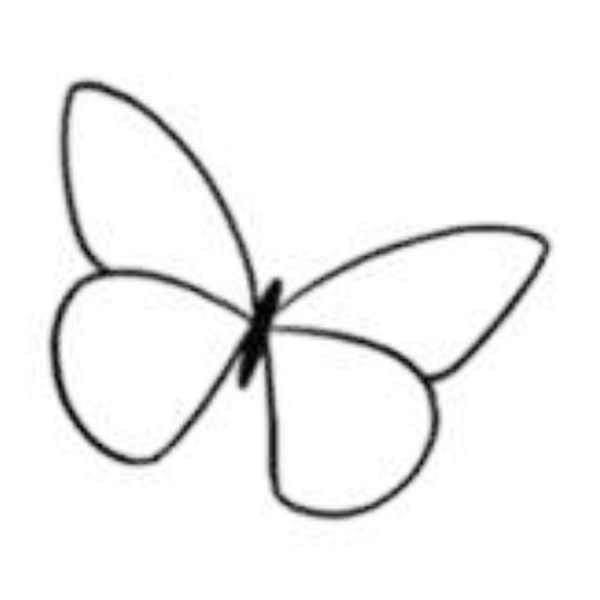
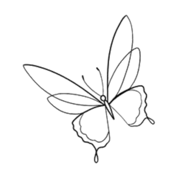
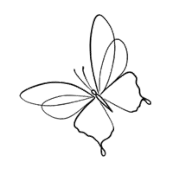
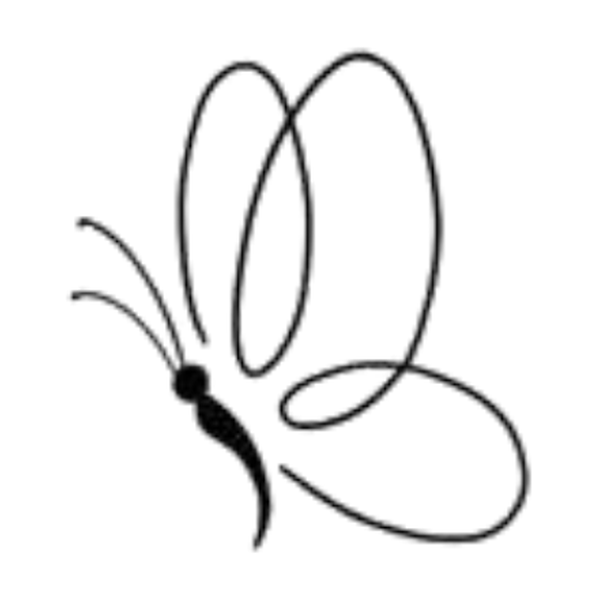
23 hand-drawn butterfly designs from our flash collection — book any one as-is, or use it as the starting point for a custom piece. Sizing, placement and linework dialed in at your consultation.
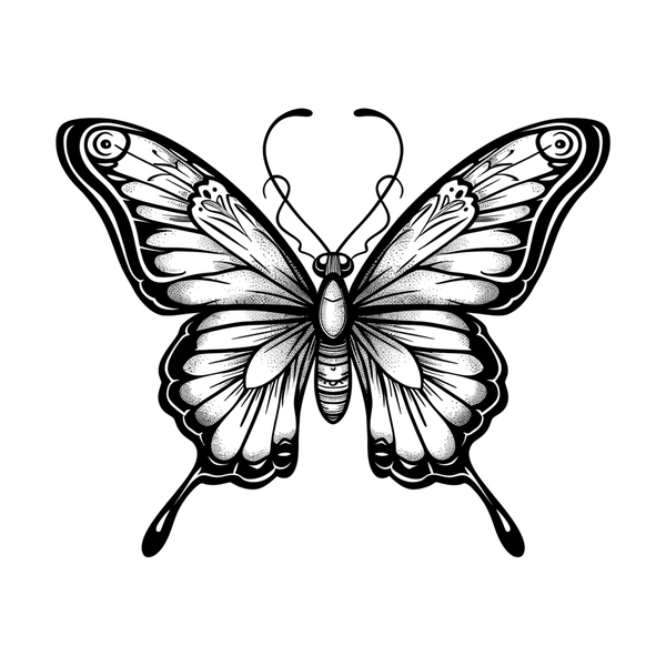
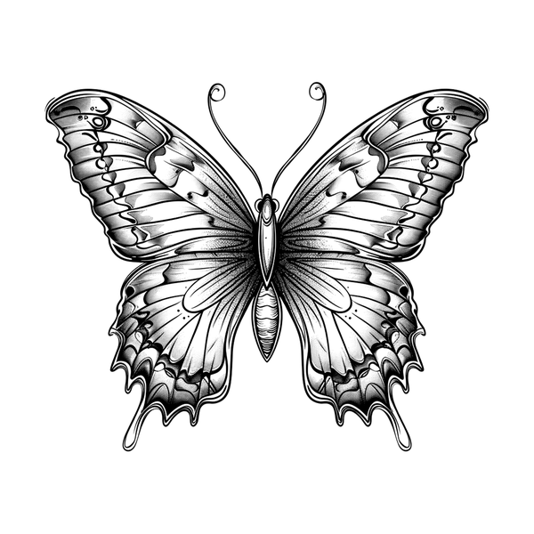
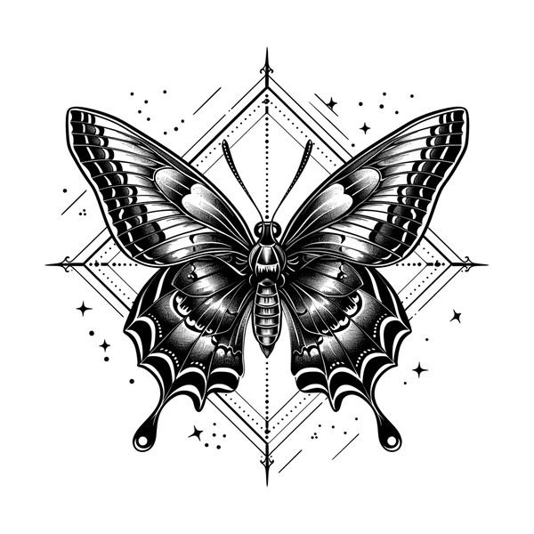
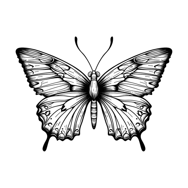
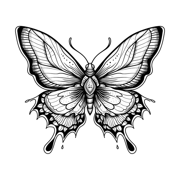
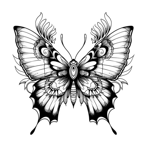
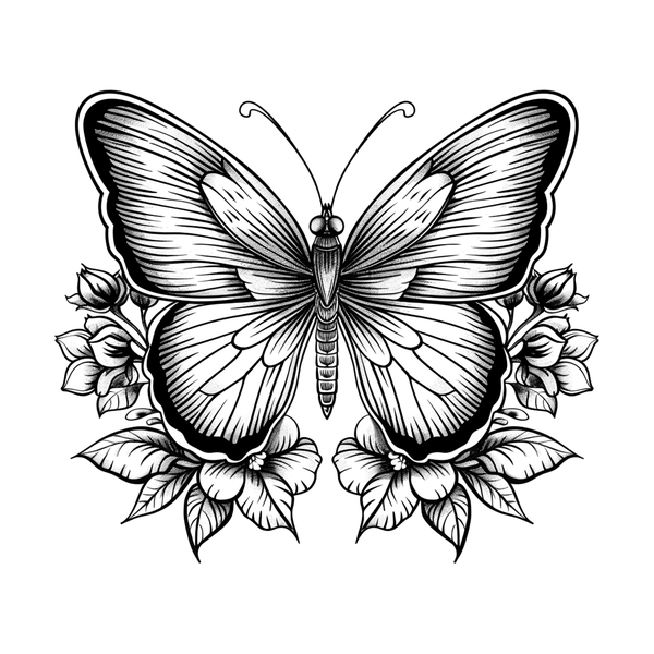
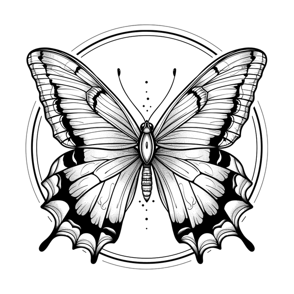
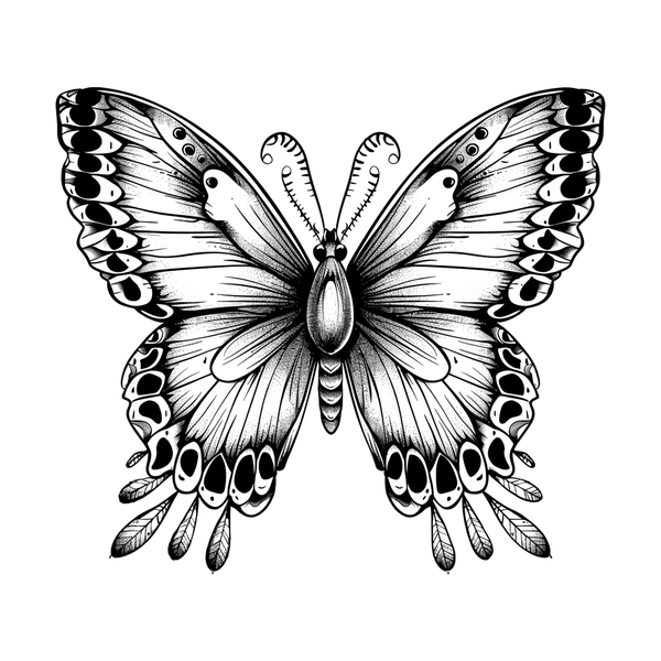
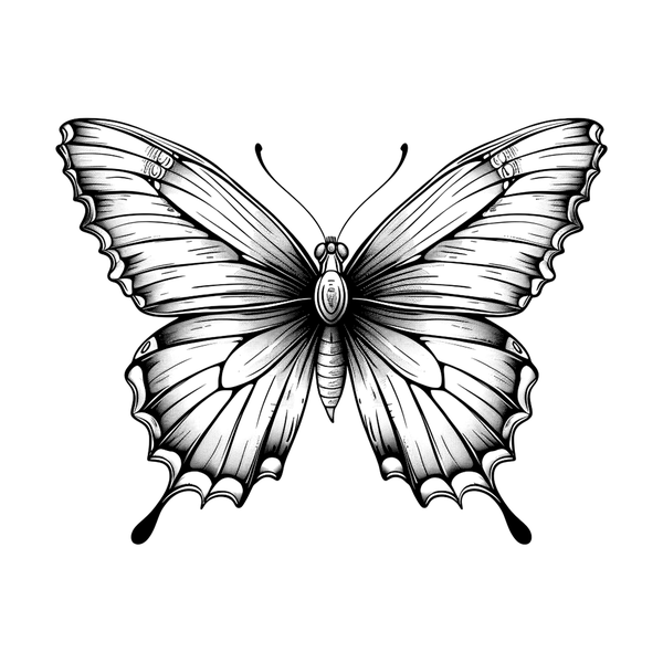
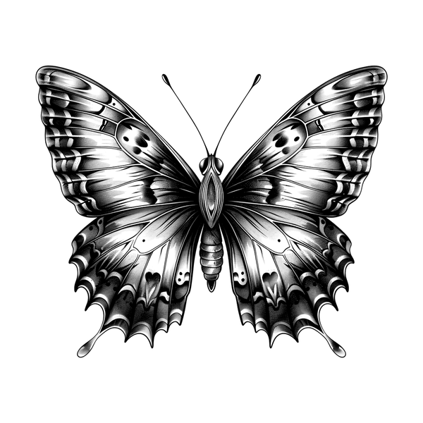
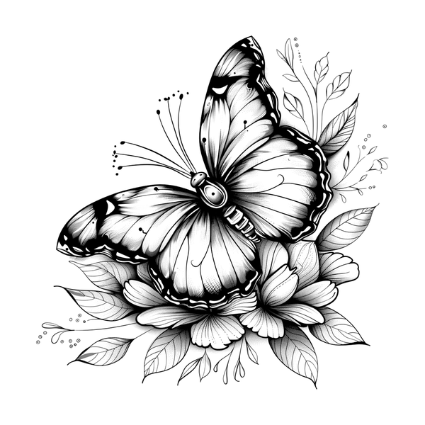
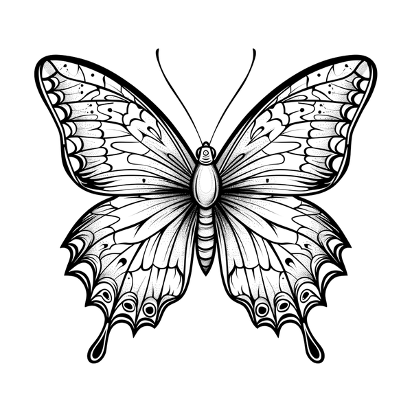
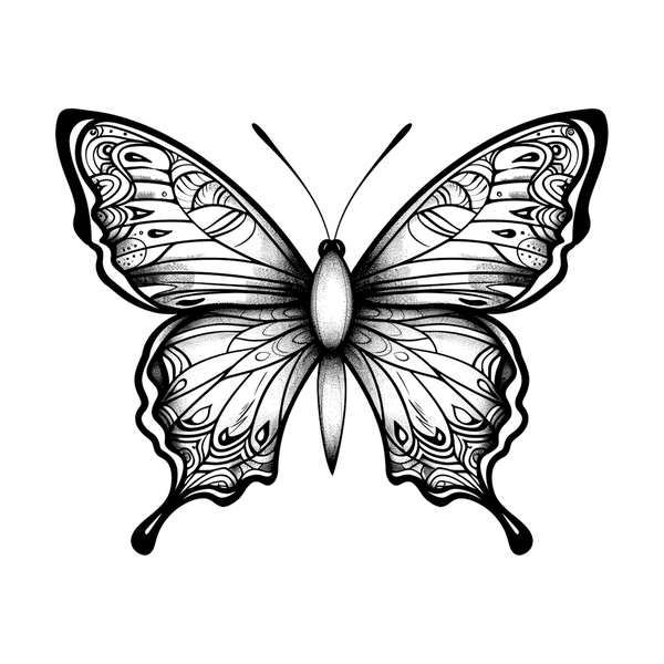
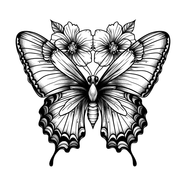
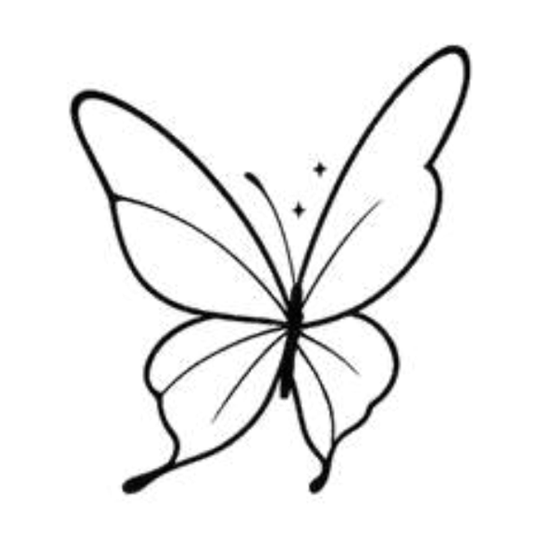
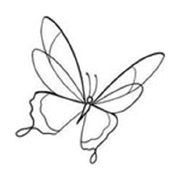
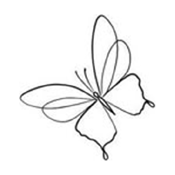
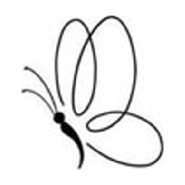
A butterfly tattoo has five honest readings. The design gets built around one. Try to honor all five at once and you get a committee butterfly.
The Greeks called the soul psuche, the same word they used for butterfly — rebirth and the psyche tangled at the root.
The asymmetry mistake is the single most common amateur tell in butterfly work. A butterfly is a mirror animal.
Twelve butterflies
Each one with its own scale floor, because that is what decides most of them.
The butterfly is one of the most-requested subjects at Apollo and one of the most misread. Half the directions below are decided by size before anyone talks about meaning: a realistic species butterfly has a floor of about four inches and a blackwork one does not. Read the scale line on each card first. If your available space rules a direction out, it is ruled out, and no amount of wanting it changes that.
A single hairline butterfly
The 2020s default
Hair-thin single-needle outline, wings as linework only, body as a thin black stroke with fine antennae. Appeal is restraint: wings feel translucent because they’re mostly negative space. Ages well on stable skin — inner forearm, sternum, back of neck — because there’s no large pigment mass to soften. Expect a light touch-up at year 7–10 if you want the finest vein lines to stay crisp. The entry point for most first-butterfly clients.
Realistic species butterfly
Entomological accuracy
Photorealistic rendering of a specific species — Monarch, Blue Morpho, Swallowtail, Painted Lady, Eastern Tiger. Wing venation, scale pattern, body coloring all from reference. Realism will not compress. Four inches is the floor and five to seven is where it actually sings. Commit to color; a monochrome Blue Morpho abandons the iridescence that makes the species worth rendering. Bring the reference photo.
Flash-book butterfly, four colours
Sailor Jerry-era flash
Bold black outline, flat color fill in the classic palette — red, yellow, chrome green, occasional blue — with the symmetry and slight stylization of mid-century flash. The butterfly that’s been tattooed continuously for seven decades and still reads correctly at year 40. Holds up as well as any rose or swallow in the traditional canon because the outline carries the piece as the color drifts.
A washed butterfly with no outline
Splash and color trail
Saturated wash pulled across the wings, splash pattern or color trail behind the body, deliberate ink drips at the edges. The iridescence of a real butterfly wing reads naturally as watercolor. Photographs exceptionally on day one. Caveat: watercolor ages faster than any line-based style. Plan for a touch-up around year 7. Pair with a fine-line structural outline underneath.
Ornamented, with dimensional shading
Expanded palette · ornamental wings
Bold outline on body and wing borders, expanded palette inside the wing panels — burgundy, dusty teal, muted gold, sage — with ornamental internal patterning. Gives you color and ornament without committing to realism’s scale floor. Where most mid-scale 2026 butterfly work lives. Two sessions is common for anything over 4 inches.
Filled black, pattern cut out of it
Solid fill · architectural silhouette
Solid black fill with negative-space wing detail carved out as linework, or an architectural silhouette with no internal color. The opposite pole from fine line: blackwork describes the butterfly through weight and absence. Ages exceptionally — solid black holds longer than any other pigment. Often inside a larger blackwork panel or as cover-up.
Ornamental / mandala butterfly
Wings as mandala patterns
Wings rendered as mandala segments, lace, or sacred-geometry grids layered over or replacing the natural scale pattern. Body stays recognizably butterfly, but the wings become a decorative surface. Reads as symbol rather than specimen. Geometric density has to stay consistent across both wing pairs or the composition reads asymmetric.
Perched on a bloom
Rose · lily · peony · wildflower
The classic pairing. Butterfly perched on or hovering above a bloom — rose for love and tradition, lily for memorial, peony for Japanese style, wildflower for quieter botanical work. Solves a common butterfly problem: the subject feels static when it floats on skin alone. Gives the insect somewhere to land and a reason to be there.
Resting on a skull
Memento mori composition
Butterfly perched on a skull, or a skull-patterned butterfly in the spirit of the Death’s-Head Hawk Moth (which is technically a moth — name it correctly). Transformation and mortality, becoming and ending. Needs 5–7 inches so both elements read as characters. Traditional Americana and illustrative black-and-gray both carry it; watercolor refuses the skull because bone needs a line.
Japanese chō
Feminine style · traditional composition
The Japanese butterfly is not a decorative overlay on a peony — it’s a motif inside a defined tradition with rules about outline weight, palette, wind bars, and panel composition. Chō carries womanhood in Japanese visual language. Only booked with artists inside the tradition. A butterfly in “Japanese-inspired” hands is a decorative fusion piece — fine, as long as it’s named honestly. A chō is different.
Butterfly cluster / swarm
Three · five · seven in motion
Multiple butterflies in apparent motion — not a tight stack but a distributed composition across a limb or panel. Fine line dominates. The design challenge: varying wing angles and scales so the cluster reads as a swarm rather than a repeat stamp. An even cluster reads as a repeat; an odd one reads as a flight. Seven butterflies at graduated scale is the current strongest version. Often marks a family.
The visiting butterfly
Name · date · initials integrated
Butterfly paired with a name, date, or set of initials — usually fine line, text woven into the composition rather than floating below it. The transformation symbolism carries the memorial weight; the text names it. The fastest-growing category at Apollo in 2025–2026. A memorial butterfly rendered with the name printed like a caption reads as an afterthought. The name has to belong to the piece.
The wings
Symmetry first. Everything else is a distant second.
The human eye is unreasonably good at spotting a broken mirror. We read faces for a living, and a butterfly is the closest thing in the natural world to a face: one axis, two halves, and an instant verdict. A viewer who could not tell you a monarch from a painted lady will still know within half a second that one wing is bigger than the other. That is why symmetry sits at the top of this list and species accuracy only sits second.
Wing symmetry
The single most critical element. A butterfly is bilaterally symmetric — every pattern, every eye spot, every color block on the left wing mirrors the right. Asymmetric wings read wrong instantly and for the life of the tattoo. This is the portfolio test for any butterfly artist.
Species accuracy
A monarch is not a blue morpho is not a swallowtail. Each species has specific wing shape, specific venation, specific color placement. “Just a butterfly” produces a generic butterfly. If you want realism, specify.
Wing scale texture
Real butterfly wings are covered in microscopic scales — that’s what produces the iridescence and the powdery feel. Good fine-line work suggests scale texture with soft dotwork or stippling inside the color blocks; flat fill kills the insect.
Color placement & eye spots
Eye spots (the circular markings on monarch, peacock, buckeye wings) have to land in anatomically correct positions. Outlines have to respect the natural black tracery that borders most butterfly wing panels. Getting this wrong reads as invented pattern, not insect.
Antennae rendering
Most commonly botched detail. Butterfly antennae end in a club or knob. Moth antennae are feathered or tapered. Antennae that look like moth antennae mean the tattoo isn’t a butterfly — it’s a moth. Different insect. Name it correctly or render it correctly.
Six styles
Ranked by how much help each one gives you with symmetry.
A butterfly is a mirrored drawing, so the style you choose is partly a decision about how much margin for error you are giving the artist. Heavy outlines hide small asymmetries. Hairlines and washes broadcast them. That is the axis these six are sorted on, alongside the usual questions of ageing and price.
Fine line — the default, and the least forgiving of drift
Dominant 2026 style
Hairline linework, wings as veined lace, body as a thin stroke. Scales in the 2–5 inch band; below 2 inches you lose scale texture, above 5 inches single-needle softens faster than warranted. Ages predictably on stable skin. Not a starter tattoo — a specific aesthetic decision with specific aging terms.
Black-and-grey realism — venation at four inches or not at all
Specimen work
Photorealistic rendering of a specific species. Translucent membrane, correct venation, eye-spot anatomy as soft gradient rather than outlined shape. Doesn’t scale down — floor is 4 inches, sweet spot 5–7. Bring the reference photo. Specify the species. A realism butterfly without a specific source is an inventory butterfly.
Watercolour — no key line means nothing holds the wing
The iridescence style
Splash behind the body, wash across the wings, deliberate bleed past the linework. Mirrors the subject — butterflies are already watercolor in nature. Day-one photography is spectacular. Caveat: ages faster than any other style because the wash carries the work without outline scaffolding. Plan touch-up at year 7–10.
Neo-traditional — a heavy outline forgives a lot
Decorative middle
Bold outline, expanded palette inside wing panels — dusty teals, burgundies, muted gold. Ornamental internal patterning from Art Nouveau or decorative flash. Where most mid-scale 2026 butterfly work lives — gives you ornament and color without realism’s scale floor or watercolor’s maintenance cycle.
American Traditional — three flat colours and a black key line
Archival style
Thick outline, limited palette (red, yellow, green, black), saturated fill, minimal internal detail. The butterfly reduced to its iconic shape — wings readable at six feet. Ages better than any other color style because the outline is load-bearing. Trade-off: you lose species-specificity and iridescence. What you gain is a butterfly that still reads in 2046.
Japanese chō — drawn to the rules of the whole limb
Hybrid style · requires specialist
In irezumi tradition, the chō rarely stands alone — paired with peony for transformation and feminine power, cherry blossom for impermanence, chrysanthemum for longevity. Traditional palette, outline weight, and compositional rules apply. Only booked with artists inside the Japanese tradition.
The Japanese butterfly
The chō is not a Western butterfly drawn in a Japanese style.
Clients ask for “a Japanese butterfly” roughly once a week and usually mean a fine-line butterfly with a red-and-black palette. That is not what the word buys. In Japanese design the butterfly is chō, and it arrives attached to a set of rules about outline weight, colour, placement inside a larger composition, and what the insect is understood to be. Some of those rules are eight centuries old. If you want the aesthetic, take the rules with it; if you only want the palette, say so honestly and let a neo-traditional artist give you the palette without the borrowed grammar.
The butterfly as a soul
The common Japanese reading of the chō is the soul made visible: the spirit of a person, living or dead, moving under its own power. A butterfly that comes into a house is read in folk tradition as somebody visiting. That is why the motif carries so easily into memorial work, and why it sits differently from the Western transformation reading, which is about the wearer changing rather than about somebody arriving. Two butterflies together read as a couple, and by extension as a marriage.
The swallowtail crest
The agehachō, the rising swallowtail, is one of the oldest and most recognisable Japanese family crests, carried by the Taira. It is nothing like a naturalistic butterfly. It is a head-on, radially balanced, heavily stylised device built to read in a single colour at the size of a coin on a sleeve. If you want a butterfly that will still be legible at two inches in fifty years, this is the design tradition that already solved the problem — and it solved it by abandoning realism entirely.
Paired paper butterflies
A traditional Shinto wedding dresses the sake vessels with two folded paper butterflies, a male and a female. That pairing is the reason a matched butterfly set reads as marriage rather than as friendship in a Japanese-informed piece. Worth knowing before you and a sibling get a matched pair in that idiom.
Where the chō sits in irezumi
In classical Japanese tattooing the butterfly is usually a supporting element rather than the subject. It appears with peony, with cherry blossom, alongside a figure, or drifting through the negative space that the wind bars and water carry. It is drawn with the same outline weight as everything else in the composition and it points somewhere. A single chō floating alone on a forearm, with none of the surrounding language, is the most common way this direction goes flat.
The dream everyone quotes
The line about waking and not knowing whether you are a man who dreamt he was a butterfly, or a butterfly now dreaming it is a man, is Zhuangzi — Chinese, Warring States period, not Japanese. It gets attributed to Japanese sources constantly. If that passage is the reason you want the tattoo, the honest design answer is often a lighter, more ambiguous butterfly than the chō, because the point of the passage is uncertainty and the chō is a confident, declarative shape.
What to ask for
If the chō is what you want, book with someone who works in Japanese and expect a conversation about the whole limb, not a single insect. Expect bold outline, flat committed colour, and a piece designed to grow. It ages extremely well for exactly that reason: everything is carried by the key line, and key lines outlast shading by decades.
Five zones
Who is meant to see it, and how often you want to see it yourself.
Butterflies have spent most of their tattoo history on placements the wearer chooses to reveal rather than places the world sees by default: hip, sternum, shoulder blade, ankle. That is not an accident of fashion. A butterfly is a small, symmetrical, quiet object and it holds its meaning better in a small, quiet spot. Five zones, and what each does to the reading you picked.
Private — where the butterfly has always lived
Sternum · ribcage · inner bicep
The default placement for fine-line and memorial butterflies. The wearer sees the piece first, the room sees it second. Skin is stable, the zone rewards the scale the design wants to be. 3–5 inches.
In your own eyeline every morning
Inner forearm · inside wrist
Where butterflies live when the wearer wants the piece in their own eyeline every day. Inner forearm is the modern neutral — fine-line, neo-traditional, or small realism all hold here. 2–4 inches.
Ornamental — where the body supplies the mirror line
Shoulder blade · upper back
Where realism butterflies and Japanese chō compositions live. The curve of a shoulder blade frames a pair of wings the way a display case frames a specimen. 5–8 inches.
Declarative — reads across a room in a t-shirt
Outer forearm · outer bicep
Neo-traditional and American traditional belong here. Reads at six feet, reads through a t-shirt sleeve, announces rather than whispers. 4–6 inches.
Under an inch, and what it costs you
Behind ear · ankle · finger
Silhouette only. Under 1.5 inches, a butterfly is a shape — four wings, a body. Finger placements fade fastest of any zone; budget for a touch-up at year 3–5 and accept the piece is a gesture, not an archive.
Four brackets
Below four inches the venation goes, and the species goes with it.
Wing veins are the skeleton of the pattern. They are what tells a viewer this is a monarch rather than a generic orange butterfly, and they are the first thing to close up as ink spreads over the years. Four inches is roughly where they survive a decade. Under that you are buying a shape, and a shape is a legitimate thing to buy as long as you know that is the purchase.
Pricing, honestly
What a butterfly costs once the drawing exists.
Apollo hourly runs $100 with Blue, Hannah or Rick and $350 with Raa or David. A half day is $400, a full day $600, a touch-up $100. The ranges below are totals for finished work and every one of them depends on artist, size, design and placement. Nobody quotes a butterfly off a description; the number comes off the drawing.
Eight companions
Give the butterfly somewhere to land.
A butterfly on its own can sit on skin like a sticker: correct, symmetrical, and going nowhere. The fix is almost always a second element that implies gravity or direction. A stem gives it something to grip. A ribbon of air gives it a path. A skull gives it a reason to have arrived. Eight companions, and what each one does to the composition and to the meaning.
On a stem, so it has something to grip
The default. Peony, rose, dahlia, cherry blossom — each pairing carries its own reading. Fine line or neo-traditional. Solves the static-floating-butterfly problem.
Landed on a skull
Transformation meets mortality. Usually neo-traditional, 5–6 inches, forearm or thigh. The pairing reads as one thing, not two. Memento mori with a soft edge.
With a name on a ribbon
The memorial style. Banner below the butterfly, name or date inside. Fine line or neo-traditional. Forearm, inner bicep, ribcage.
Crossing a crescent
Witchcraft-adjacent, 2020s aesthetic. Fine line on sternum or inner forearm. Crescent moon most common, full moon for heavier symbolism.
Butterfly + moth (contrast)
Day and night, transformation and mystery, color and monochrome. The pairing rewards composition planning because the two subjects have to read as companions, not competitors.
Three or five, never four
Three, five, or seven butterflies at graduated scale. Threes and fives sit better on skin than fours. Family pairing — one butterfly per sibling, per child, per lost one.
Over a constellation
Butterfly shape built from dots and thin connecting lines, star-map idiom. Reads as both insect and celestial navigation. 3–5 inches, sternum or shoulder.
Butterfly + ribbon / stream
Illustrative motion — ribbon or stream trailing behind the butterfly, implying flight path. Neo-traditional style, 5–7 inches, outer forearm or thigh.
The memorial butterfly
The loved one who visits. The fastest-growing subset.
The tattoo marks the visitation, not the person. Design language is different from a portrait piece — the conversation is its own.
Name, date, or initials integrated
On the wing, in a small banner beneath, or worked into the body segments. Text sizing and font matter as much as the butterfly rendering — font choice is part of the piece, not an afterthought.
In-flight vs. perched
In-flight open-winged reads as visiting — the soul arriving, briefly present, about to go. Perched with folded wings reads as here now, companion, permanence. Different answers to different grief states. Neither is wrong.
Colour or greyscale for a memorial
All-black for mourning, formality, weight. Monarch orange for warmth and the specifically-remembered person. Iridescent for celebration of a life fully lived. None is wrong — different answers to who this person was.
Where memorial work sits best
Inner forearm, inner bicep, ribcage. Private style — memorial butterflies most often live where the wearer sees them first and the room sees them second.
Before the drawing starts
The six things we ask before anyone draws a wing.
A butterfly that answers the wrong question beautifully is still the wrong tattoo, and it is harder to live with than an ugly one. We would rather push the consult a week.
Which of the five?
Transformation, memorial, femininity, freedom, or soul. If you arrive without one, we spend the first half of consultation finding it — because placement, species, scale, and style all descend from this one answer.
A real species, or a butterfly shape?
A monarch, a blue morpho, a painted lady, a swallowtail, and a generic stylized butterfly are five different tattoos. If the butterfly is memorial — the specific one that landed on the hospital window the day she died — we want the species.
Dorsal or ventral?
Open wings read as flight, arrival, visitation, freedom mid-motion. Folded wings read as rest, pause, presence, stillness. A small question with a large downstream consequence most clients haven’t thought about.
Single butterfly or cluster?
One butterfly reads as focused, singular, the mark itself. A cluster of three, five, or seven reads as flock, family, or accumulated visits. Clusters need scale — under 5 inches total and the individual butterflies lose their wings to each other.
On show, or only when you choose?
Forearm, shoulder, outer calf, sternum-and-up read public. Ribcage, inner bicep, hip, and lower back read private. Butterflies historically lived on private placements — the design rewards intimacy.
Is anyone else getting one?
Mothers and daughters, siblings, friend-groups ask for matched butterflies more often than almost any other subject. If yes, design the set at once and stencil at one sitting. If the matching is “maybe someday,” design yours as standalone.
The mockery of the lower-back butterfly was misogynistic. Contemporary lower-back butterflies know the baggage and choose it anyway.
Memorial butterflies are not pictures of the person. They are the vehicle of the person’s return.
A butterfly you can describe in one clean sentence is a butterfly ready to be tattooed. Anything longer is still research.
Where butterfly work fails
Seven failures, six of them visible on the stencil.
Six of the seven are still fixable while the stencil is on the skin and you are looking at it in a mirror. Look properly. Nobody has ever regretted the ten minutes.
The asymmetry mistake
A butterfly is a mirror animal. The left wing pattern must match the right — same dots, same bands, same edge geometry — or the eye reads the piece as wrong before it reads it as a butterfly. Single most common amateur tell. Fix: confirm your artist uses a mirrored reference at the stencil stage. Ask for healed butterfly work photographed straight-on.
The scale-compression mistake
A butterfly has four wings, two antennae, a segmented body, and wing pattern. Under 2 inches, the pattern disappears. Under 3 inches, you own a stylized shape. Detailed butterflies begin at 4 inches and reward 5 or more. Fix: commit to scale or commit to a deliberately stylized design.
Asking for a monarch, getting a generic orange one
“Just a butterfly” produces a generic butterfly. If your mother’s was a monarch, the tattoo is a monarch. If the one that landed on the coffin was a painted lady, the tattoo is a painted lady. Fix: bring reference photos, species name, or both. Ten minutes of field-guide reading beats “close enough.”
Watercolour with nothing holding it
Watercolor butterflies are beautiful day one — splash-pattern wings, color bleeding off the edge. They also lose saturation faster than any other style because color does the structural work normally carried by outline. Fix: plan for a touch-up at year 5–7, or pick a style with outline scaffolding.
The generic-tramp-stamp default
Butterflies on the lower back carry cultural baggage from the early 2000s. Some clients know this and are reclaiming it deliberately. Some clients genuinely have no idea. Fix: the artist names the baggage, not imposes judgment. If you still want lower-back after hearing the context, the placement is yours to own.
Defaulting to hairline because everyone does
“A small fine-line butterfly on the inner forearm” is currently one of the most-ordered configurations in LA. It’s not wrong. It’s also not yours unless you’ve chosen a reading. Fix: every style choice descends from a reading, not from the algorithm. Pick the reading first.
The wrong artist for a mirrored subject
Butterflies reward specialists. Symmetry, wing-pattern fidelity, and species accuracy are craft problems — the artist either runs mirrored stencils and studies lepidoptera reference, or they don’t. Fix: ask to see three healed butterflies from their portfolio. If they can’t produce three, they’re not the right match.
Your first butterfly
Two to three inches, fine line, black-and-grey, somewhere flat.
Flat skin matters more than people expect on a mirrored subject: a wing laid across a curve reads shorter than its twin from every angle except the one the artist drew it from. Seven settings, none of them adventurous, all of them chosen for a reason.
Three layers
A species with a reason, a colour with a source, a meaning you keep.
Layer one gets all the consultation time. Layers two and three take about ten minutes between them and are the entire difference between your butterfly and the one four thousand other people have.
Layer one — species, style, size, wing position
Species (or deliberately stylized), wing position, style, scale, placement, palette. These are the bones. They determine whether the piece reads as memorial, transformation, feminine, free, or soul. Most clients start and stop here — which is why most butterfly tattoos look like every other butterfly tattoo.
Layer two — a colour or a date with a source
A specific species tied to a memory. A date, an initial, or a short script line on a wing or in a banner. A companion element — a single flower the loved one grew, a small constellation above, a second butterfly for a sibling. This layer is where the piece separates from the category.
Layer three — the part you never have to explain
What the butterfly marks for you. Nobody else needs to know. A butterfly that reads as decoration to strangers reads as memorial, as sobriety, as the day you left, as a soul-in-motion to you. That’s enough. That’s often the whole point.
When to wait
Four reasons the honest answer this month is not yet.
None of these mean no. They all mean later, and later is cheap.
The reading is still unpicked
If none of the five readings fits cleanly, the butterfly isn’t ready yet. The design has to descend from a reading. Wait until the reading clarifies. Two weeks, two months, a year. Neither the butterfly nor the reading is going anywhere.
The loss is still recent
If the memorial butterfly is for a loss inside the last six months, wait. A butterfly chosen in month four is chosen by somebody still in the first shock of it, and the design almost always turns out to be about the death rather than about the person. Memorial butterflies booked in early grief are among the most covered-up memorial work there is. Twelve months is the honest minimum.
Matching in a not-yet-settled pairing
A matching butterfly with a partner inside the first year, or with a friend-group before the group’s shape is clear, or with a sibling who hasn’t agreed to the design — all wait situations. Matching tattoos are a design commitment.
You still can’t say it in one sentence
If the description requires three paragraphs and a Pinterest board of 40 images, the design hasn’t landed yet. A butterfly you can describe in one clean sentence — “a monarch for my mom, open wings, forearm, three inches” — is ready to be tattooed.
FAQ
Eight butterfly questions we answer most weeks.
Eight questions covering meaning, lower-back history, scale, symmetry, species, artist selection, memorial conventions, and style match.
What does a butterfly tattoo mean?
Five primary readings. Transformation — caterpillar to chrysalis to winged thing, the universal reading, carries sobriety, recovery, divorce, gender transition. Memorial — the loved one who visits, a growing belief especially across the American South and Latin America that butterfly visitations are a loved one checking in. Femininity and womanhood — the Japanese chō has carried this category for centuries, and contemporary American tattooing has reclaimed it from the 1990s decorative style. Freedom and autonomy — what you left, not what you became; often chosen after divorce or leaving a controlling situation. Soul / psuche — in Greek, the same word means both soul and butterfly, the oldest symbolic reading the West has recorded. Choose one as the primary before anyone draws, and let the rest sit underneath where only you can see them.
What’s the difference between a tramp stamp and a reclaimed lower-back butterfly?
Context and intent. The early-2000s lower-back butterfly became a cultural punchline, and the punchline was misogynistic — women were mocked for a placement choice men weren’t mocked for. Starting around 2015, writers like Halle Kiefer reframed the mockery as what it always was, and the reclamation began. Today’s lower-back butterfly is a different piece from its 2003 ancestor. Larger scale (5–8 inches rather than 2–3), often paired with ornamental elements — Art Nouveau borders, single script lines, botanical framing — that signal reclamation even to casual viewers. The wearer knows the baggage and chooses it anyway. The placement is honest. The piece is honest. If you didn’t know the history and the artist doesn’t mention it, that’s on the artist.
How big should a butterfly tattoo be?
Depends on style. Under 2 inches: fine-line silhouette only — scale texture and wing venation collapse below this floor. 2–4 inches: fine-line sweet spot, venation readable, antennae intact. 4–6 inches: neo-traditional and watercolor territory, small realism starts to earn its keep. 6 inches and up: realism, specimen work, Japanese chō compositions. Work backwards from the venation. Under three inches the wing pattern closes up; under two you own a silhouette with antennae. If you want veins, eye spots and true colour separation to still be there in ten years, four inches is the floor.
Does a butterfly tattoo have to have symmetrical wings?
Yes — unless the asymmetry is deliberate and obvious (watercolor splash, one wing deliberately torn, abstract deconstructed composition). A butterfly is bilaterally symmetric in nature, which means the viewer’s eye knows what it’s supposed to look like. Every pattern, eye spot, and color block on the left wing must mirror the right. Asymmetric wings read wrong instantly and for the life of the tattoo. This is the single most common amateur tell in butterfly work — the skill check on any butterfly artist’s portfolio. Ask to see healed butterfly work photographed straight-on. If the left and right don’t match, keep shopping.
What’s the best species for a butterfly tattoo?
Depends on the reading and the palette you want. Monarch — orange and black, American native, strong memorial style (the monarch as returning visitor). Blue Morpho — iridescent blue, South American, ages well only in full color with a skilled colorist. Swallowtail — large forked tails, yellow-and-black or black-and-blue species, graphic silhouette. Painted Lady — orange-brown-white tortoiseshell pattern, subtle, common in gardens, reads as quiet rather than bold. Eastern Tiger — yellow with black stripes, high-contrast, reads clearly at small scale. For realism, specify the species before you book. For fine-line or stylized work, the species is less critical — but name your inspiration so the wing shape and pattern reference something real.
How do I pick an artist for a butterfly tattoo?
Butterflies reward specialists. Three portfolio requirements: (1) at least three healed butterfly tattoos, photographed straight-on so you can verify wing symmetry; (2) evidence of species-specific reference work if you’re going realism — not generic “butterfly” drawings but specific monarch or blue morpho renderings; (3) consistency of line weight across wings. If the artist can’t produce three healed butterflies, they’re a generalist doing butterflies occasionally — keep shopping. If the healed work shows asymmetry or sloppy antennae, those are portfolio tells that don’t get better with your tattoo. Wait three weeks for the right match rather than booking this week’s opening with the wrong one.
Can a butterfly tattoo be a memorial piece?
Yes — and it’s one of the fastest-growing memorial subjects at Apollo. The reading is specific: the belief, common across cultures but especially strong in the American South and across Latin America, that a butterfly visitation is a loved one checking in. The tattoo marks the visitation, not the person — it’s the vehicle of their return, not their portrait. Conventions: name or date integrated into wing or body segments (not printed like a caption below); in-flight open wings for visiting, folded wings for present-now; color style ranges from all-black for mourning to monarch orange for warmth to iridescent for celebration. Wait 6–12 months after the loss before booking. Grief is still moving in the first year; the piece you need at month 4 isn’t the piece you need at year 2.
What styles work best for butterfly tattoos?
Fine Line / Single-Needle is the dominant 2026 style — 2–5 inches, hairline linework, matches the subject’s delicacy. Black-and-Gray Realism for species-specific work at 4–7 inches minimum. Watercolor for iridescence (caveat: ages faster, plan touch-up at year 7–10). Neo-Traditional at 4–6 inches for decorative ornamental work. American Traditional at 3–5 inches for longevity priority. Japanese chō as part of a larger irezumi composition, only with Japanese-tradition artists. Match the style to the reading: transformation reads in fine line, memorial reads in fine line with text, femininity reads in neo-traditional or Japanese, freedom reads in open-winged fine line, soul reads in minimalist fine line or ornamental geometric.
Know which of the five it is?
Name the reading in four words and the rest gets easy.
Five readings, one butterfly. Bring the one you actually mean, whether that's transformation, memorial, femininity, freedom or soul, and we'll draw the wings around it. Symmetry gets solved at the stencil, not on the day.