Tattoo Styles
Abstract
Gesture first, subject second. Abstract is the one style where you cannot hand over a picture of the finished tattoo, because it does not exist yet — so the brief is built from feeling, weight and movement instead. The painting lineage, the four dialects, and how to commission work with no reference.
Book a consultationAt the concept
What abstract tattooing is.
Non-representational work on skin. Defined by composition, not by subject.
Abstract tattooing doesn't depict a rose, a skull, a tiger, or a portrait. It depicts shapes, colors, gestures, textures, rhythms, weights. The subject of an abstract tattoo is the composition itself — how a wedge of black relates to a smear of red, how a jagged line interrupts a soft field, how negative space holds the eye.
This distinguishes abstract work from two adjacent genres it often gets confused with. Geometric tattooing is rule-based: symmetry, sacred geometry, mandalas, tessellations. Ornamental tattooing is decorative pattern — filigree, lacework, jewelry-like repetition designed to flatter the body's contours. Abstract is neither. It is not governed by rules and it is not designed to ornament.
A good abstract tattoo earns its place by composition alone. There is no "what is it" answer to give at a party. The piece is itself, or it is nothing. That demands a client who understands this going in, and an artist who can make marks that hold up as marks — not as failed attempts to depict something.
Art-historical lineage
The painters behind the style.
Abstract tattooing borrows from a century of abstract painting. The names matter because they're the emotional vocabulary artists and clients share at consultation.
1910s – 1940s
Kandinsky & Mondrian
Wassily Kandinsky argued that color and form carried emotional weight independent of subject — a yellow triangle could say something a yellow sun could not. Piet Mondrian reduced composition to black grid and primary color. Together they defined the premise: composition as meaning.
1950s – 1960s
Rothko & the color-field generation
Mark Rothko's canvases aimed for something close to religious feeling through pure hue. Helen Frankenthaler stained raw canvas with thinned paint. Clyfford Still built jagged tectonic forms that looked like torn paper or weather fronts. The vocabulary most often quoted in abstract tattooing.
1950s – 1980s
Pollock, Twombly, Basquiat
Jackson Pollock dripped and flung. Cy Twombly scribbled deliberately. Jean-Michel Basquiat collided text, gesture, and figure. The lineage that informs gestural and scribble abstract tattooing — the mark as language.
2010s – present
Abstract translates to skin
Tattoo artists began seriously translating these vocabularies in the 2000s and 2010s. Some translations worked — Mondrian-style geometry, gestural brushwork. Others struggled — Rothko's gradients almost never survive intact. The artists doing this well aren't copying paintings. They're asking what the painting was trying to do, and solving for that in skin's language.
The most important thing to understand about the lineage: it's a reference library, not a template library. The painting in your mood board was made on primed canvas with wet pigment and dry time. The tattoo is a healed wound carrying ink suspended in dermis. A good abstract artist honors the spirit of the reference while solving for the medium.
Four subcategories
The four dialects of abstract.
Abstract is a wide umbrella. These four branches cover almost every piece that walks in as "abstract."
Ι
Gestural / brushstroke
Work that emulates painterly gesture — the look of a loaded brush dragged across a surface, the energy of a single decisive mark. Watercolor-adjacent but distinct. The best gestural abstract work looks like a painting quoted in a different medium rather than a painting copied badly. Requires an artist with genuine painting literacy; otherwise the marks read as shaky lines rather than gesture.
ΙΙ
Geometric abstract
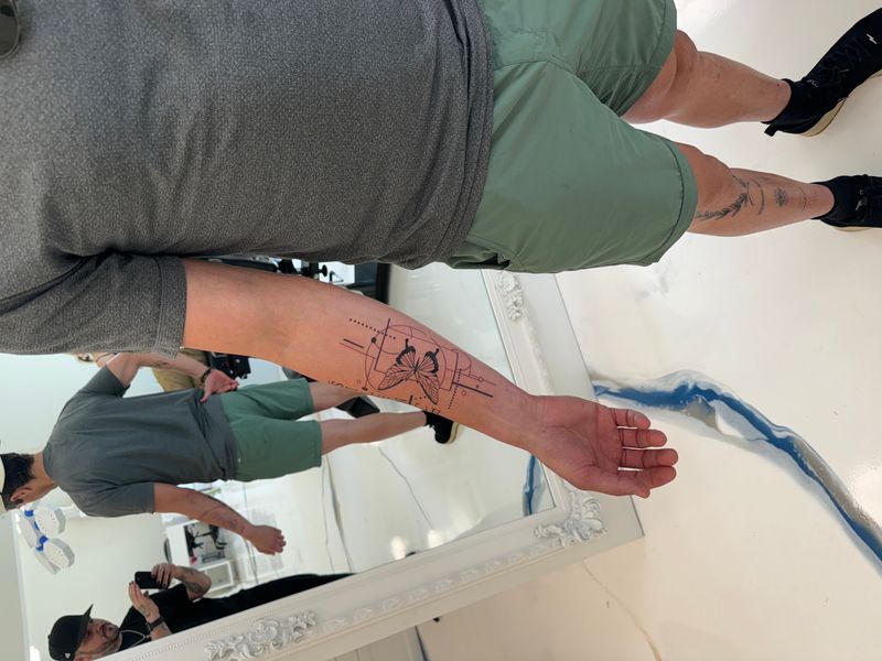
Hard edges, angular compositions, broken-mirror or shattered-plane aesthetics. Distinguished from pure geometric tattooing by its refusal of symmetry — angles chosen by the eye, not generated by formula. Mirko Sata's broken-glass work sits here. Tends to age better than its softer cousins because flat black holds its shape over decades.
ΙΙΙ
Color-field
Rothko-inspired compositions of large, layered color areas, soft transitions between hues, atmospheric weight. The most ambitious abstract subcategory and the most punishing on skin. Skin does not hold the kind of gradient Rothko built on canvas. Most serious artists attempt color-field only in small form, on well-suited placement, with full honesty about aging.
ΙV
Scribble / gesture
Cy Twombly-adjacent linework — loose, apparently chaotic, deliberately under-composed. The 'apparently' is the whole job. A good scribble tattoo is heavily composed to look uncomposed; a bad one is actually uncomposed and just looks like a mistake. Rewards artists with strong drawing fundamentals hiding inside their loose hand.
Ground and size
Choosing ground for a design with no silhouette.
Abstract tattoos live or die by the canvas you give them. Unlike a portrait, an abstract composition doesn't come with a built-in silhouette — the shape of the piece is the art.
How a shapeless design meets a body
- Upper back (best). The widest flat canvas on the body, ideal for panel-style or gestural compositions where the negative space carries as much weight as the marks themselves.
- Ribcage (best). Long vertical real estate that suits splash, drip, and flowing gesture work. The natural curve actually enhances abstract motion.
- Outer thigh (best). Flat, forgiving, and big enough for layered color-field or broken-geometric pieces.
- Upper arm panel (best). The classic gallery wall for medium abstract work — deltoid through bicep.
- Forearm (moderate). Works well for smaller gestural pieces, single brushstroke studies, and minimal line-gesture tattoos. Tapering shape limits wide compositions.
- Fingers, hands (avoid). Surface too small and broken by knuckles to carry an abstract read. The piece will collapse into a smudge within a year.
How big it has to be
- Under 4 inches. Most abstract compositions collapse. Gestural strokes lose their speed, color fields turn into dots. Discouraged unless the piece is a deliberately minimal single-mark study.
- 4–7 inches. Sweet spot for most abstract work. Large enough that brushstrokes read as brushstrokes, small enough to fit forearm, inner bicep, or calf placements.
- 7–12 inches. Where abstract really opens up. Back panels, thigh panels, full ribcage pieces — the composition can have multiple gestures, layered color fields, and internal rhythm.
- 12+ inches. Full-panel abstract. Multi-session builds, usually two to three sittings, with room for the artist to work in true painterly layers.
Compositions
Eight arrangements worth studying.
Not a catalog. These are opening positions — shapes and scales we know hold together on skin.
1. Gestural brushstroke down forearm
One long, deliberate brushstroke running from inner elbow to wrist, following the forearm taper. Solid black or a single saturated color. Bristle separation at the start, full saturation through the middle, dry-brush tail. Reads like a Franz Kline mark scaled to the body. Heals cleanly, ages gracefully — no complex detail to fall apart.
2. Broken-mirror shards on shoulder blade
A cluster of sharp-edged polygonal shards arranged as if a mirror shattered across the shoulder blade. Each shard filled with a different value — solid black, heavy stipple, fine parallel hatching, empty skin. Reads as tonal abstraction rather than literal glass.
3. Rothko-inspired color-field, 4-inch
Two or three horizontal color blocks stacked vertically on inner bicep. Soft feathered edges that bleed into the next rather than holding a hard line. Burnt orange over deep maroon, or teal over ochre, with a thin seam of warm cream between them.
4. Splash composition across ribcage
Vertical composition starting as a dense ink splash high on the ribcage, breaking downward into scattered droplets, drips, and fine spatter as it travels toward the hip. Varying opacity — some solid, some dry-brush, some single-needle flecks.
5. Twombly-style scribble on outer forearm
A loose, looping scribble of fine line work that reads as handwriting without words — the kind of nervous, searching mark Twombly made famous. Varying line weight, some passages dense and tangled, others trailing off. 5–6 inches.
6. Abstract portrait (essence of a face)
A portrait reduced to its fewest possible marks — the gesture of a hairline, the shadow of a jaw, a single dark mass where an eye might be — arranged so the viewer's brain completes the face without ever actually seeing one. 6–8 inches.
7. Horizon + gesture landscape
A single strong horizontal line suggests a horizon. Above and below, loose gestural marks suggest sky, weather, water, ground — but never commit. Soft grayscale with a single color accent. Works beautifully on the ribcage or across the collarbone.
8. Color study — three overlapping blocks
Three rectangles of color — magenta, cadmium yellow, cobalt blue — overlap at their corners, with the overlap zones rendered in the color you would get if they mixed as paint. Pure color theory on skin.
Hybrids
Hybrids that hold together.
Abstract rarely lives alone on the body. These are the hybrids that work without compromising either half.
Pairing
Abstract + fine-line
Gestural strokes supported by delicate line detail inside or around them. The gesture provides emotional weight; fine line adds a layer of drawing that rewards close viewing.
Pairing
Abstract + blackwork
Color fields replaced with solid black shapes, turning what would have been a painterly composition into a graphic one. Ages exceptionally well because there's no color to fade.
Pairing
Abstract + geometric
Hard-edged geometric framing around loose, painterly fills. The tension between precise edges and uncontrolled interiors is the whole point.
Pairing
Abstract + watercolor
The most natural hybrid. Watercolor already leans abstract; adding stronger gestural structure gives the piece backbone so it doesn't read as pure wash.
Pairing
Abstract + dotwork
Dotwork provides texture and density inside loose abstract fields. Stipple replaces solid fill, offering atmospheric depth without rigid boundary.
Honest caveats
What the style asks of you.
The realities a good artist will walk you through before the first sketch.
Translation is not copy.
Painterly aesthetics often do not translate to skin the way a client first hopes. A good artist will tell you what can survive the translation and what cannot.
Color-field work ages dramatically.
Soft gradients soften further. The "looks cool at day one, looks messy at year five" failure mode is real and common enough that it should be priced into the decision.
Composition literacy is required.
A successful abstract piece requires an artist who understands why the composition works. If they cannot talk about weight, negative space, rhythm, and why a particular mark is where it is, the piece is at risk.
Not a casual first-tattoo style.
Understand the art first — look at the painters, sit with the references, figure out what you actually respond to — then come to the consultation. A good abstract tattoo is a collaboration between a literate client and a literate artist.
First abstract piece
Eight things to do first.
The difference between an abstract tattoo that ages well and one that reads as noise at year three is almost always in what the client did before booking.
- Study the painters first. Before the consultation, sit with Kandinsky, Rothko, Twombly, Frankenthaler, Basquiat. Notice what pulls you. The specificity of that reaction becomes the brief.
- Pick one emotion as the anchor. Not a mood board of twelve feelings. One. The piece holds together when it is solving for a single emotional target.
- Let the artist scale up. First-time abstract clients underestimate scale almost universally. Accept the artist's upsize recommendation — compositions need room.
- Choose a flat plane. Upper arm, outer thigh, shoulder blade. Save curves and joints for later pieces when you understand how your skin carries abstract marks.
- Budget the consultation. Serious abstract artists design across weeks, not days. The first conversation rarely ends with a booking date on the same week.
- Bring raw material, not briefs. A photograph of weather. A passage of music. A fragment of a poem. The rawer the material, the more room for the artist to translate.
- Ask about healed work. Not just day-one photos. Year-two, year-five. Abstract pieces age distinctively — confirm you like how this artist's work softens over time.
- Plan for touch-up. Soft gestural work benefits from a refresh every few years. Not a flaw — a feature of the medium.
Your levers
Three levers you control.
Abstract work is personalized at the concept level, not at the surface.
Emotional anchor
A color relationship tied to a specific memory. A gesture borrowed from a handwritten letter. A fragment of a painting that carried you through a hard year.
Placement logic
Private placements (inner bicep, ribcage) for pieces meant as personal signals; visible placements (forearm, outer arm) for pieces intended as public abstraction.
Palette choice
All-black compositions for stability and graphic weight; single-color accents for emotional punctuation; full color-field for ambitious painterly statements.
Habits we redirect
Six habits we redirect.
The failure modes we watch for, and the conversations that prevent them.
Expecting the tattoo to look like the reference painting
The reference is emotional direction, not a template. Skin is not canvas. Ink spreads differently, your body moves, and the scale is radically different. Clients who insist on literal replication leave disappointed.
Choosing a generalist for abstract work
An artist who does everything usually does abstract adequately at best. Abstract composition is a specialized eye that takes years to develop. The artist who books a realism portrait next week and an abstract sleeve the week after is rarely the right call for either.
Going too small
Abstract needs canvas. A gestural composition jammed onto a two-inch wrist piece becomes unreadable noise. Shapes need room to breathe, negative space needs to function, and the eye needs somewhere to travel.
Not planning for the touch-up cycle
Abstract work, especially lighter gestural pieces, benefits from periodic touch-ups that refresh edges and re-intensify pigment. Budget for a touch-up every 3–5 years.
Matching the style to the wrong placement
Bold abstract blackwork on a finger, delicate gestural work on a bicep that flexes constantly, a balanced composition forced onto a curved rib — placement mismatches ruin otherwise strong concepts. Trust the artist's placement recommendations.
Missing the consultation conversation about intent
The single biggest abstract tattoo regret is arriving without a clear sense of what the piece is supposed to evoke. 'Something cool and abstract' is not a brief. The strongest abstract work emerges from a real conversation about emotion, memory, or idea.
Questions to ask
Eight things to ask before you commit.
An artist comfortable in their abstract craft will have a real answer to every one.
- Show me three abstract pieces of yours at a year or more out.
- What abstract painters or artists do you reference when you work?
- How do you approach composition on a curved body plane?
- Would you recommend color or black-and-gray for this concept?
- What's your honest read on how this design will age?
- How many sessions do you think this will need?
- Have you ever talked a client out of an abstract piece? Why?
- What needle configuration do you prefer for gestural work?
Vagueness here is itself the answer. Abstract is not a style to practice on a paying client.
FAQ
Ten things people ask when there is no reference to point at.
The questions that arrive when a client cannot show us a picture of the thing they want — answered the way we answer them in the chair.
What's the difference between abstract and watercolor tattoos?
Watercolor mimics a specific medium — soft bleeds, paper-stain edges, pigment pooling. Abstract is a broader conceptual category defined by non-representational composition: shape, gesture, negative space, movement. A watercolor tattoo can be abstract, but most abstract tattoos aren't watercolor. Abstract often uses bold blackwork, geometric fragments, or gestural ink — the unifying factor is that the piece evokes rather than depicts.
How does abstract tattooing age?
Depends on the sub-style. Bold abstract blackwork with strong shape language ages beautifully, often better than fine-line realism, because thick blocks of pigment stay readable as skin shifts. Delicate gestural washes and watercolor-adjacent abstract fade faster and need touch-ups every 4–7 years. Composition matters more than line weight — intentional shapes survive, busy noise does not.
Can I bring a painting as reference for my abstract tattoo?
Yes, and you should — but bring it as an emotional reference, not a literal copy target. A Rothko canvas, a Basquiat fragment, a Cy Twombly gesture: these communicate what you want the piece to feel like. Your artist will translate that feeling into something that reads as a tattoo on your specific body.
How long does an abstract tattoo session take?
Small gestural pieces run 2–3 hours. Mid-scale abstract compositions — forearm, calf, shoulder cap — typically 4–6 hours. Larger abstract work spanning a back panel, ribs, or full sleeve runs multiple sessions totaling 15–40 hours. Abstract is deceptive: a simple-looking piece often took longer than a detailed realism portrait because every shape placement is a deliberate composition decision.
Are abstract tattoos a good first tattoo?
They can be, if you approach the consultation correctly. The risk isn't the style — it's that first-time clients often want something safe and misread abstract as low-commitment because it lacks a clear subject. Abstract demands strong conceptual intent. If you know what you want the piece to evoke and you choose an artist whose abstract portfolio resonates, it's a tremendous first tattoo.
Will my abstract tattoo look like the reference painting?
No, and that's the point. A reference painting is a mood board, not a blueprint. Your artist adapts the gesture, color relationships, and composition to your anatomy, skin tone, and placement. A good abstract tattoo honors the spirit of the reference while functioning as a tattoo — respecting how ink spreads, how skin stretches, and how the piece reads from conversational distance.
What's the best placement for abstract work?
Larger, flatter canvases serve abstract best — upper back, thigh, ribs, forearm panel, shoulder cap. Abstract needs room to breathe; compositions lose their balance when forced onto narrow real estate. Placements with dynamic body movement work well because the piece animates when you move. Avoid tight, curved placements like fingers or behind the ear unless the design is specifically engineered for the shape.
How do I find a good abstract tattoo artist?
Look for artists whose portfolio leads with abstract, not artists who dabble in it between other styles. Study their healed work — ask for photos taken 6+ months after completion. Notice composition: do shapes feel intentional, or scattered? Read their captions — abstract artists who talk about concept, emotion, and reference art usually produce stronger work.
Can abstract tattoos be covered up later?
Yes, though the process depends on how dense the original is. Bold abstract blackwork covers as readily as any heavy work. Gestural or watercolor-adjacent abstract is often easier to cover because the ink tends to be less saturated. Always consult a dedicated coverup specialist rather than assuming any artist can handle the transition.
Does pricing differ for abstract work?
Abstract pricing is discussed at consultation and depends on design labor, session count, and scale. A strong abstract piece requires hours of compositional planning before the needle touches skin. The conceptual framework and the artist's eye — not just tattooing hours — drive the conversation.
Ready to talk composition?
Bring the feeling first — we'll translate it into shape, weight, and gesture.
Abstract is a collaboration between a literate client and a literate artist. Bring references, bring the emotion you want the piece to carry, bring the memory or the music or the fragment of a painting that moved you. Then we argue about it a little. Composition, placement, and how much the drawing is allowed to change once it meets the shape of your arm.