Tattoo Ideas
Watercolor Tattoo Ideas
Watercolor is one of the most requested styles we see, and one of the most misunderstood. It is not a subject or a genre — it is a way of applying color that mimics pigment bleeding into wet paper, which means it behaves differently in skin than almost anything else we tattoo. Here is how we think about watercolor pieces at our Santa Monica studio: what suits the style, what it costs you in longevity, and how to build one so it still reads a decade from now.
Book a consultationWhat "Watercolor" Actually Means in Skin
On paper, watercolor works because pigment is suspended in water and allowed to move — feathered edges, translucent overlaps, unpredictable blooms. In skin, none of that is literally happening. A watercolor tattoo is an illusion built from soft gradients, open negative space, splatter, drip trails, and color laid down at lower saturation than a traditional piece. The artist is imitating the look of a wash using a medium that is fundamentally permanent and fundamentally in a living, shedding, sun-exposed organ.
That gap between the reference image and the medium is where most watercolor disappointment comes from. A piece that looks exactly like the Pinterest painting on day one was probably built with pigment concentrations too low to survive. Understanding the trade-off up front is the difference between a watercolor tattoo you love at ten years and one you are researching cover-ups for at three.
How Watercolor Ages — The Honest Version
All tattoos soften over time. Ink particles migrate slightly, the immune system continues clearing pigment for years, and UV exposure breaks down color. Watercolor pieces are simply more exposed to every one of those forces at once.
- Soft edges blur first. A feathered edge has nowhere to go but outward. What reads as a delicate fade at three months can read as an indistinct smudge at five years, because there is no hard boundary holding the shape.
- Pale washes fade fastest. The lighter the dilution, the fewer pigment particles are sitting in the dermis, and the less there is to lose before the area reads as skin. Very light yellows, pale pinks, and soft lavenders are the most fragile colors in the palette.
- Splatter and micro-detail merge. Fine dots and thin drip trails are individually small deposits of ink. Over time, adjacent marks spread toward each other, and a spray of distinct flecks can settle into a haze.
- Composition survives better than texture. A piece built on strong shapes will still read from across a room in fifteen years. A piece built entirely on delicate texture may not.
None of this is an argument against watercolor. It is an argument for designing watercolor with aging built into the plan rather than discovered later.
The Anchor: Why Structure Under the Wash Matters
The single most useful decision in a watercolor tattoo is whether there is something structural holding the piece together. We generally push clients toward one of three approaches:
Line-Anchored Watercolor
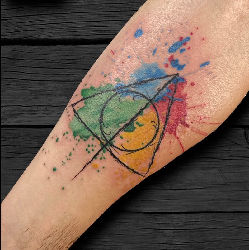
A clean black or dark-toned linework drawing sits as the skeleton — a bird, a botanical, a figure — with the color wash floating loosely around and behind it. Even if every wash softens by half, the drawing still reads. This is the most reliable long-term watercolor structure, and it is what we recommend for anyone getting their first color piece.
Blackwork-Anchored Watercolor
Instead of outlines, solid black shapes, heavy shadow, or a graphic silhouette provide the contrast. The wash reads as light bleeding around a dense form. This ages exceptionally well because black is the most stable pigment we work with, and the contrast between dense black and open color is what your eye actually locks onto.
True Lineless Watercolor
Pure color, no anchor. It is the most faithful to the painting reference and the most beautiful fresh. It is also the option most likely to need a touch-up cycle and the one we are most direct about. If you want it, we would rather build it at a slightly higher saturation than the reference and place it somewhere protected than talk you out of it entirely.
Saturation, Skin Tone, and Color Choice
Tattoo pigment is translucent. Your skin is the paper, and every color you put down is filtered through your own undertone — which means the same palette reads differently on different people. On deeper skin tones, low-saturation pastels tend to lose contrast against the surrounding skin, while saturated jewel tones, warm oranges and reds, deep teals, and violets hold their distinction far better. On lighter skin, pale washes read more clearly, but they are still the first thing to fade.
A practical rule we use: pick the color for contrast, not for the reference image. If a wash needs to be distinguishable from your skin at arm's length, it needs enough pigment to be distinguishable at arm's length in ten years, not just at the studio mirror. Bringing photos of your bare skin in natural light to your consultation lets us plan this properly instead of guessing.
Placement: Keep the Wash Out of the Sun
Sun exposure is the fastest way to lose a watercolor piece, and in Los Angeles that is not a theoretical concern. Placement matters more here than it does for a blackwork or traditional piece.
- Strong placements: inner upper arm, upper back and shoulder blade, ribs, thigh, and inner forearm. These spend most of the year covered and see less direct UV.
- Riskier placements: outer forearm, hands, tops of feet, and anything below the sleeve line on someone who is outdoors daily. These will need sunscreen as an actual habit, not an intention.
- High-friction areas: hands, fingers, inner wrists, and feet also get mechanical wear. Delicate washes in those spots do not hold.
If your heart is set on a forearm watercolor, that is workable — it just moves the conversation toward a line or blackwork anchor and a slightly bolder palette.
Subjects That Suit the Style
Watercolor is a technique looking for the right subject. It works when the subject already has a reason to dissolve at the edges:
- Botanicals — poppies, peonies, wildflowers, eucalyptus. Petals and leaves justify soft color bleeding past the drawing.
- Birds and butterflies — motion and plumage give the splatter narrative purpose rather than making it decoration.
- Ocean and sky — waves, tide lines, sunsets, and coastline abstractions. A natural fit for a studio on the Westside, and the gradients are the subject.
- Animals with a graphic core — a strong black linework fox, whale, or horse with color exploding behind it. This is the classic line-anchored build.
- Abstract and geometric hybrids — solid geometry over loose wash. The hard edges do the structural work; the wash does the mood.
Subjects we steer people away from in pure watercolor: portraits, lettering, and anything where legibility is the whole point. Softness and legibility are working against each other there. For more direction on matching a subject to a style, browse our other tattoo ideas.
Aftercare and the Touch-Up Reality
Fresh watercolor peels the same as any tattoo, but because the color is lighter, the healing phase can look alarming — washes can appear to vanish under peeling skin and then partially return. Judge nothing until you are past full healing, typically a couple of months out. After that, expect that a watercolor piece may want a touch-up sooner than a traditional one, and that daily sunscreen on the piece is the highest-return habit available to you. Talk to us about a maintenance plan when you book a consultation — it is a normal part of owning this style, not a sign anything went wrong.
Common watercolor tattoo questions, answered
Do watercolor tattoos really fade faster than other tattoos?
Yes, in practice — but not because the ink is different. The style relies on lower pigment saturation, soft edges, and fine detail, all of which have less material to lose before the design starts reading as indistinct. A watercolor piece built with a line or blackwork anchor and a bolder palette ages much closer to a traditional tattoo.
Should my watercolor tattoo have black outlines?
We recommend some form of structure for most people, though it does not have to be a full outline. A partial line, a heavy black shadow, or a graphic silhouette all serve the same purpose: giving your eye something stable to read when the washes soften. Fully lineless work is beautiful and completely valid, it just carries more maintenance.
Where is the best placement for a watercolor tattoo in Los Angeles?
Anywhere that sees less direct sun. Inner upper arm, shoulder blade, upper back, ribs, and thigh are the strongest options for a Southern California lifestyle. Hands, feet, and outer forearms get both UV and friction, so we plan those with heavier structure and more saturated color.
Do watercolor tattoos work on darker skin tones?
Absolutely, with the right palette. Pale pastels tend to lose contrast against deeper skin, so we build with saturated jewel tones, warm reds and oranges, deep teals, and violets, often anchored with blackwork. We will look at your skin in natural light during the consultation and plan the palette around contrast rather than copying a reference image.
How often will a watercolor tattoo need touch-ups?
It depends entirely on placement, sun exposure, palette, and how the piece was built. A structured, well-placed piece may go many years without needing anything. A pale, lineless piece on a sun-exposed forearm will want attention sooner. We would rather set that expectation before the first session than after.
Can watercolor be combined with other tattoo styles?
Yes, and hybrids are often the strongest version of the style. Fine-line botanical with a loose color wash, blackwork geometry with color bleeding through, or illustrative animals with splatter behind them all take advantage of watercolor's mood while keeping a durable backbone.
Is a watercolor tattoo a good first tattoo?
It can be, as long as it is designed for longevity rather than for the photo. For a first piece we usually suggest a line-anchored composition at a moderate size in a protected placement. That gives you the aesthetic you want while you learn how your own skin heals and holds color.
Are watercolor tattoos harder to cover up later?
Generally they are easier than heavy black or dense traditional work, since the pigment sits lighter, though scattered color and splatter can limit palette options for a cover-up. This is worth mentioning at consultation if you think the piece might eventually be part of a larger sleeve or back project.